|
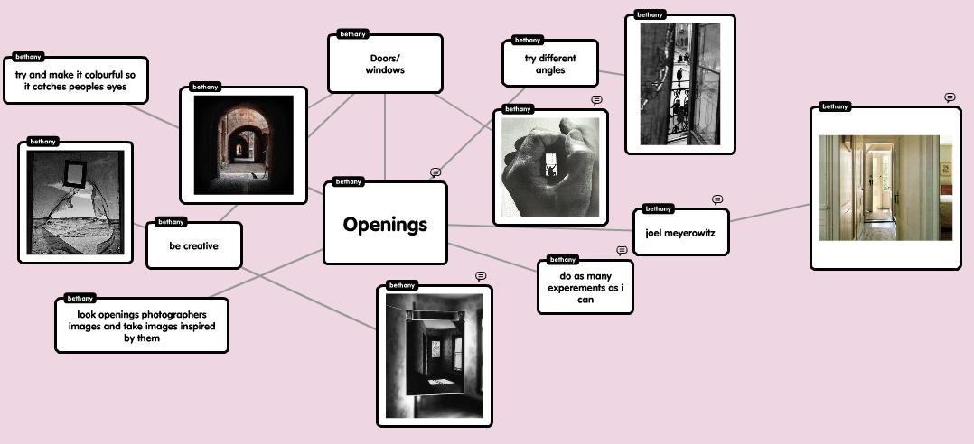
My plan: Openings
Why I chose Openings ? I chose Openings because I like the way how some of the Openings images are weird and wonderful and unique and no images like them. Most of the artists that take Opening photographs I have not come across therefore I will research them and develop my knowledge on them. |
|
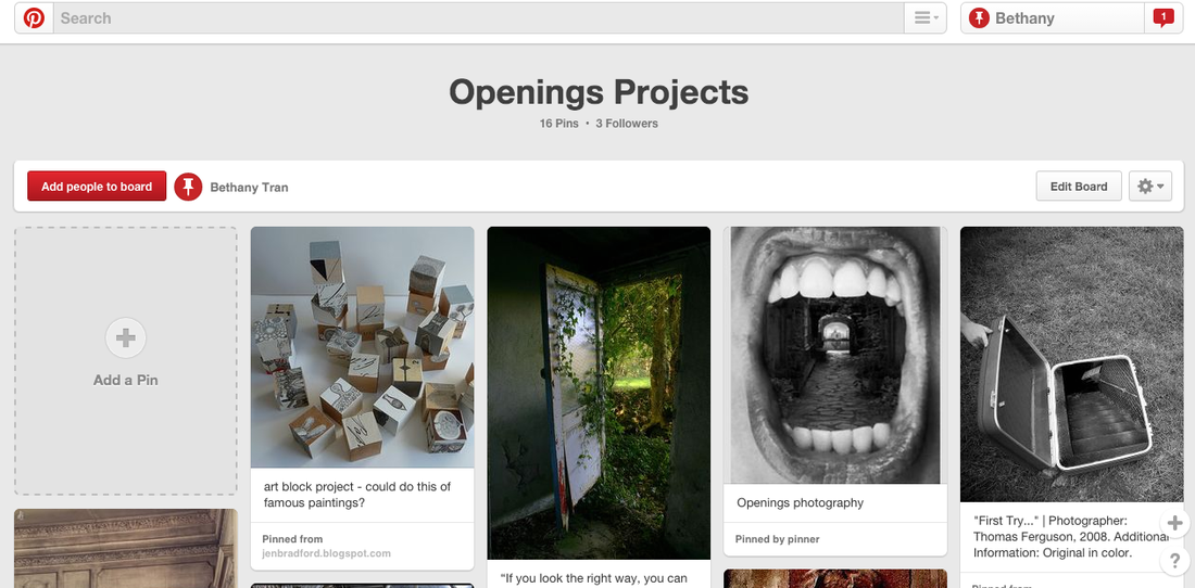
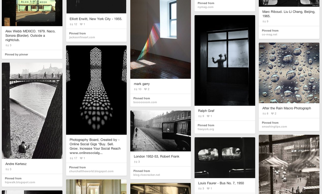
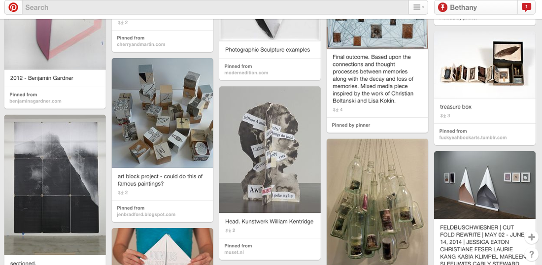
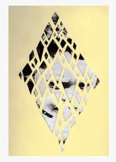
Openings Pintrest: tallisarts
Plan
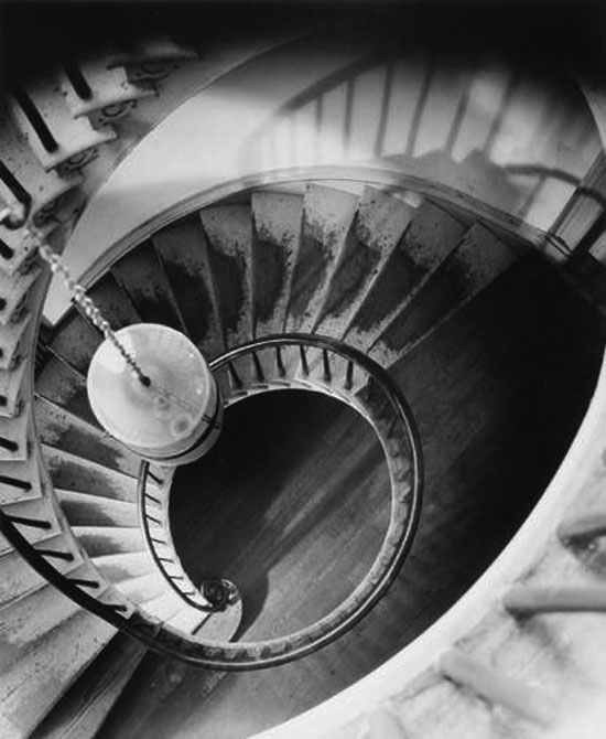
Joel Meryerowitz

|
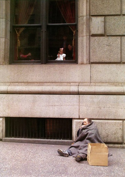
This is my favourite image form Joel Meryerowitz photographs. This image has a low tonal range meaning most of the colours in the image have the same tone and slightly blend into each other. The doors opened are central within the composition, meaning it is the center of attention. This image fits well on to the 'Openings' category because the image is of doors opened and behind that door is another door opened and so on. |
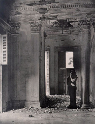
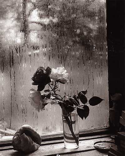
Clarence John Laughlin
|
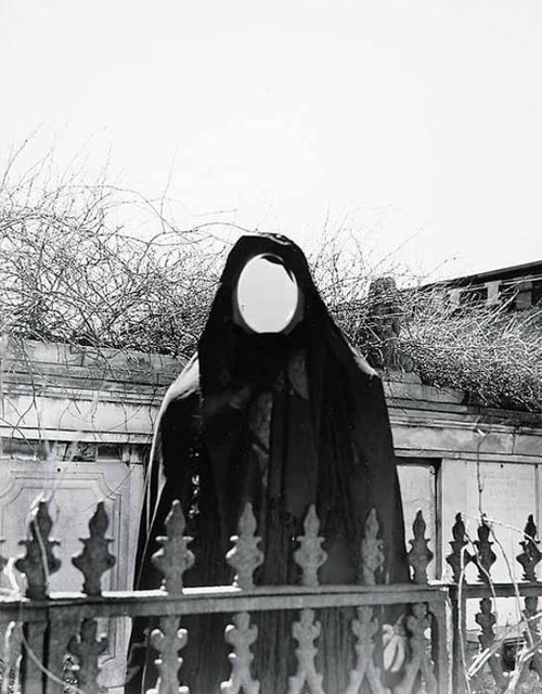
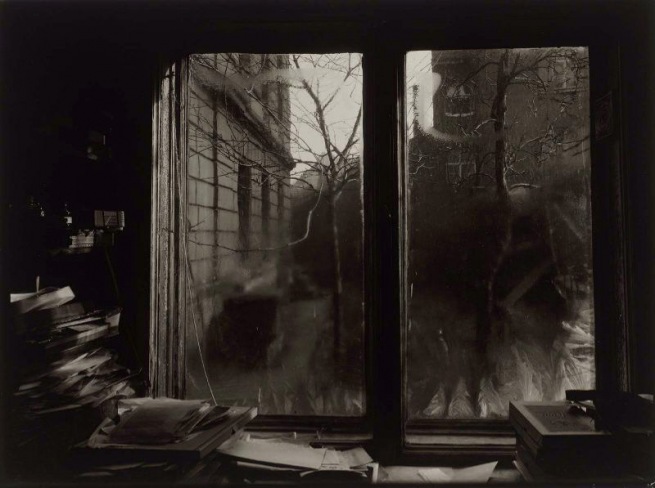
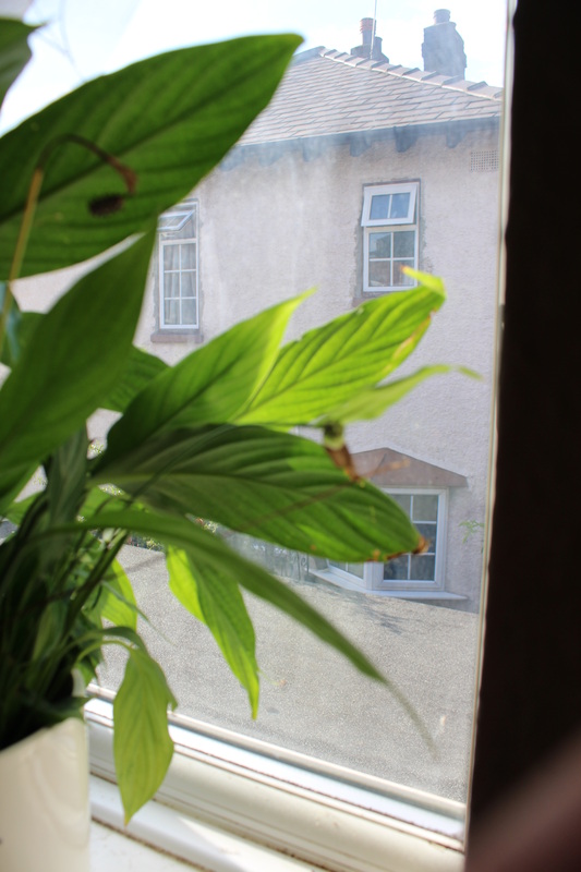
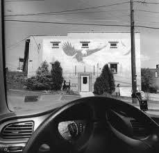
This is my favourite image from Clarence John Laughlin photographs. Most of his images have a grey and white tone however in this image has a yellowish tone. The building is central within the composition, meaning it is the centre of attention. In the top right hand corner window there is a figure standing there creating a sense of mystery. This image fits well into the 'Openings' category, as you can see it was taken of a house and its windows, where some of them look closed and some looks opened. In the bottom left hand corner the window looks like it is closed and you can see a reflection in the glass. The top left hand corner looks like it is a wooden door as there is no reflection. This image looks like it was taken with a film camera as the tone is quiet yellowish. |
Experiment: 1 (School)
Evaluation
|
WWW:
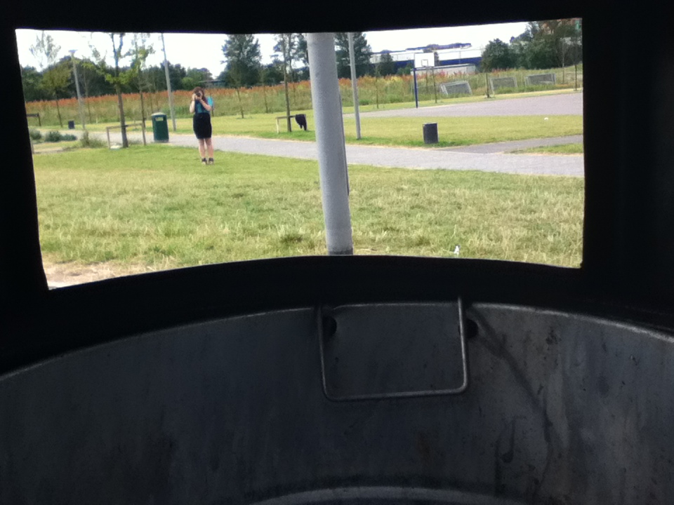
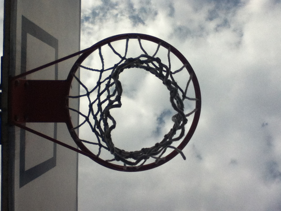
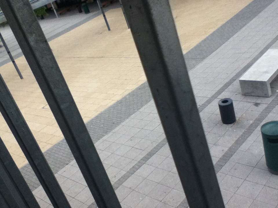
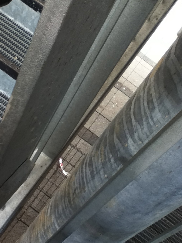
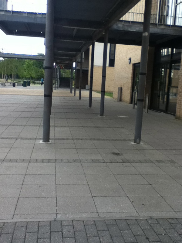
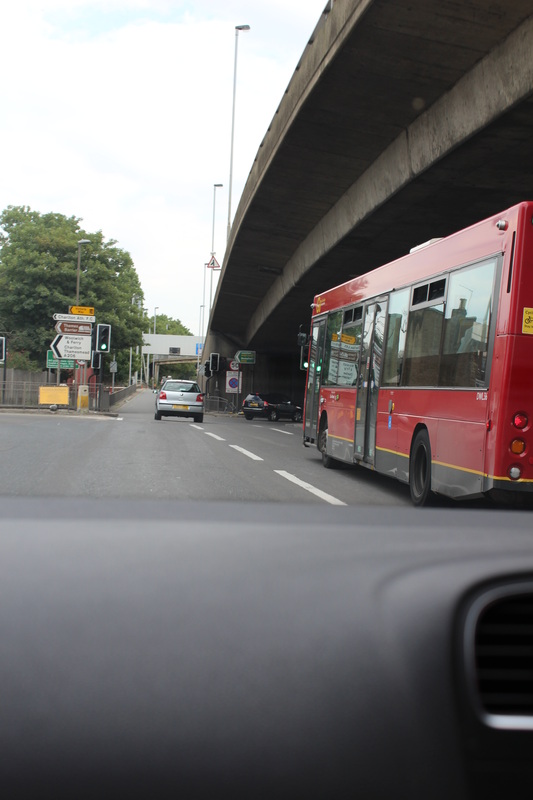
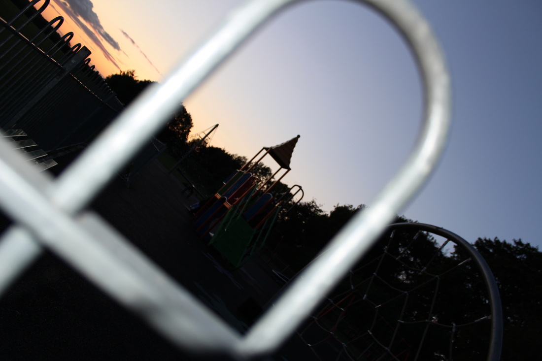
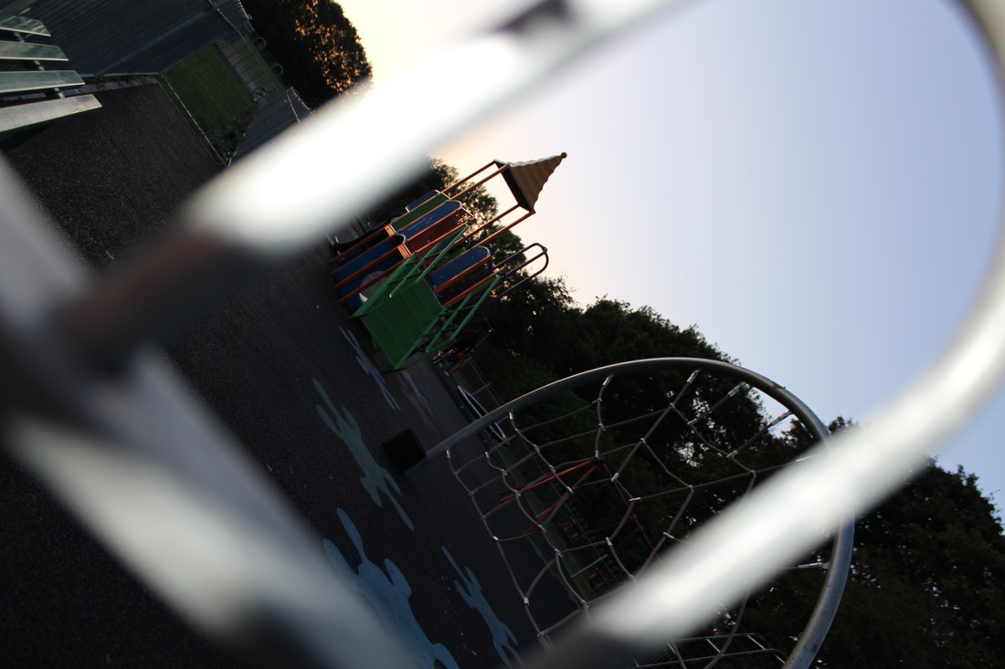
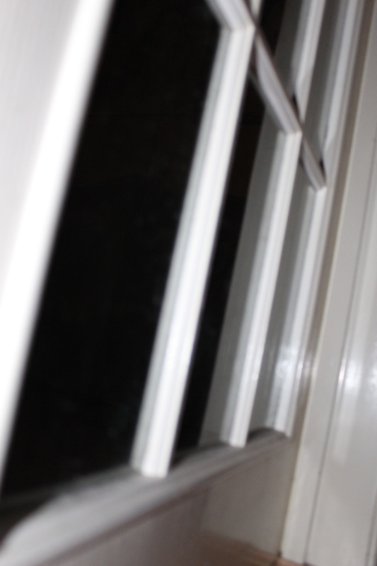
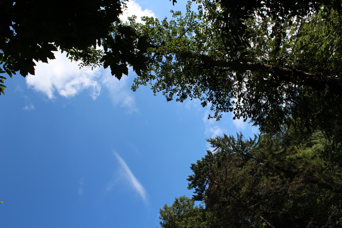
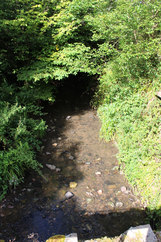
This set of images are my first ever set on 'Openings'. This set of images I took in school. To take these images I went round school trying to take images related to my theme 'Openings'. I think that only some of these images fit in the category of 'Openings'. The image that I think fits very well in the 'Opening' category and I think is my best image is the 2nd image . I think this because you can clearly see the opening, which is the basketball hoop. This image was taken from down below looking upward, through the basketball hoop and facing the cloudy sky. |
EBI:
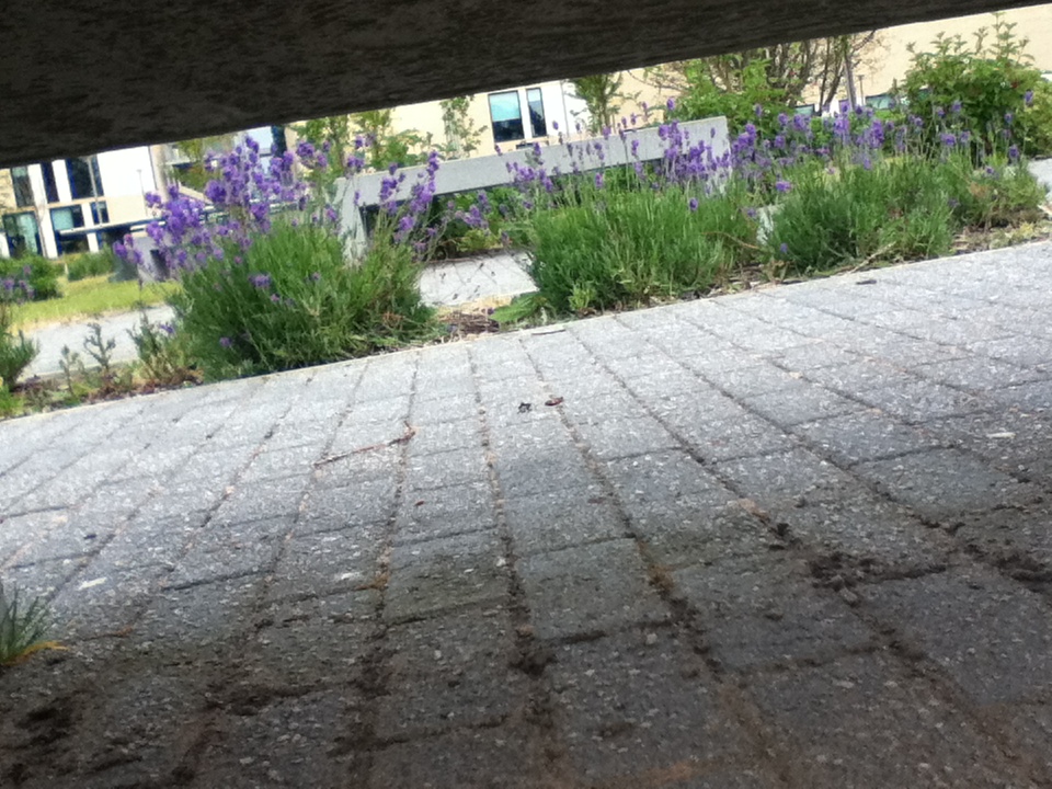
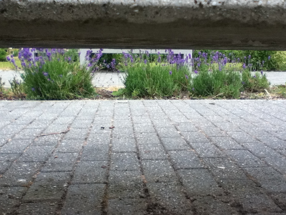
I think that the image that I could of have taken better is the last image. This image is not that good because it does not fit in the category of 'Openings'. It does not fit in the category because it is not really clear where the openings. This was my first time taking images related to openings, so I think that if I were to do this image again it would better because I have learned more about the 'Openings' category. |
Experiment: 2 Through A Paper Hole
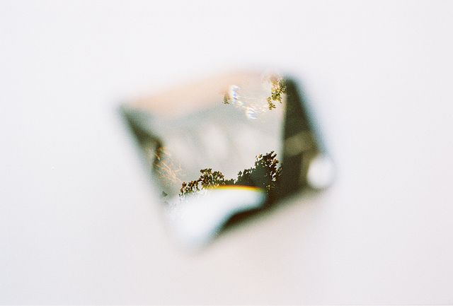
Inspiration by: Andrew Frederick
|
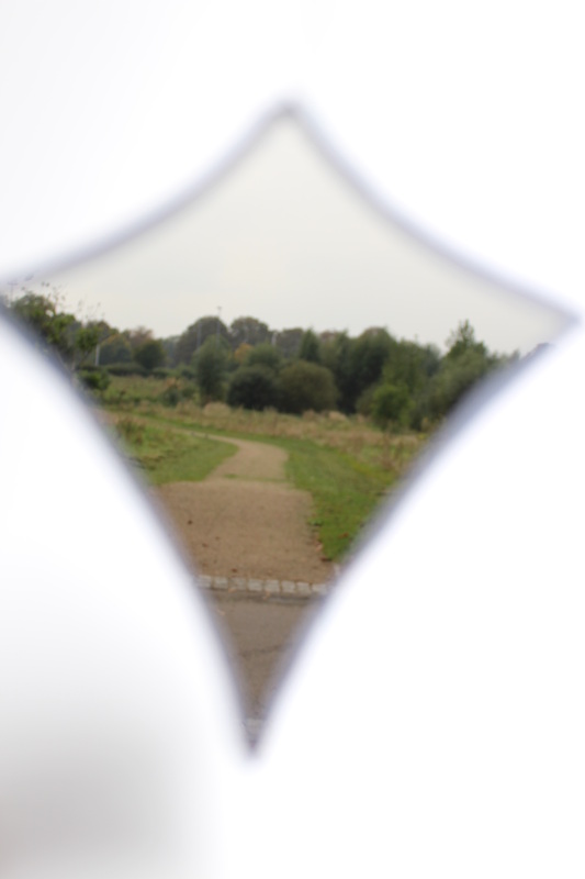
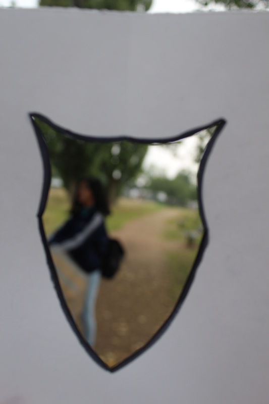
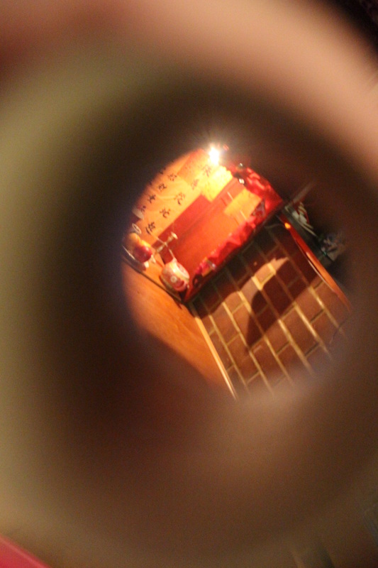
This image is called 'a camera looking at a camera looking at the world.' photographed by an photographer named Andrew Frederick.
There is a lot of free space in this image, which is all around the hole, which makes the hole stand out in the image as it is the main thing that you see. The main thing that is in focus in this image would be the trees through the hole. This then makes the trees stand out as it is the only thing that is in focus. The fact that the tress through the hole are in focus, the edges of the paper hole are blurred out, which makes the edges softer and not as sharp as it would be if the edges of the paper hole are in focus. Another thing that stands out in this image would be the colours through the hole, these stand out against the image as the free space in the image is white. |
Evaluation
|
WWW:
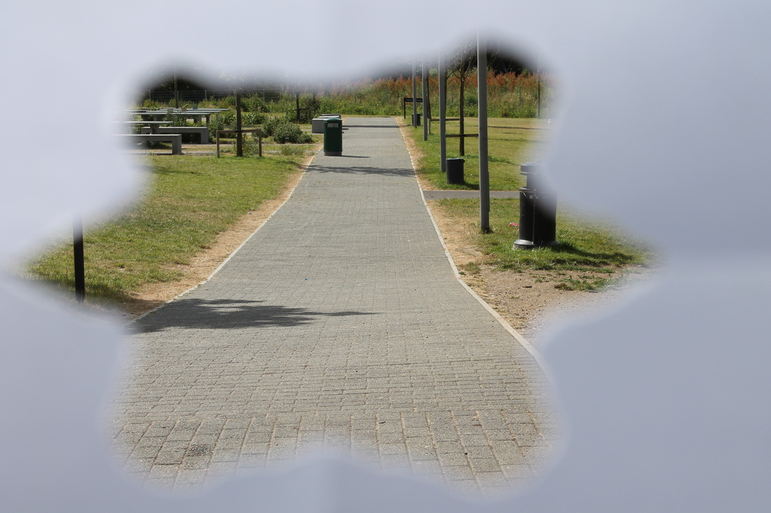
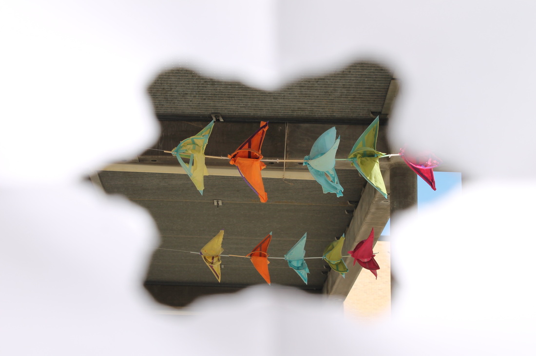
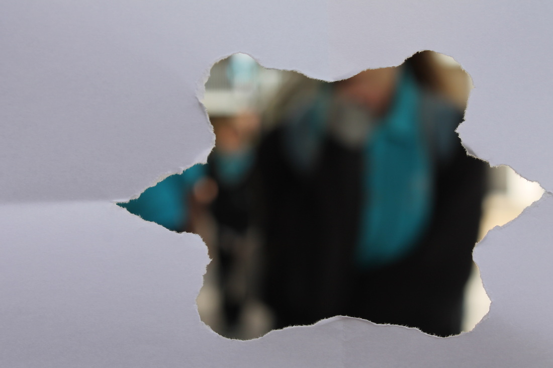
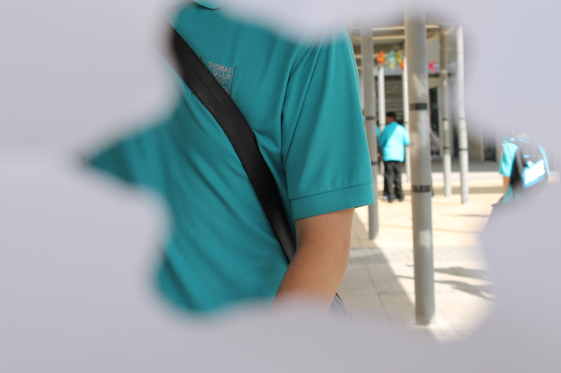
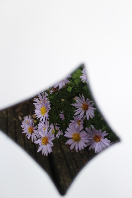
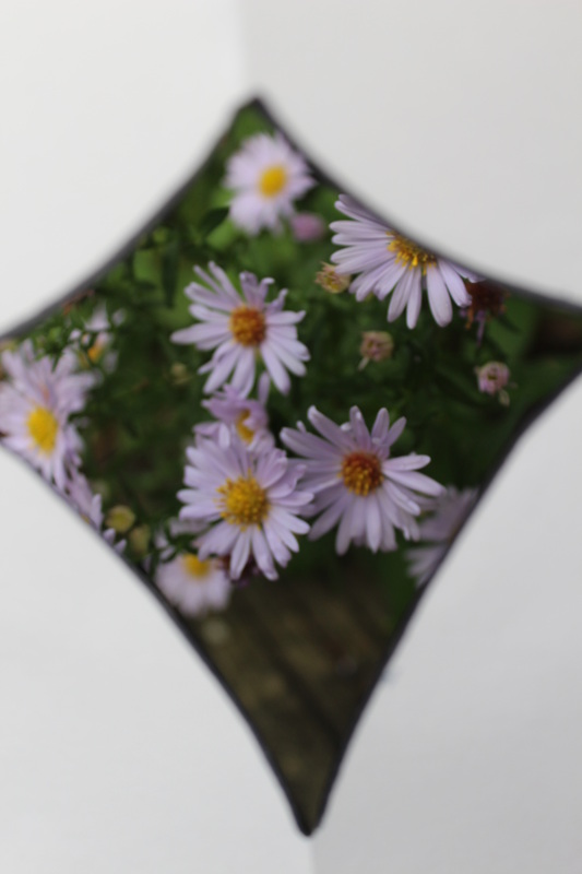
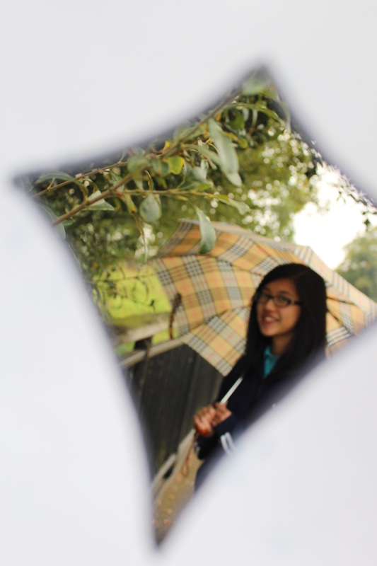
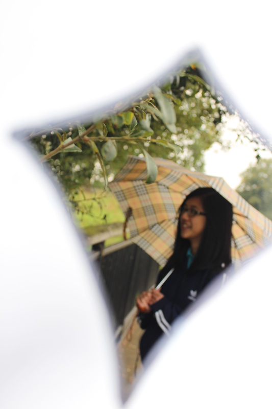
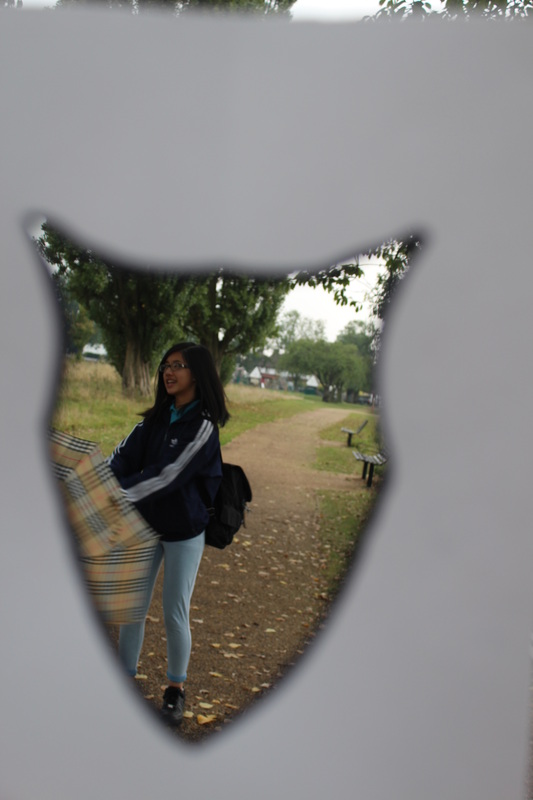
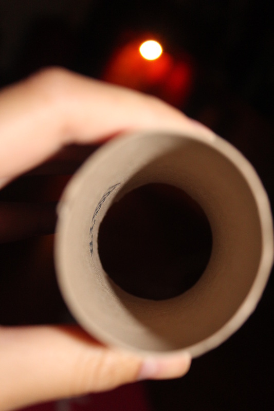
When I took this set of images, I used a piece of paper which I had ripped a hole out. I made it into a fancy shape so it wouldn't look boring with just average/simple hole. I think that the 3rd image is my best photo. I think this because the things on the rope are in focus and are bright colours stand out against the grey background and the white fore-ground. The paper makes it look like it is outline of the things on the rope making you look at them when you first look at the image. The edges of the paper hole are blurred. Whilst taking this I had to get my friend to hold up the paper in front of the camera, making sure that the things on the rope are in focus and making sure they have a central composition. I really like this photo because you can look directly through the photo and see what's on the other side. In this photo the other side of the image is clear, in focused, central and bright coloured. Whereas the outer paper layer edges are blurred and rough, meaning the paper layer is not in focus. This image fist well in to the 'Opening' category because the paper hole is acting as a opening to the things on the other side, so the things on the other side could be seen My Second best image is the 6th image. This image was taken using the same technique as the other one, Having a friend holding up the paper in front of the camera. In this image the paper is in focus rather that what's on the other side. The paper hole is slightly to the right making the left hand side of the image empty. Through the opening you can see a blurred figure. This makes it more interesting as you wonder what the figure is doing. The outline of the paper hole is in focus, so you can clearly see the holes edges. The white paper is in contrast with the figure through the opening. The figure is wearing dark colours which stand out on the white for ground. The figure is also wearing a bright blue t-shirt which also stands out on the white fore ground. Even though the colours are blurred it still clearly stands out against the white fore ground. I really like this image as the blurred figure really stands out against the white fore ground. |
EBI:
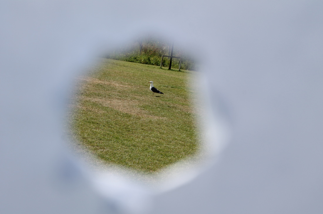
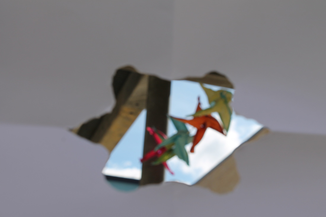
I think the image I could of have taken better is the last photo. Another photo of the coloured things on the rope. This image didn't turn out good because I didn't focus on anything making everything blurry. The paper was held too far away form the camera, so you can see more of the paper rather than the colourful things. If I were to take this image again I would improve it by trying to focus on something so the image wouldn't be blurry and be more clear. I would also focus on something, so it would be the center of attention. Making the thing I am focusing on focused and the rest of the image blurry so the focused part of the image stands out, therefore being the center of attention, being the first thing you see when you look at the image because it is the only focused part, against the blurry background/fore-ground. Another thing I could improve on is to put the piece of paper closer to the camera so you see less of the paper in the final image. I would put the paper closer to the camera but not too close because if i did put it too close the paper wouldn't be seen, therefore the image wouldn't fit in to the 'Openings' category. I think that another image I could of have done better is the 2nd image. The photo of the bird. This image didn't turn out good because the bird is too far away and the edge of the paper opening is too blurry, this suggests that I was focusing on he bird rather than the paper opening. This might be because the paper was too close to the camera lens. This image is the only image that the paper opening was ripped out as a normal circle and not as a funky shape. This makes the image seem more boring as the shape of the hole is not unusual as the others but is a normal .everyday, boring circle. I think that the bird should be closer and not a far away as it looks a little bit odd because the bird is the only thing in the background. If i got closer to the bird, then the bird would be bigger filling up more of the negative space. |
Experiment: 2 Through A Paper Hole- Refined
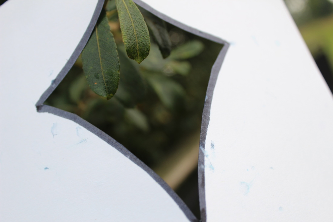
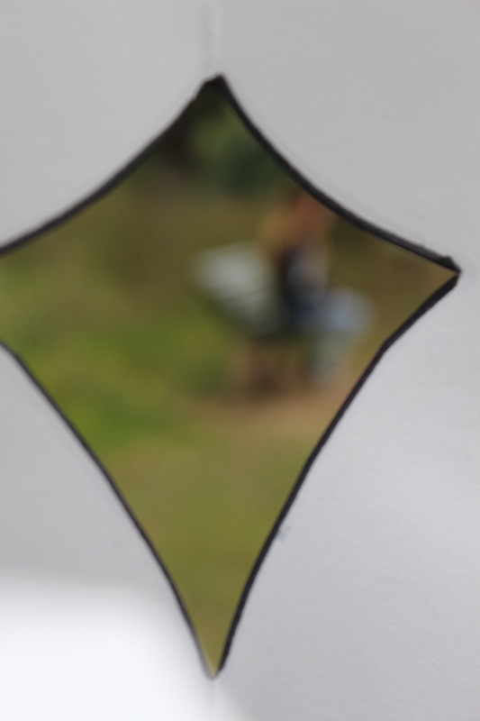
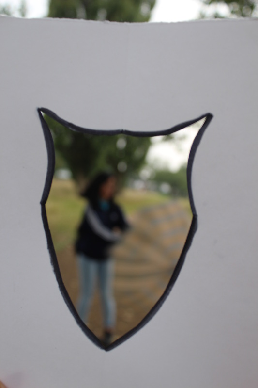
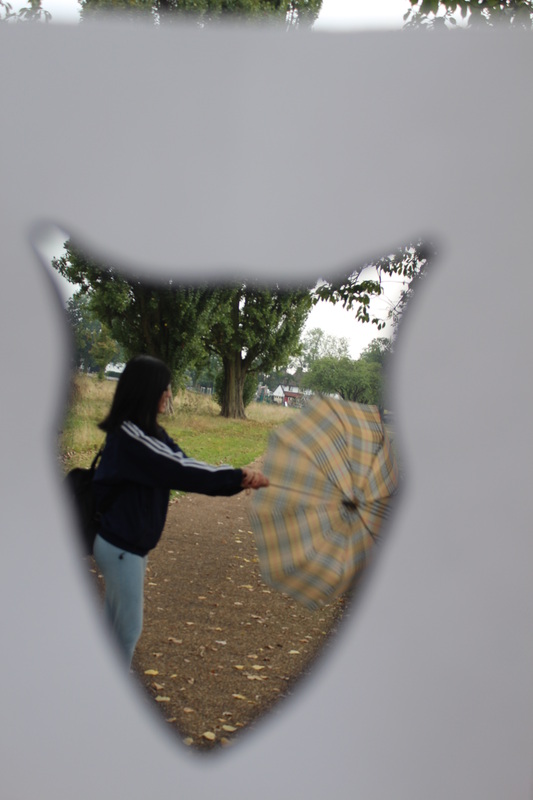
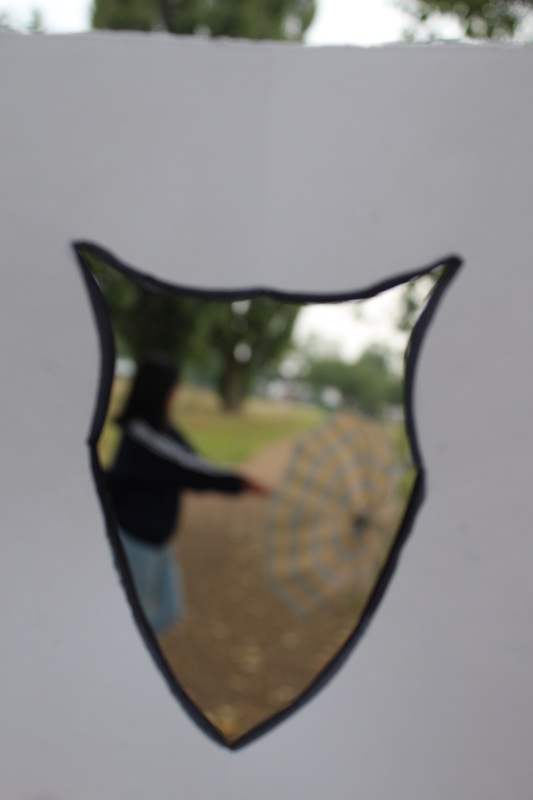
Here is a set of images that I have tried to improve from the last set of images. To improve from the last set I tried to make more absurd shapes in the paper to make the image seem more unique. Different from the last set of images, instead of the hole being ripped out of the paper, I cut the shapes out to make the edges more clean and sharp. I also outlined the shape to make it stand out more making it the center of attention. Some of these images are really blurry, as I was trying to focus on the black line rather than what is through the hole. Buy doing this it made the line really clear making it the center of attention. While taking these image I found out that it was really important to make sure that the paper was straight and to make sure that the paper fits the whole screen, meaning that there would be no need to crop the image. However I think that this set of images didn't work out really well as I feel that by having a rough edge around the hole and making sure that it was in focus was makes it a better image as then we would be able to see all the layers of the paper. Another thing that I found out was that by having a smaller design would make the it easier to take the image, as then we are able to put the paper close up to the camera, making sure that the paper fits the whole frame.
Josef Sudek:

|
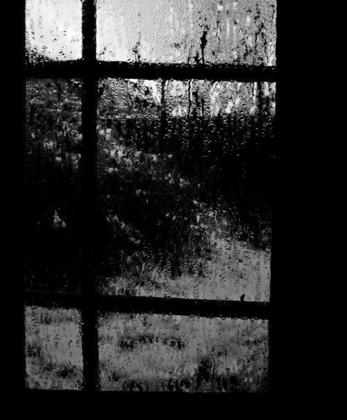
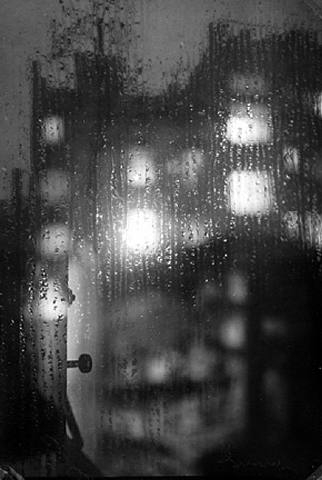
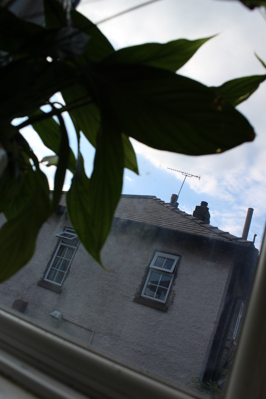
This is one of my favourite from Josef Sudek 'windows' series. All of his images have the dark and dingy look to them. They all have the same colours in them, black , dark brown and often grey. This images does not have a wide tonal range meaning all the colours blend in to each other and have the same dark tone to them. This image fits well into the 'Openings' category, as you can see this image is taken of a window and whats on the other side. On the window you can see there is a dark patch on the middle of the window spreading outwards, this could be a a shadow maybe.
|
Experiment: 3 Josef Sudek (Windows) Inspired
Evaluation
|
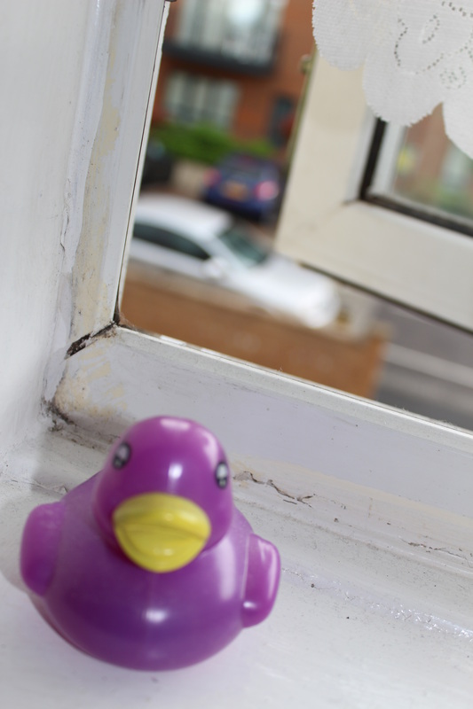
WWW:
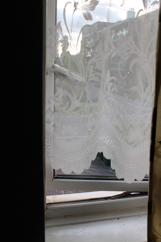
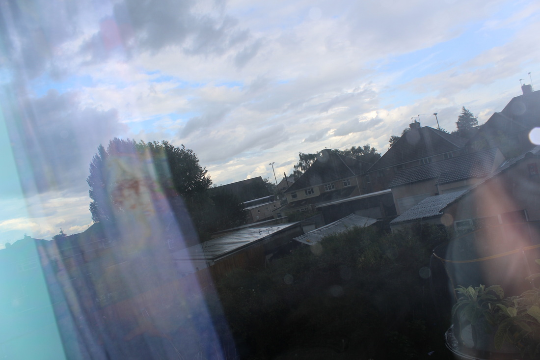
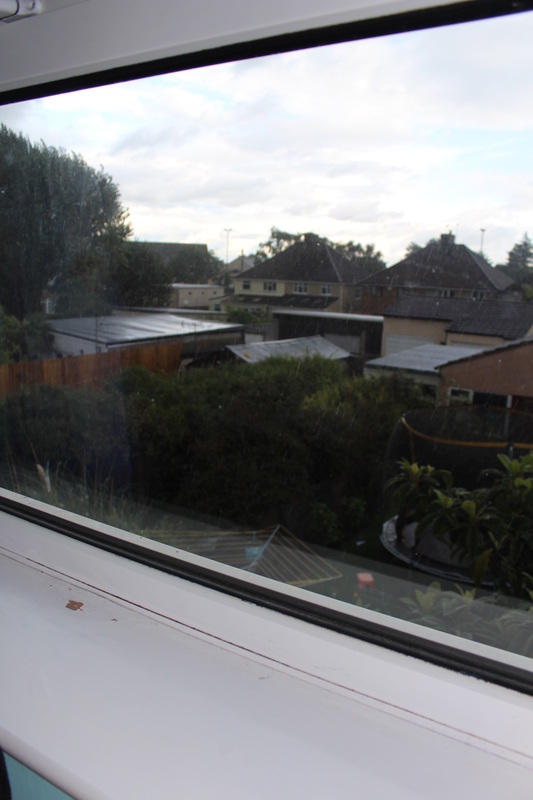
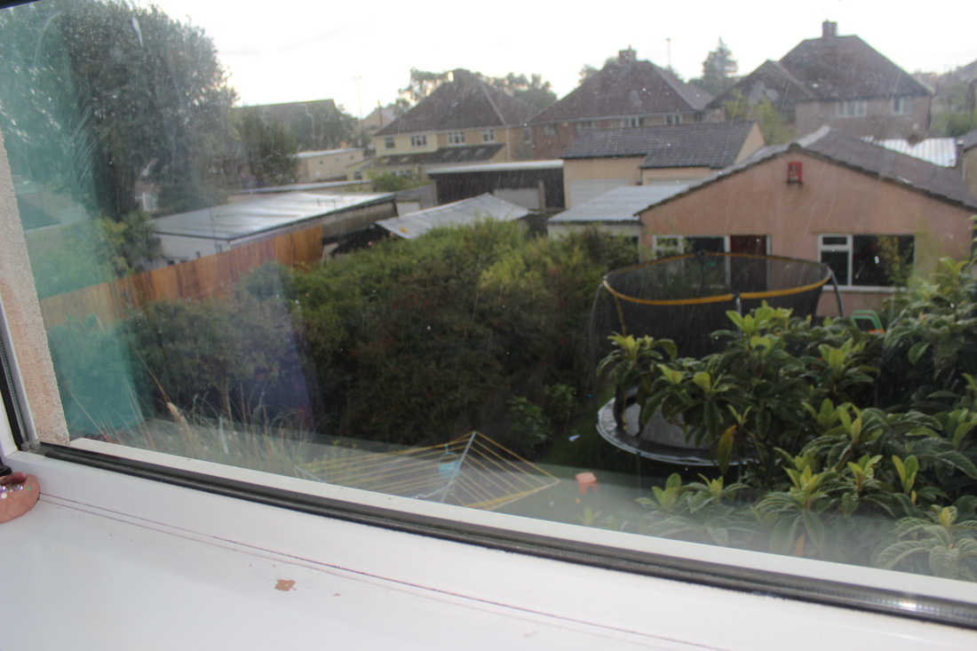
This is my 3rd set of images, that I took at home. When taking these images I tried to relate them to my topic 'Openings'. I personally think that half of my images I have taken fit well in to the 'Openings', the other half I think don't fit in to my theme. I think that the 4th image in my series is my best image. The focus in this image is on the window still behind the purple rubber duck. Which makes the rubber duck, outside and the window blurry. The rubber duck is placed slightly to the left, therefore not making it the center of attention. Through the window you can see the outside, which is all blurred up making it look mysterious. This image fits well in the 'Openings' category because you can clearly see the opened window and you can see what's on the other side of the opening. One way to improve this image would be to focus on the outside, though the opening, then it would fit even more in the opening category because then the viewers eyes would go straight through the opening. My second best photo is the 5th one. This image was taken on the same day as the others, with the same idea in mind. Trying to capture an opening. This image fits well in to the category 'Openings', as you can see this image was taken through a window opening. I like this image because rather than focusing on the window, the focus was on the outside. Making you eyes wonder to what's outside the window rather than the window it self. Because the focus wasn't on the window, the window edges are blurred, which makes it look messy against the focused background. The fore ground of this image has light colours whereas the background has slightly darker colours. This means that the colours are in contrast to each other. |
EBI:
Personally I think that the 10th image is not my best photo I have take throughout thus series of images. I think that this image does not fit in to the 'Opening' category because you cant clearly see that it was taken through a window, as this image does not show any part of the window. Whereas in the other images you can see part of the window, which suggest that is was taken from a window looking out. Another thing bad about this image is that it doesn't look planned, it looks like I have just taken the image without thinking about the composition or lighting. My second not my best photo is the 12th photo. I think this because this image is only taken of an window and no other subject or thing. On the left side of this image there is negative space. This is weird as it is the only negative space in the image. This image is hard to tell whether it fits in to the category 'Openings' because even though you can slightly see the opening at the bottom of the image, the thing covering the window makes it harder and more confusing to tell whether it is an opening. What I could of have done better is to take this image so there are no negative spaces, and take the image from a lower angle, looking upwards so you can capture more of the opening |
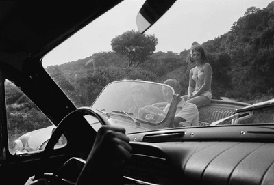
Lee Friedlander:

|
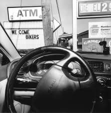
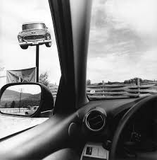
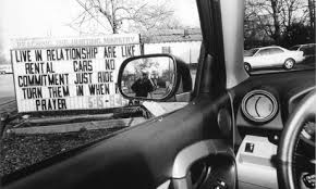
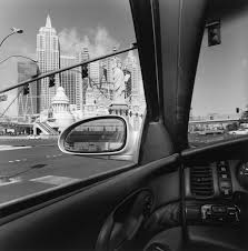
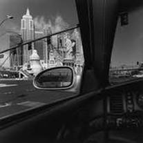
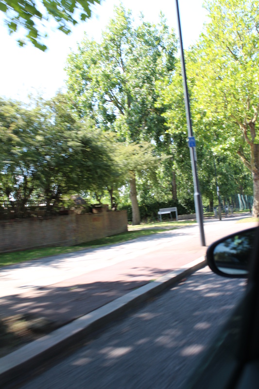
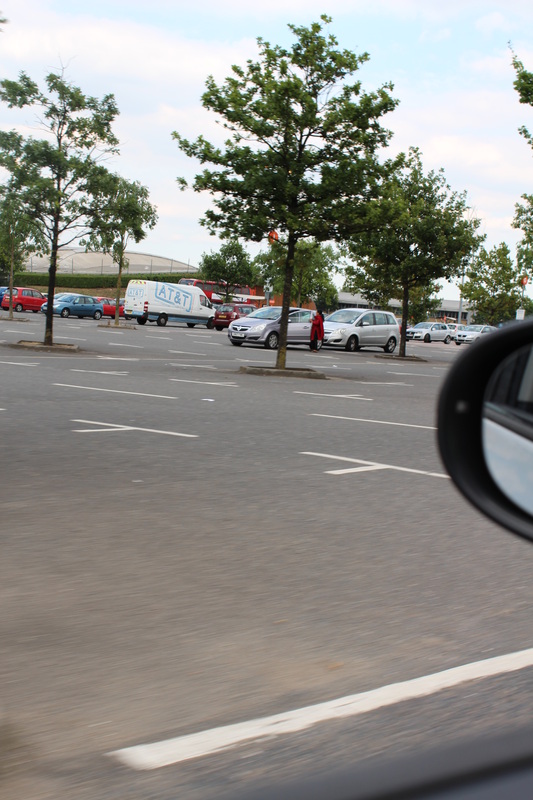
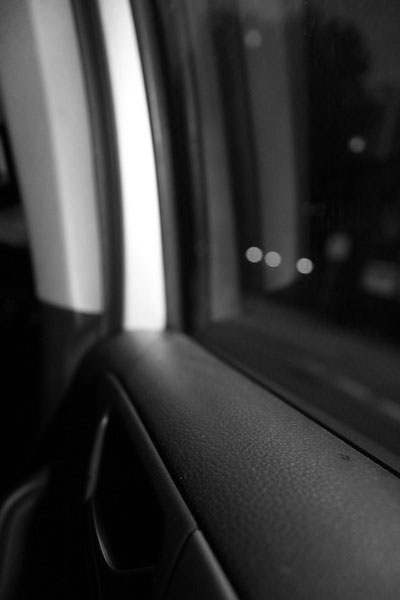
This is one of my favourite images that Lee Friedlander took in his 'Cars' series. All his images in his 'Cars' series are in the same colour; grey, black and often white. You can clearly see the difference between the colours meaning this image has a wide tonal range. In the mirror on the left side of the image you can see the reflection of what's behind him. The mirror is not blurred meaning that he wanted it in his image therefore making it focused. The buildings in the left hand corner stand out the most because they are the brightest colours on the image, therefore making it the first thing you se when you look at the image. This image fits well into the 'Openings' category because as you can see it was taken from a car window.
|
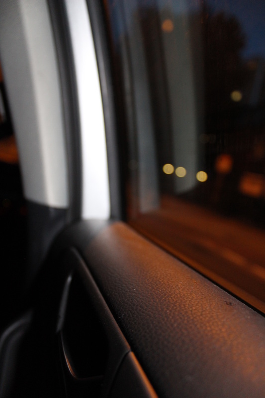
Experiment: 4 Lee Friedlander (Cars) Inspired
Evaluation
|
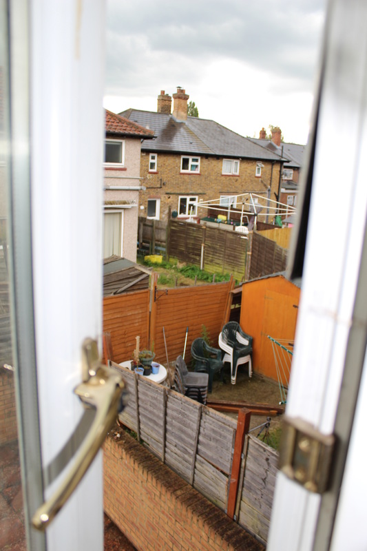
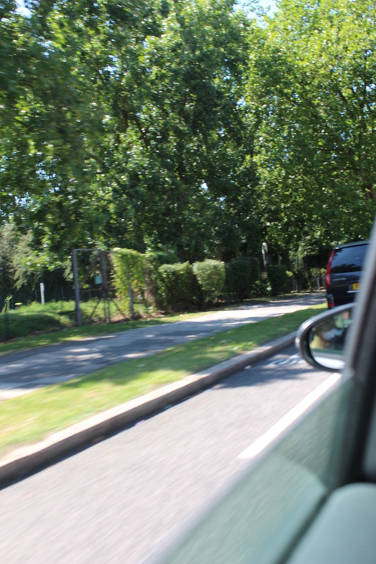
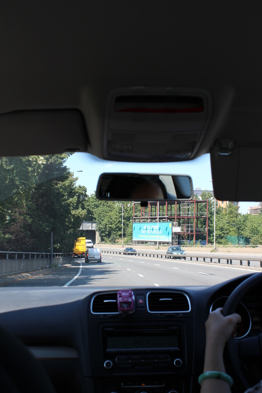
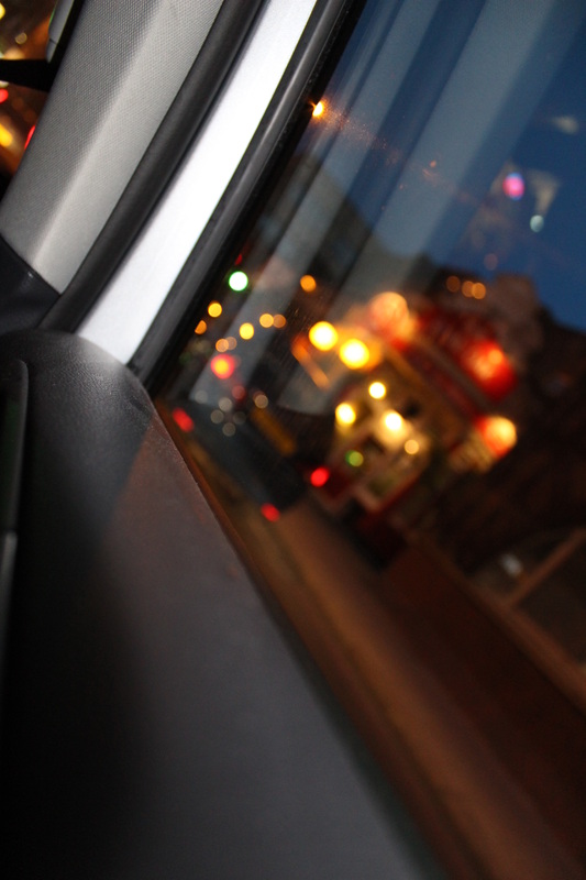
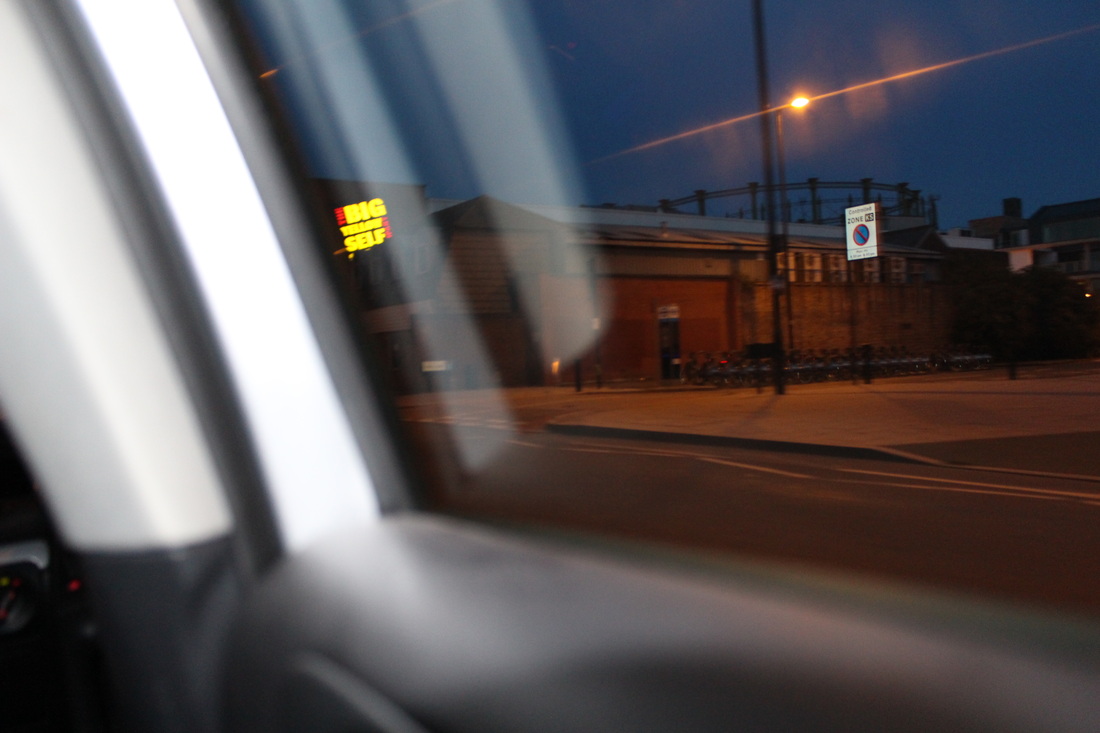
WWW:
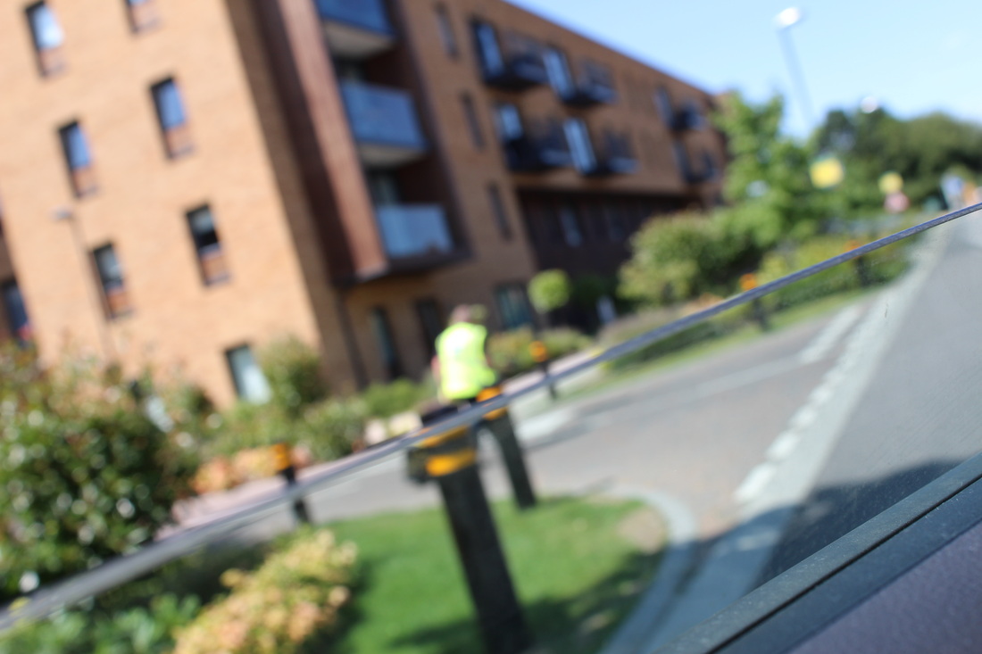
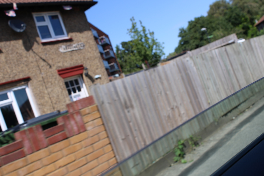
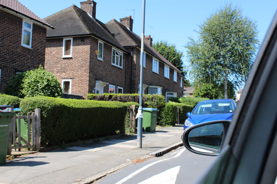
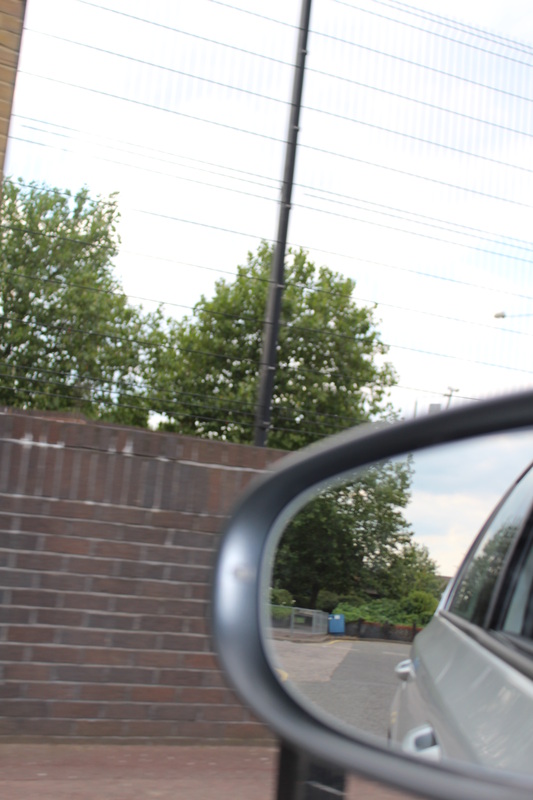
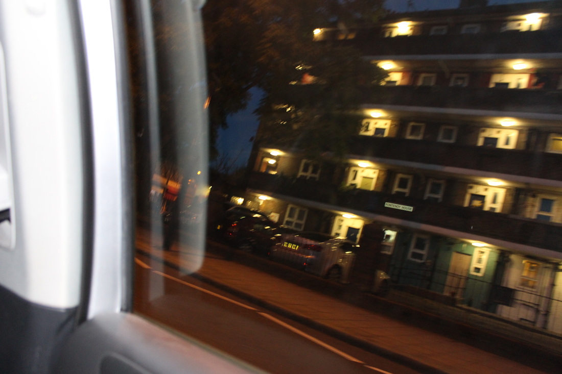
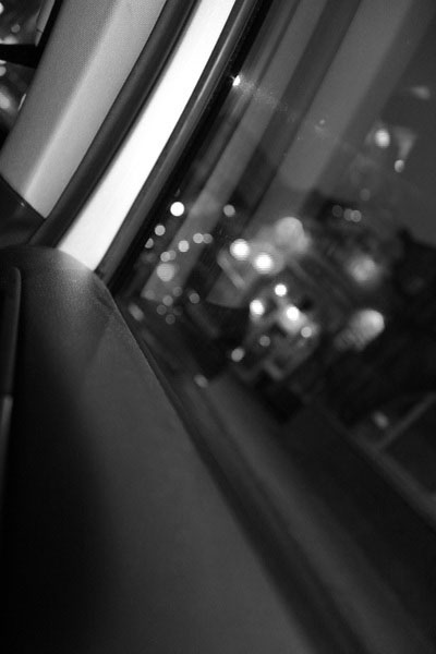
This is my 4th set of images, that I have taken during a car ride and that have been inspired by Lee Friedlander's series called 'Cars'. I think that the 1st photo is the best photo I have taken in this series of images. What I really like about this image is that the window edge is sharp, clear and in focus, starting form the bottom, right hand corner, and as it goes diagonally across the image it starts to get blurrier and more out of focus. Until it get towards the bottom left hand corner the window edge is really blurry and out of focus. The main focus in this image would be the bottom right hand corner of the image. The right part of the window edge and parts of the window still, underneath the window. Another thing I really like about this image is that the sharp, clear and in focused window edge, really stands out against the blurry and out of focused background, therefore making the window edge stand out even more. I think that this image fits well in to the category of 'Openings' because as you can see this image was taken through an opened window, therefore meaning it is being taken through an opening. My second best image in this series is the 5th image. This image is also taken during a car ride and is also inspired by Lee Friedlander's series called 'Cars'. What I really like about this image is that the edges of the window is blurred and how it slightly blends in with the other car, even though the colour difference. The window edge is blurred out suggesting it not being in focus. This image, being inspired by the series 'Cars', looks much like some of Lee Friedlander's images in his series. Personally I find this a bad thing because I have not used my own imagination or my own idea to make this image my own. Meaning I have just used the photographers idea and I have not changed it to make the image my own. This is the one bad thing about this image, I think. the main focus in this image would be the other car and the opened window, where this image is being taken through. They are the main focus in this image because they take up most of the space in this image and would be the first things you see when you look at this image. I think that this image fits well in to the category of 'Openings' also because as you can see this image has been taken through an opened window. |
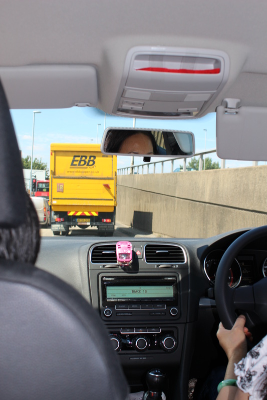
EBI:
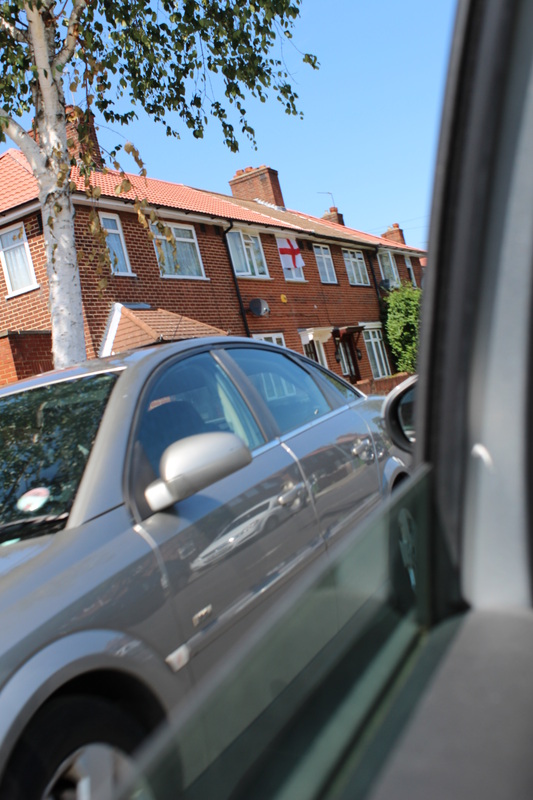
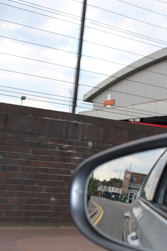
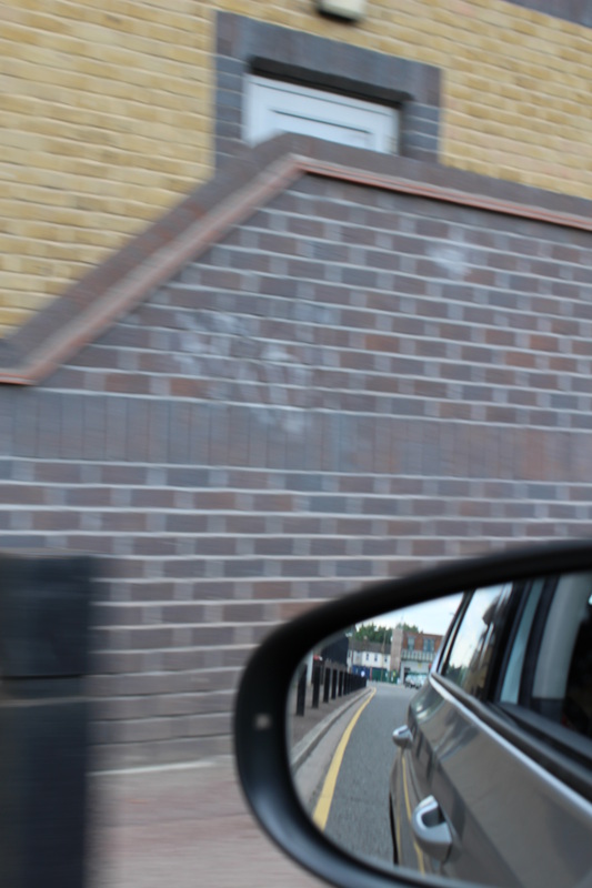
There are many photos in this series that didn't work out, but there is a photo that I think really didn't turn out well and that is the 13th photo. I think this image didn't turn out well, is because the background is very blurry and out of focus. What I could of have done better is to chose a different, more interesting place to take this photo, as this background is boring and plain, because there is nothing there. There is one thing that I really like about this photo. And that is the only focused part of the image on the bottom right hand corner, where the mirror is. That is the only focused part of the image. It is so focused and clear, It really stands out against the very blurry background. Therefore making it the first thing you see when you look at this photo. Another thing I like about this this photo is that you can see what's behind, in the mirror. This is interesting because it kind of creates another image within this image. Another photo that didn't turn put well is the 10th photo. I think that this image didn't turn out well, would be because this image is very plain, just like the 13th photo. There is nothing in this image that is interesting and nothing in this image stands out. I would say that most of this image is in focus. However there is an out focused part in the image. And that would be the bottom left hand corner. The painting on the road is blurred by the movement of the car and the camera. One way to make this image better would be to maybe zoom in to where the trees are, so the image wouldn't have so much of negative space, near the bottom of the image |
Experiment: 5
|
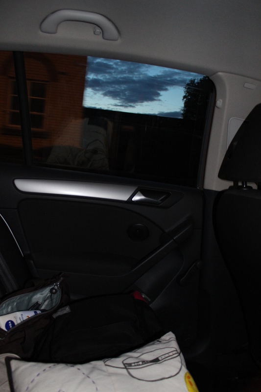
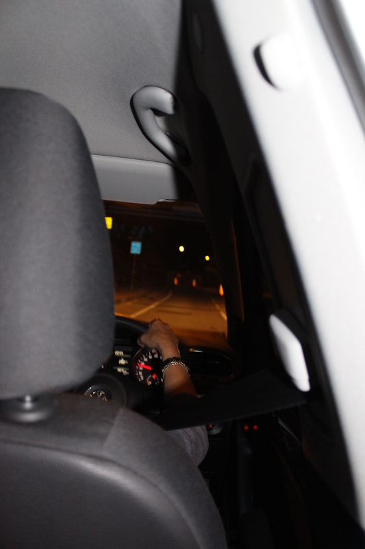
WWW:
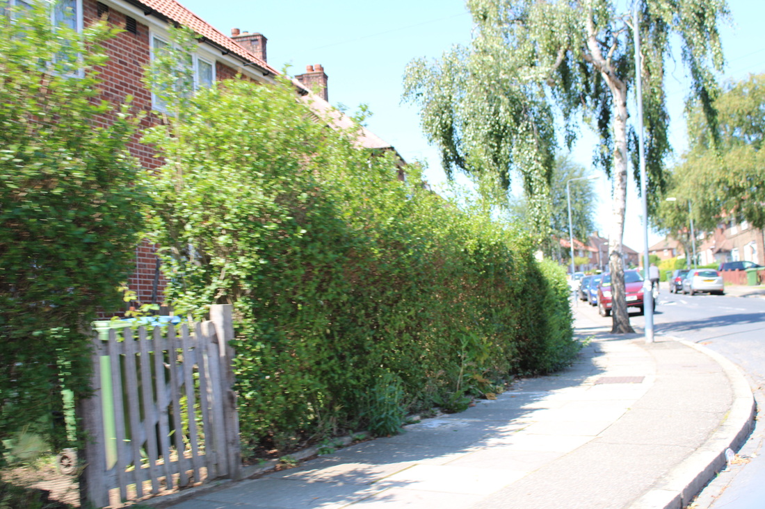
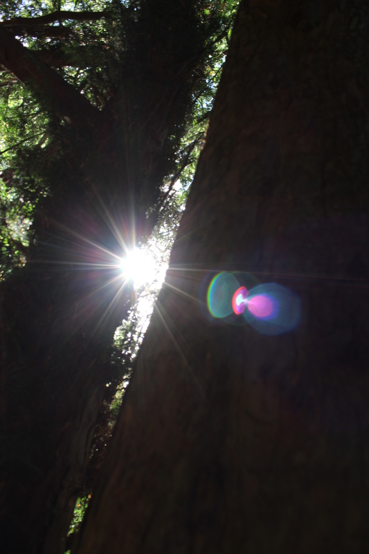
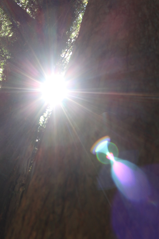
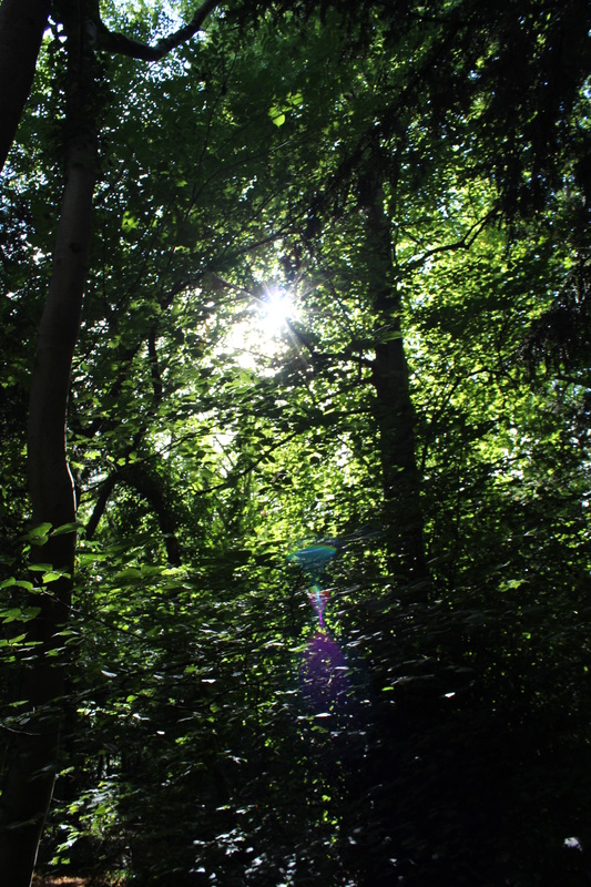
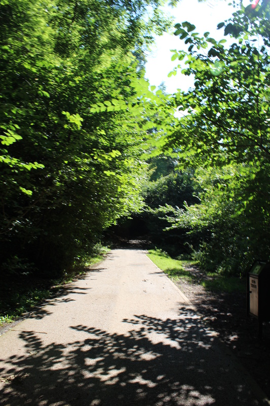
This is my 5th series of images. Some of these images have been taken in a car, just like Lee Friendlander's, series called 'Cars', and just like my 4th set of images. All of these images have been taken with the word and ideas relating to 'Openings', going through my mind, therefore most of these images would relate back to the word 'Openings'. I think that the 23rd photo in this series. I really like this photo because even though the openings are not really noticeable you can still see them. In this image you can clearly see two trees trunks side by side with space in the middle of them. This middle part of the image I would count it as the opening because you can see through it and what's on the other side. There are more openings on the top left hand corner of the photo. You can see even more smaller openings. On the top left hand corner where the light is shining through, this is where I think there are openings because if they were not openings then how would the light be able to shine through? Therefore they must be openings. Some more openings are created when the branches slightly cross over each other creating an opening, also in the top left hand corner. What I really like about this photo is the sun light that you can see through the opening in the middle of the photo. I think this photo also has the element of lines. I think this because from the middle of the image where the opening is you can slightly see the lines the sun light is creating. |
EBI:
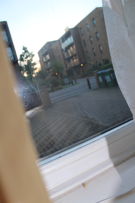
I think that image that didn't turn out well would be the 3rd image. This image didn't turn out well because this image is very plain. This is a very simple image, with nothing in it. This image was taken from a window, which would make this image fit well in to the category of 'Openings'. This image has a calm feeling to it as there is no movement in it. This image seems like it was taken from an angle, as the image is slightly tilted and not straight. I think that this image is mostly blurry, as there is no focused point on the image. In the window you can see a slight reflection of the flash from the camera, which also lights up part of the image. One way to make this image better would be to crop out the side bits of this image so it does not have as many negative space in this image. Another way to make this image better would be to have the focus on just one thing so that the background is blurry and the the focused part of the image would contrast with the blurry background. I could have also taken this image from a different angle ,eg. higher angle or lower angle.this would give the image a different perspective. |
Display Strategies
There are a few display strategies that I thought would be good for my final pieces. The ones above are the ones that I thought would be really good fro my final pieces. Personally I think that the first display strategy would be the most effective as my theme is openings and this display strategy shows openings. However I would choose the last display strategy as it is the one that I like the most and is the one I think would stand out the most as it is unique.
1st Final Piece


Black And White
This is my 1st final piece. These images were taken from my 4th set of images. My inspirations for these images are the images from Lee Friedlander series called 'Cars'. I chose to put these images together because they looked well together and complimented each other. Another reason I put these images to groups was because they have many thing in common. To present these images I will just mount them as I think that would be the best way to present them as it is simple but effective.
Final Evaluation
For this personal project I had decided to choose the theme 'Openings. I choose this theme because this was the theme that stood out the most for me as I thought it can go many directions and that I could experiment with many different techniques. I was also very excited to find and research the many artists that use the theme 'Openings' in their work.
To start of I went on to the Tallis Arts Pinterest to gain inspiration and to discover photographers who uses the theme 'Openings'. After briefly looking at some photos with the theme of 'Openings'. I choose some artists which I then did some research on and they were my main inspirations for my images. For each artist I did research on I put a gallery of some of their image with the theme of 'Openings'. I also wrote a evaluation for each artist for my favourite image from the images I put with the artist research. After my first set of images, which was taken in school, I evaluated them to see what had went well and what needed improvement. After even more artist research I finally found an image that really inspired me.' An image called a camera looking at a camera looking at the world.', by a photographer named Andrew Frederick. This image really inspired me as I thought the idea was a good idea and also I felt that I could create a set of images that would be very good and as unique and the original image. After finding and evaluating this image, I went out to take images that were inspired by the original image. I got a piece of plain paper, which then I ripped out an usual and unique shape. I choose to rip it rather that cut it because I thought that a rough edge would be better than a straight edge and I also thought that it would look more natural. After evaluating that set of images, I took another set of images developing from the last set. In this set of images I made sure to make the hole a unique shape, so it would make the image look very interesting.
I then researched another artist,Lee Friedlander, 'Cars' this is set of images inspired me to create my own. After evaluating his image, I made my own set of images. Evaluating my fist set of images inspired by the 'cars' series, I created my second set of images.
