|
Chiaroscuro
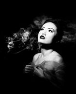
Chiaroscuro is an Italian work for light and dark, (chiaro 'light'; scuro 'dark') . It is the technique of using strong contrasts between light and dark (shadow). Artists who are famous for using chiaroscuro are Leonardo da Vinci and Caravaggio. Leonardo used this technique to give a vivid impression of the three-dimensionality of his figures, on the other hand Caravaggio used the technique for the sake of drama. |
|
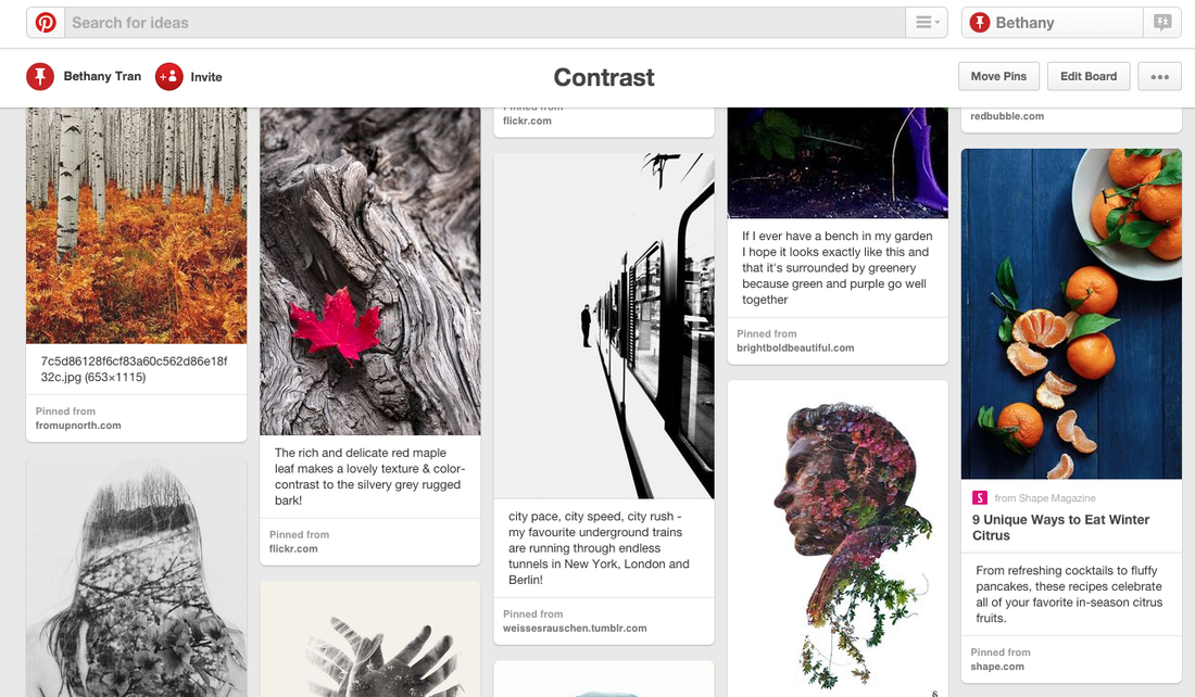
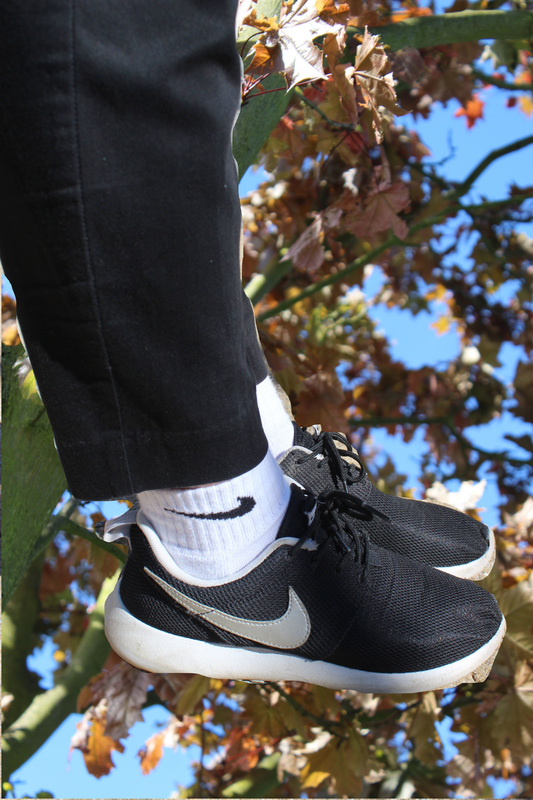
1st set of images:
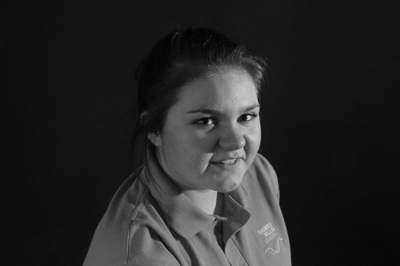
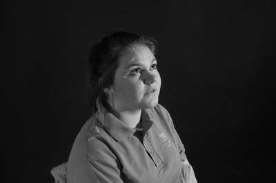
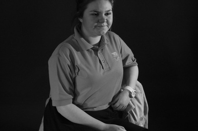
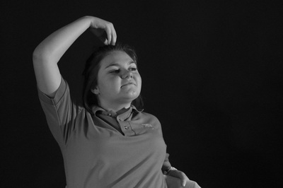
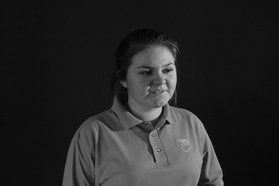
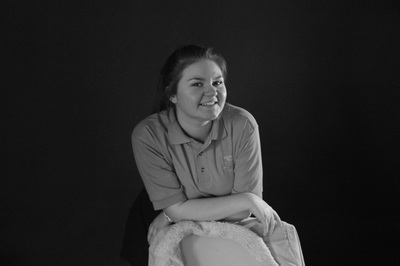
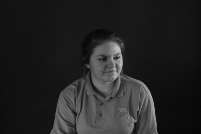
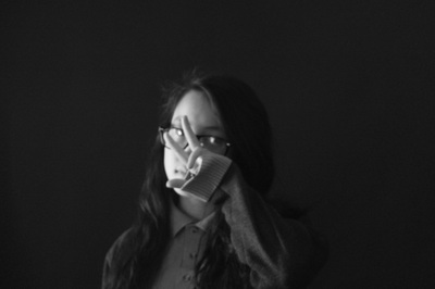
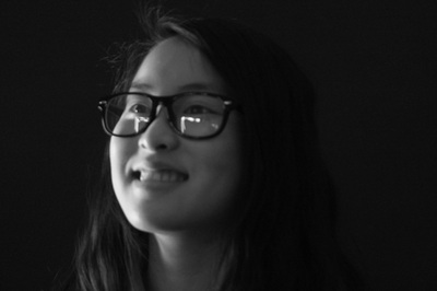
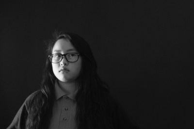
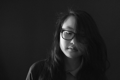
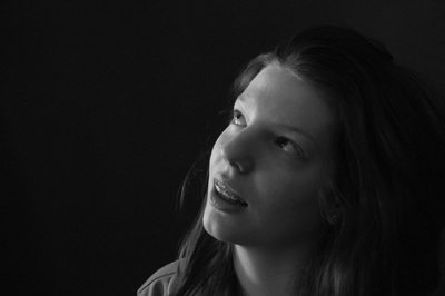
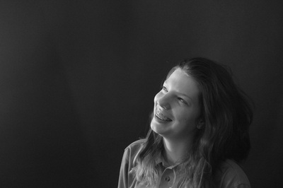
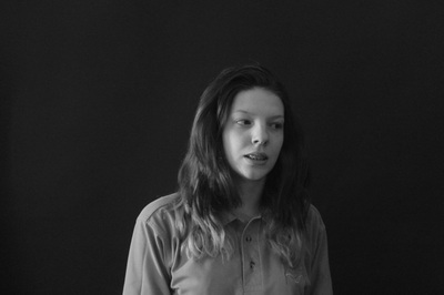
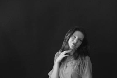
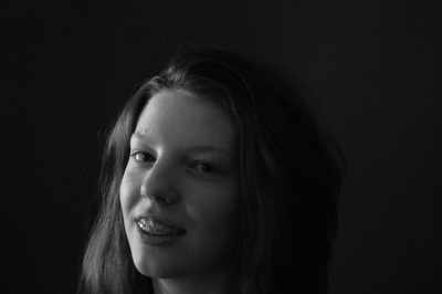
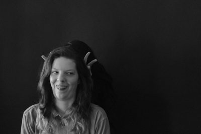
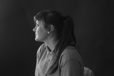
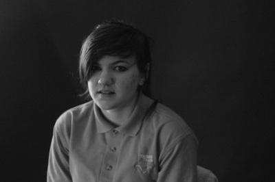
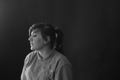
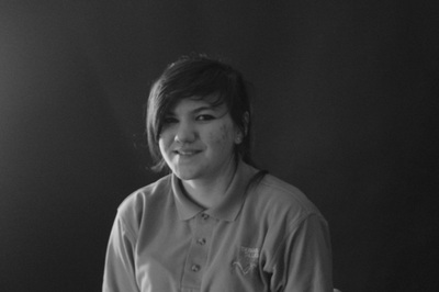
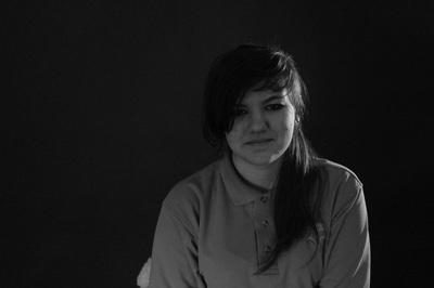
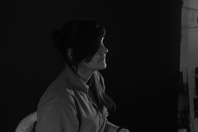
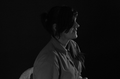
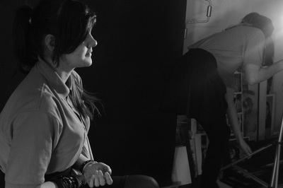
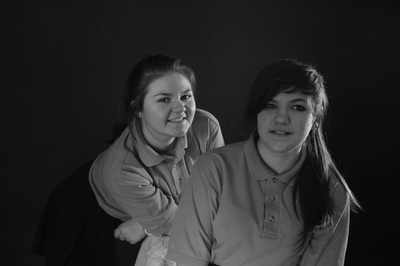
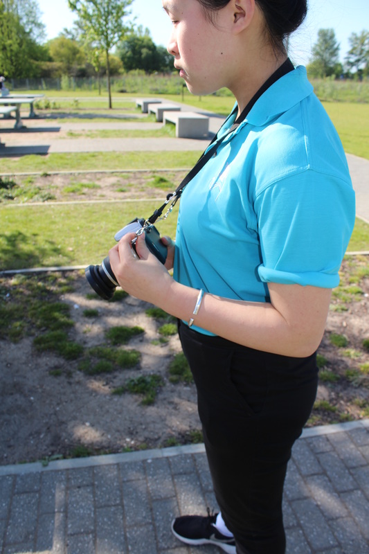
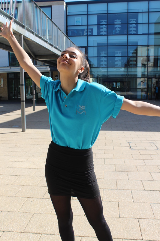
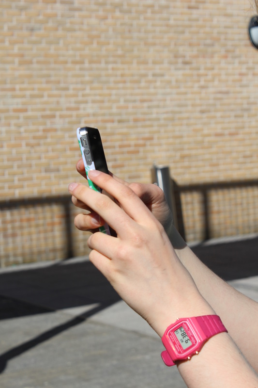
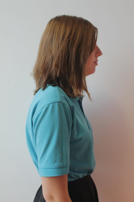
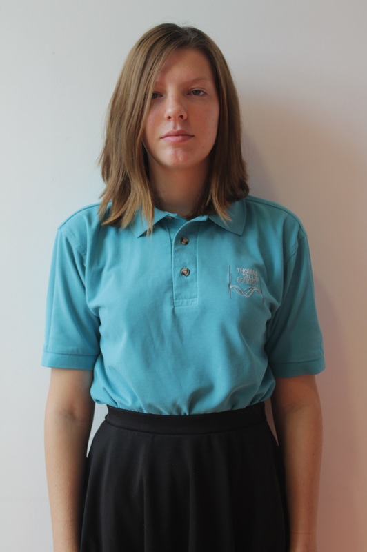
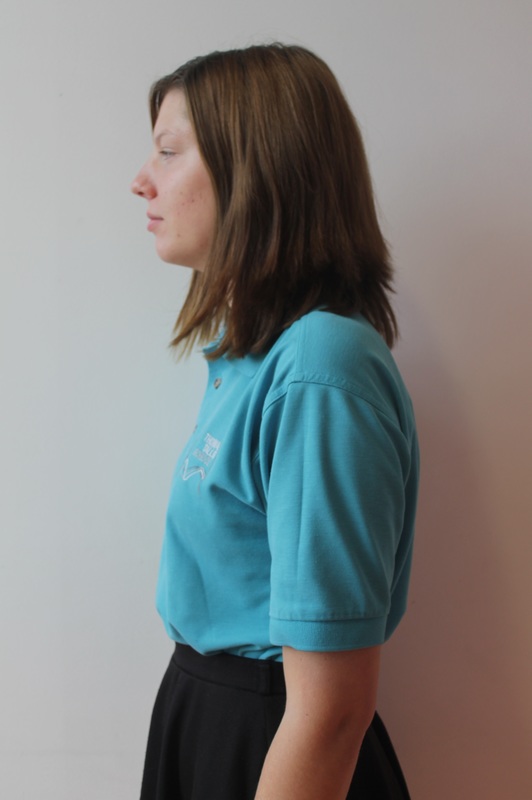
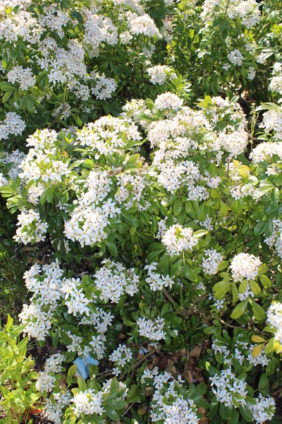
This set of images were our first attempts on the high contrast topic. When taking these images we took turns in changing roles; modelling, note taker, photographer, director and light director. After taking a few images we managed to get the lighting in the right place, so that it was shining on the model and not the backdrop. We did this by having the light near to the model, not facing towards the model but facing towards the camera, this meant that the light wont be on the backdrop and there wont be a shadow of the model on the backdrop. During this photo-shoot we didn't focus on the facial expression or what the model was doing because we wanted to see what position the light and camera worked best in.
2nd set of images: Edward Western inspired.
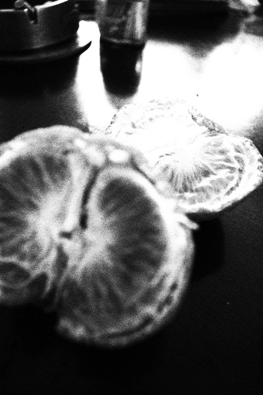
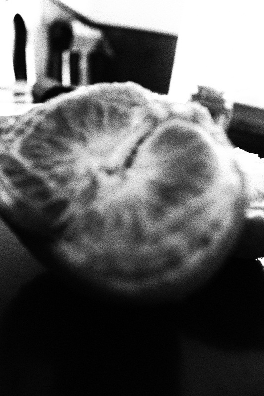
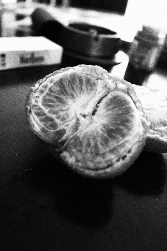
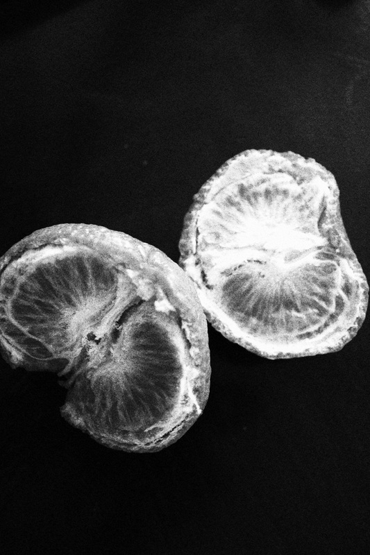
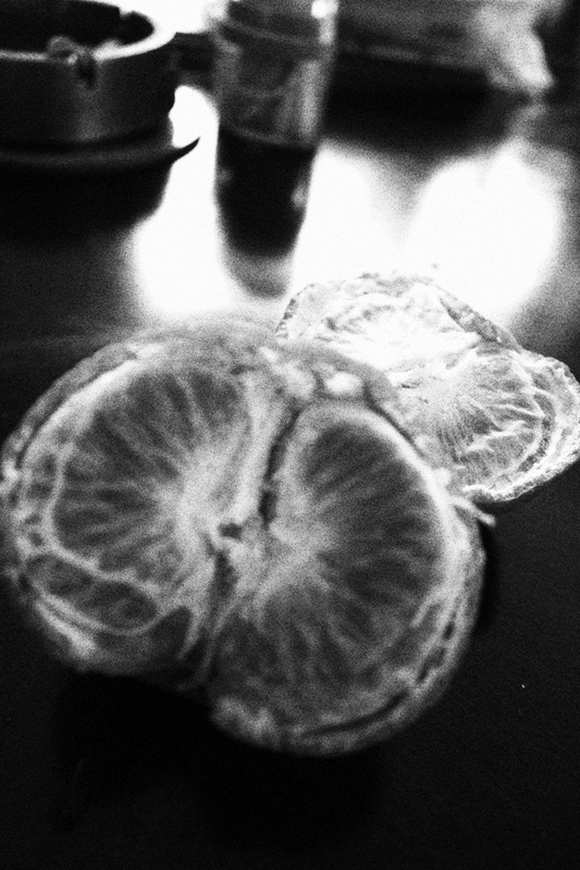
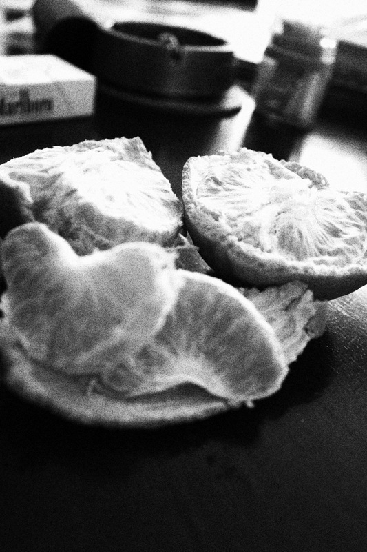
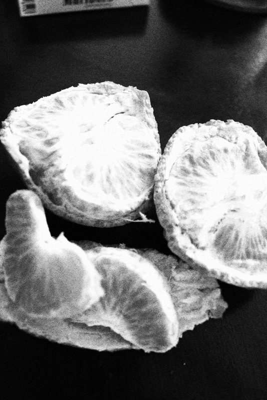
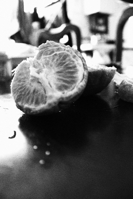
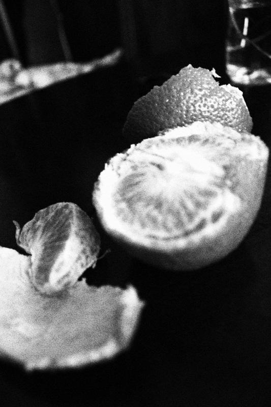
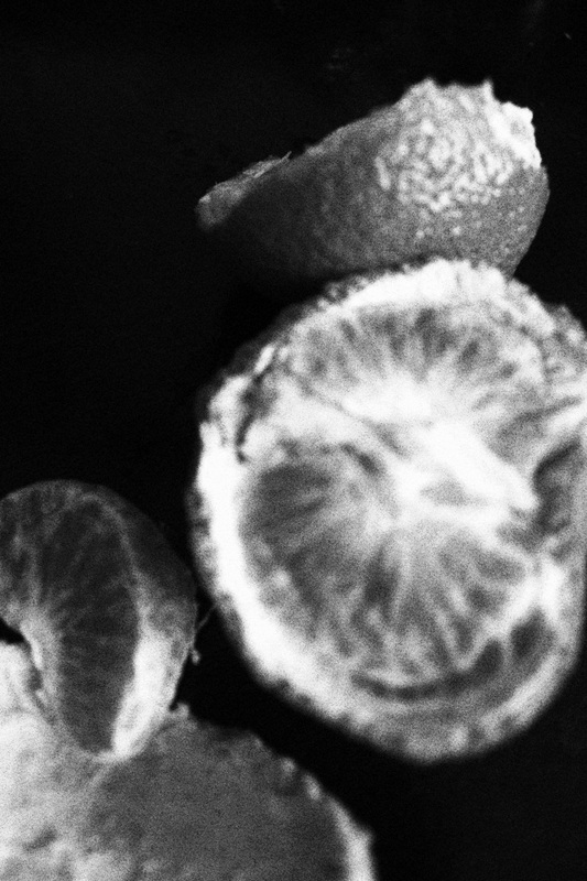
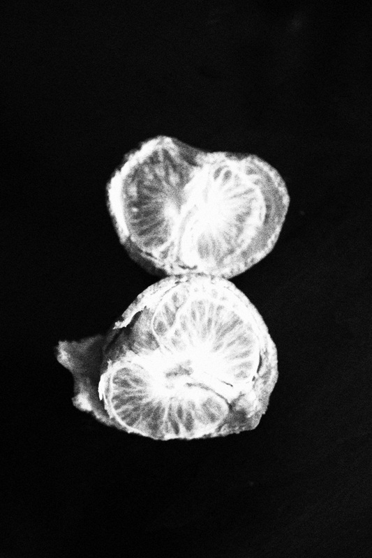
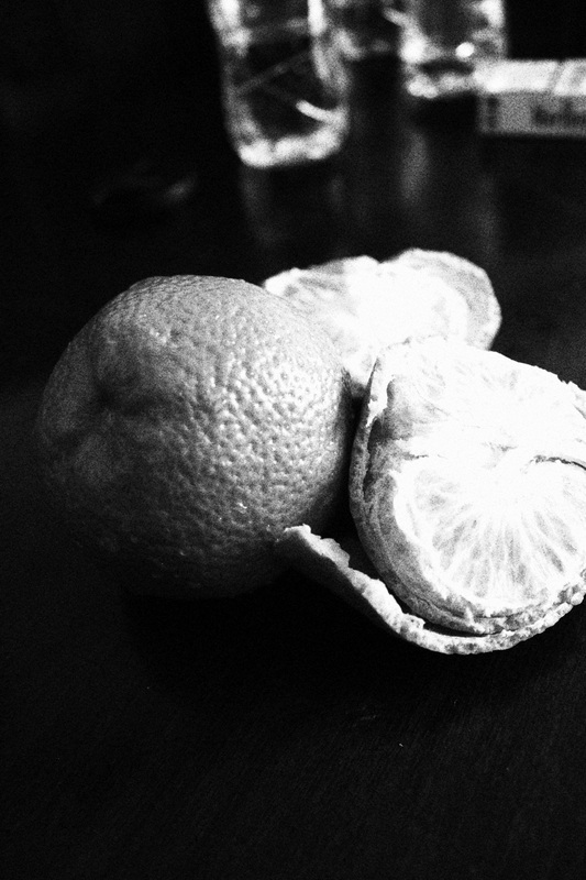
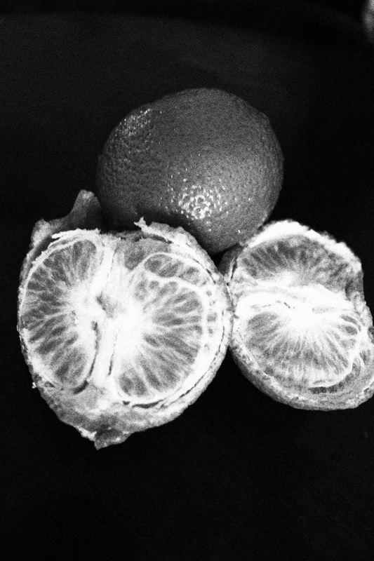
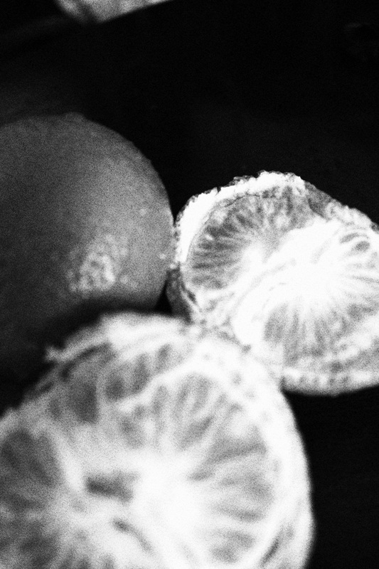
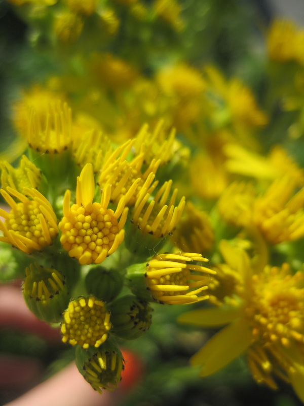
This set of images is my second attempt of Chiaroscuro. These images are inspired and based on the image of the pepper by Edward Weston. I had decided to take a picture of an orange because it had many textures. In theses images I used natural light to light to the object in the images, which was the orange. In some of these images the light reflected onto the table, I found that this happened the most when I took the image from the side and that it didn't happen when I took the image from above. With that in mind, I carried on taking images from above the object What I think went well in this set of images is that there are many tones of white and black in the image. In some of the images the background is pitch black which makes the orange stand out more as the orange is white and grey. Creating a high contrast, for example you can see the many different tones in the image.
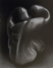
Edward Weston
|
This image of a pepper is abnormal and unique because of the peppers curve and the contrasts in the image. I think that Edward Western wanted to make the peppers curves bolder and sharper by using light and dark. By having the light shining from above it creates a lot of shadow on the curves which emphasises the abnormal shape, curves, tone and texture. The fact that at the top of the image is really dark and that it fades down the image where it is lighter, creating a gradient effect. This effect also happens on the pepper, which would make you think that the pepper would blend in with the background, but because of the light shining on top of the pepper, it makes the pepper seem lighter and enhances the abnormal shape. The fact that this shape is so abstract, disguises the fact that it is in fact a pepper.
|
Trent Parke
|
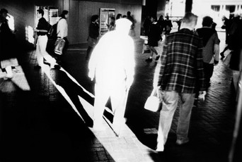
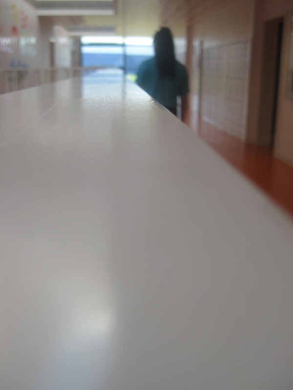
In this image Trent Parke used the natural sun light to light the man. The man in the image is standing right in the doorway, causing the sunlight to directly hit him, fully illuminating him, whereas the rest of this image is darker and has less light. This image has strong contrasts, only using natural light and not artifical light. Because the light is so bright and only shining on one person, the edges of the silhouette is slightly flared out, making it seem like the person is somewhat magical. Behind the man you can see his shadow which is pitch black, which creates an even more of a contrast, as they are so close together, the lightness and the darkness. |
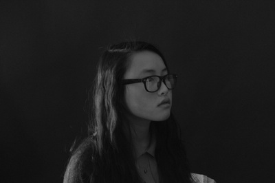
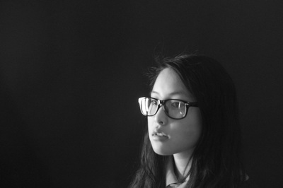
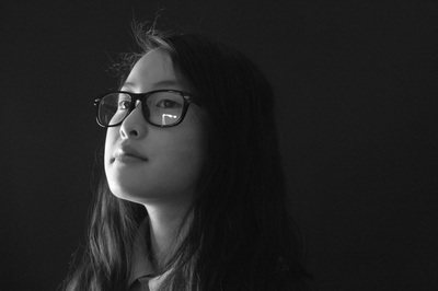
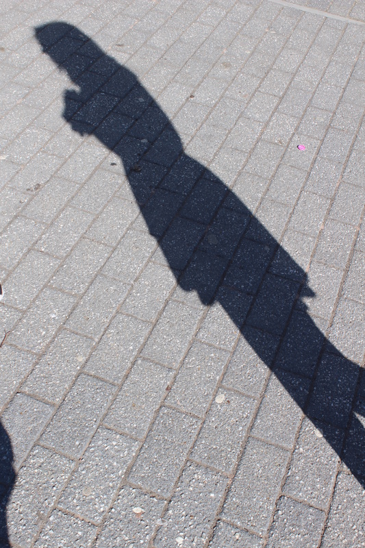
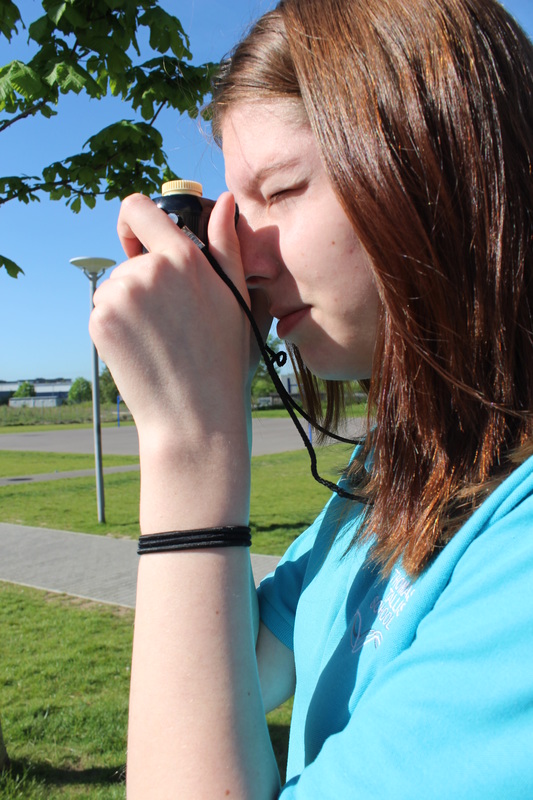
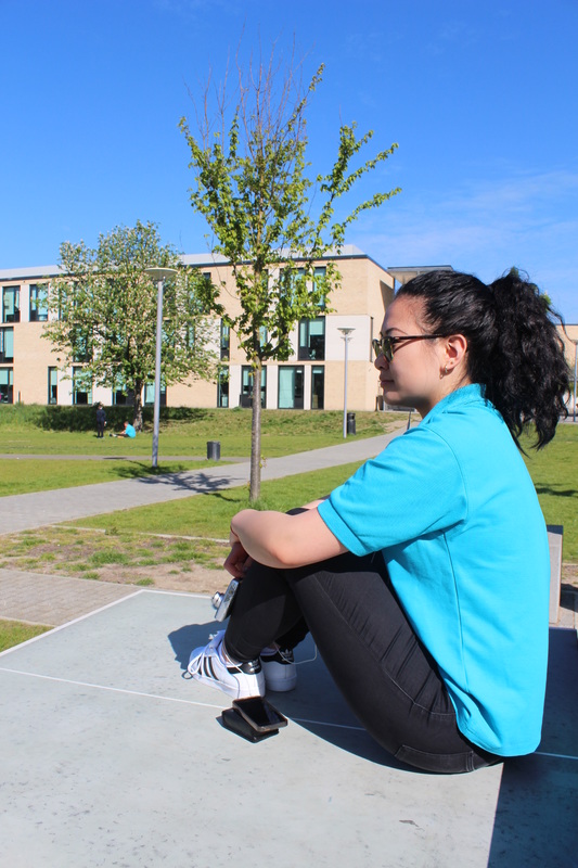
3RD SET OF IMAGES
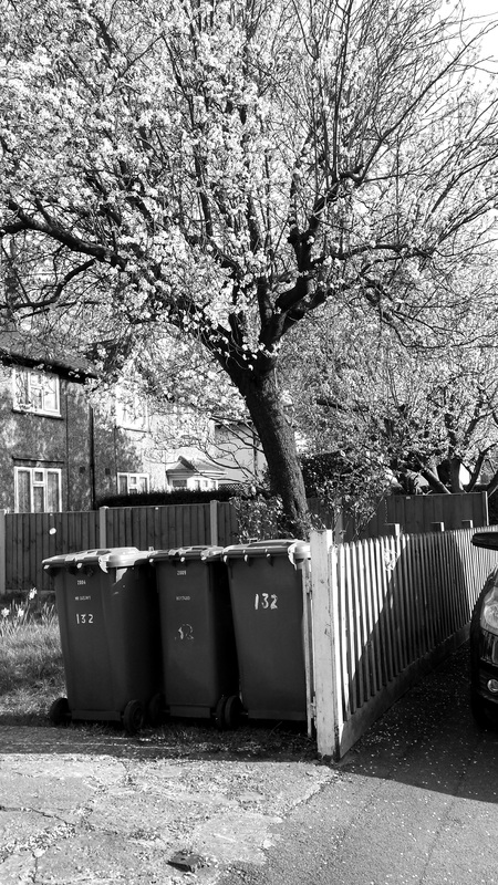
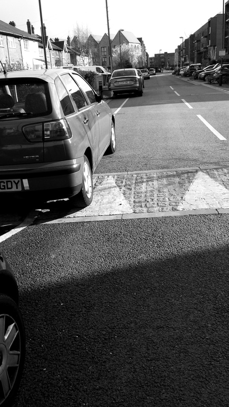
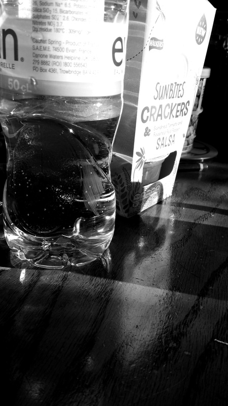
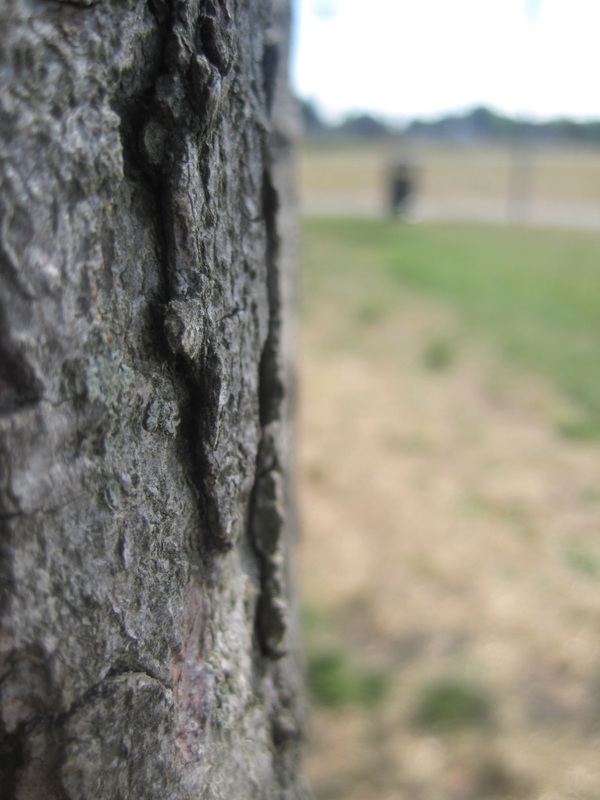
This set of images is my 3rd attempt at Chiaroscuro, these images were inspired by the overall concept of contrast. I took these images on my phone, using a black and white effect, to make my images black and white and to make my images have a higher contrast. When taking these images I was looking for objects or places that the sun was hitting creating a shadow. My most favourite image from this series would be the second to last image as I feel that this images represents contrast well. This image went well because you can clearly see the tones in the image. At the top half of the photo you can see that the object was overexposed by the sun light, which makes the top half of the object very white. However at the bottom of the image you can see that it does not have much light shining in that area, therefore making that area dark and close to the colour black. On the left side of the image the bottle has a fair amount of light shining on it making the bottle have a grey colour.
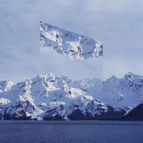
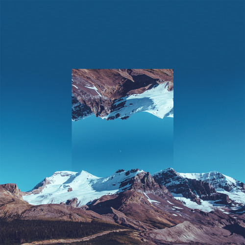
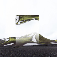
Victoria Siemer
Victoria Siemer is a graphic designer based in Brooklyn. She creates surreal photo manipulations hat reflect her like boredom and heartbreak. Her work has been featured in a variety of digital publications including Huffington Post, iGNANT and many more.

|
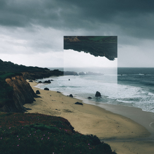
This is one of my favourite images from Victoria Siemer. I am drawn to the vibrant green that stands out the most against the white. The original image has been flipped and placed on top of the original image, therefore the vibrant green of that section is at the top of the image where the white sky is. The flipped image has created a sense of uniqueness to the original image, as the white sky of the flipped image has become less opaque and had created a mist over that section of the images causing the vibrant green to become duller. |
|
Christoffer Relander
|
|
As a photographer I am captivated to explore the world through a filter. Life can be beautiful, but the imagined always absorbs me. |
|
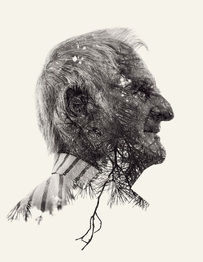
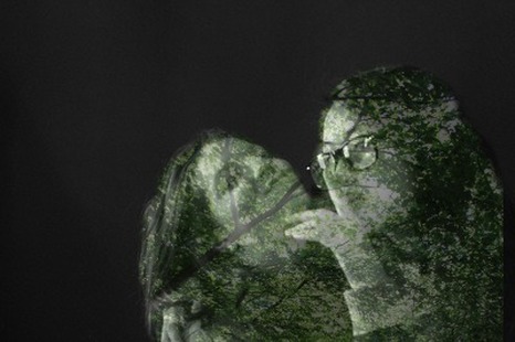
This is one of my favourite images by Christoffer Relander . I really like this image as you can still slightly see the facial features of the man even the image has been edited to blend a different image to another. This is called double exposure. The edited image has been placed on a beige background to create a contrast. There is also a lot of empty space in the image, which makes the subject of the image stand out more as there is nothing in the image besides the subject. Another contrast that I can see within this image would be the fact that, the overlay on the subject of the image is nature and the subject is a human, making the contrast between human and nature. |
|
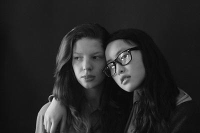
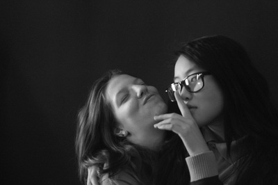
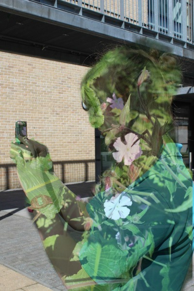
4TH SET OF IMAGES (CHRISTOFFER RELANDER inspired)
            |
        |
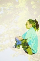
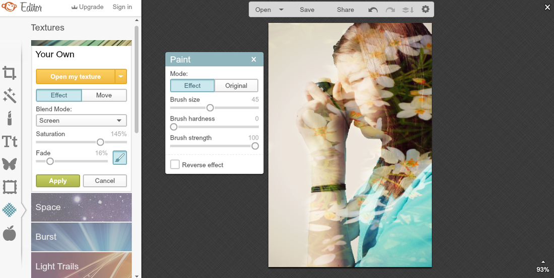
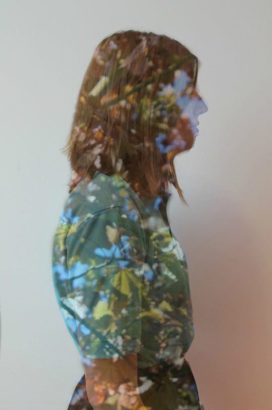
In this set of images I decided to take some of people and some of nature. I decided to do this because I wanted to layer an image of nature on top of an image of a person to create a contrast. Down below are my successful attempts at layering on Photoshop and Picmonkey(an online editing site)
1ST ATTEMPT AT LAYERING (photoshop)
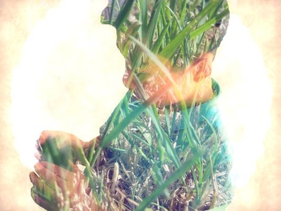
Here are my fist attempts at layering on Photoshop. Personally I believe that these images have not turned out well and is not what I expected it would be like. In the images the layer on top of the image, the edges are too harsh and sharp, making a defined line around the layer .What I was wanting to do was to layer the image on top of another and to blend the edges to make the layer look apart of the image below. What I could improve on next time would be to fade the layer slightly so its not as opaque and to slightly blend the edges so it doesn't appear as harsh and sharp. What I well was that I was able to layer and image on top of another. I did this in two ways, putting the human aspect as the layer and in top of the nature image and using the human image as the base, then putting the nature image on top as a layer over the human part. In these images the contrast is between human and nature.
What to do next
- Take more images relating to humans and nature
- Try to find a different way of editing images
- Attempt to soften the edges of layers
- Lightly fade the layer so it is not as opaque
2nd attempt at layering (picmonkey)

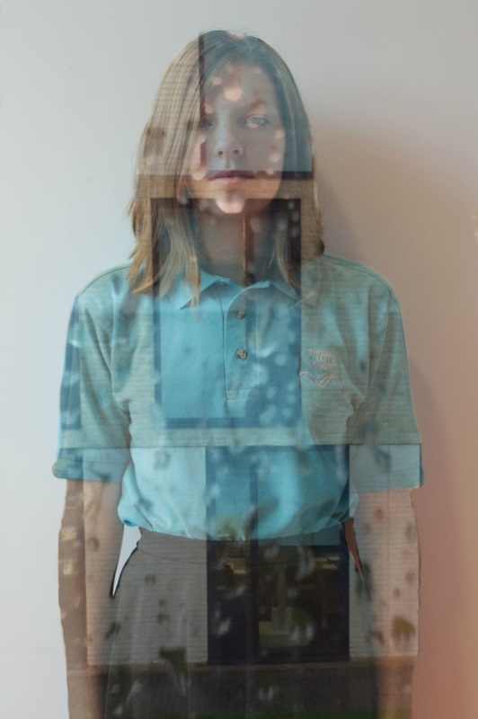
Here are my second attempt at layering but instead of using Photoshop I used an online website called Picmonkey. Using this online website I was able to layer another image on top of another. Even though I was able to do this on Photoshop, I found it easier to do this on Picmonkey, as all I had to do was add the layer and slowly using a rubber, rub out the parts that I didn't want. I think that these images have improved from the last set of images as the nature layer is not as opaque as the last set of images, the edges around the person in the image is also slightly blended making them not as sharp and sharp.
|
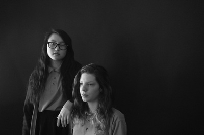
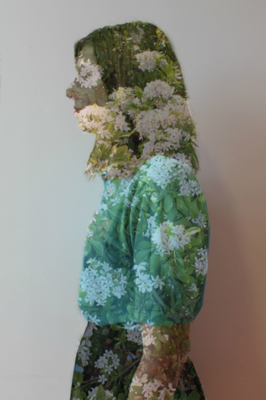
Personally I think that the image to the right is the best image from the set of images above. I think that this image is the best because the background is clear, the clear background creates strong contrast in the image as there is nothing in it, it also makes the people in the image stand out more as the background is a clear colour. I think that the composition in this image is really good, as the people are placed at the bottom right hand corner of the image. This is not an ordinary place where people or objects in an image would go, as they would be normally placed in the centre, having the people being placed in the bottom right hand corner makes the image unique, as its not done as much. The composition gives off a quiet and clam feeling as there are not many objects or people in the image, therefore giving the image a clam and quiet feeling to it. Another thing that I think went well in this image is that the layer in the image is not as opaque and is more see through. This means that we can slightly see the facial features of the people in the image. The edges of the layer is also slightly softer and not as sharp and harsh, this make that image look more natural. In this image there is high contrast between the layer and the completely black background. The layer is lighter than the background, which draws attention to itself, causing it to be the centre of attention.
|
|
What to do next
- Find a way to remove the background of an image
- To make the background on an image white
- Using the same images from the last set of image
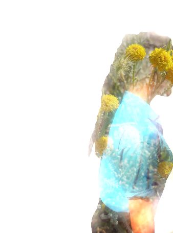
1st attempt at double exposure (pickmonkey)
  |
|
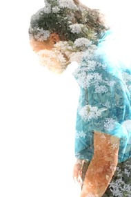
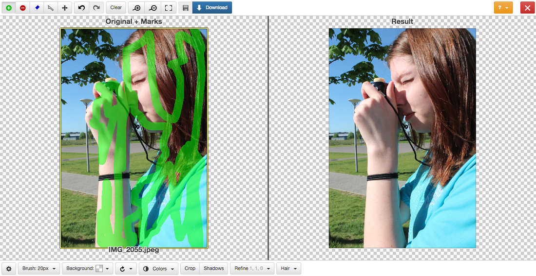
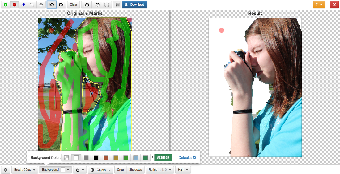
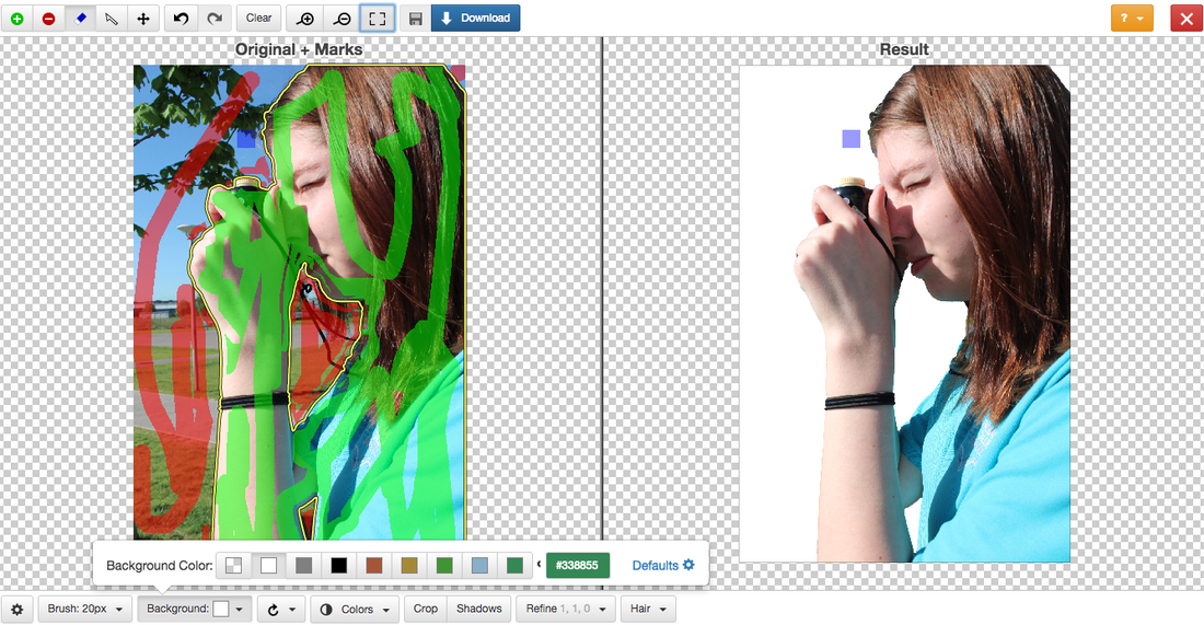
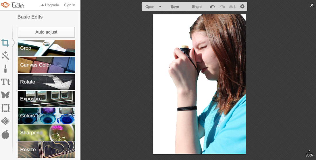
Here is my first attempt at double exposure, to create theses image I used the online editing app Picmonkey. Before editing these images I used another online website to remove the background and to make the background white, as I felt that doing a double exposure with a plain background would be better. The website that I used to remove the background is Clipping Magic. These double exposures were made using the same images as the last set of images, as I wanted to experiment more on editing.
www:
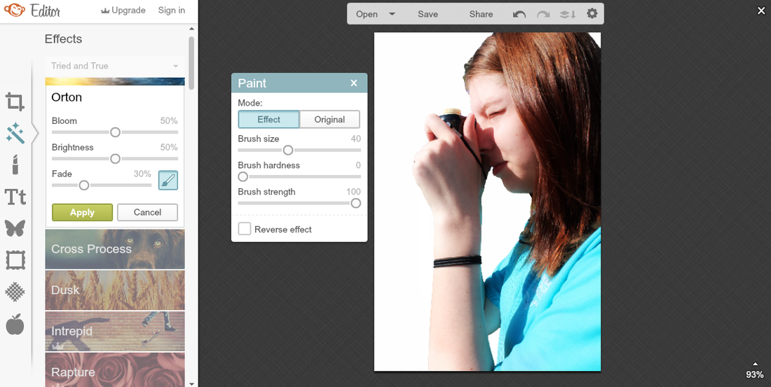
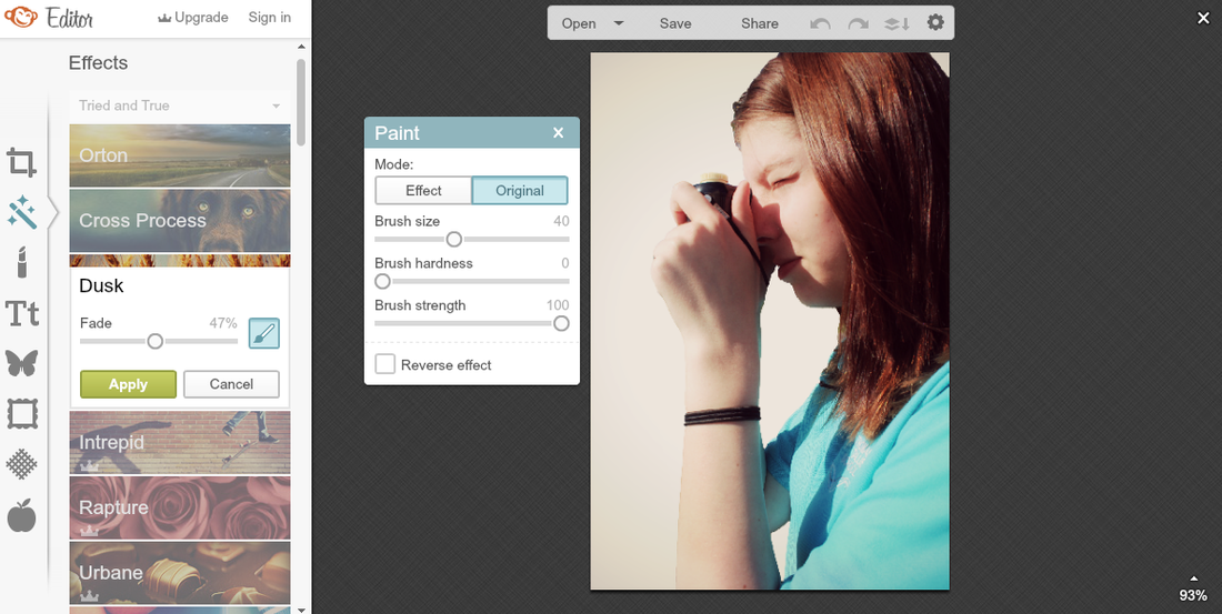
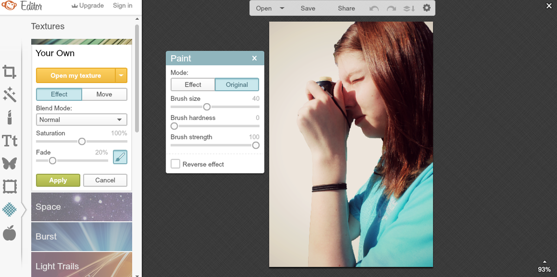
I think that these images have improved from the last set of images, as I have done what I wanted to improve on, which was to somehow make the background of the images white and plain as it thought that double exposure would work better on a plain background. For three of these images I have kept the background of the images white as it would make the person the images stand out more. For another two of these images I decided that I would add some kind of effect from Pickmonkey, these effects were Orton and Dusk, theses effects made the images darker and gives a slight shadow on the person, however using these effects makes the background have the same yellowish tinge. Also I have decided to add some light to these images, to do this I used the Bokeh Shapes effects on Pickmonkey. For one of these images I decided to do something really different and to keep the overlay image visible.
www:
I think that these images have improved from the last set of images, as I have done what I wanted to improve on, which was to somehow make the background of the images white and plain as it thought that double exposure would work better on a plain background. For three of these images I have kept the background of the images white as it would make the person the images stand out more. For another two of these images I decided that I would add some kind of effect from Pickmonkey, these effects were Orton and Dusk, theses effects made the images darker and gives a slight shadow on the person, however using these effects makes the background have the same yellowish tinge. Also I have decided to add some light to these images, to do this I used the Bokeh Shapes effects on Pickmonkey. For one of these images I decided to do something really different and to keep the overlay image visible.
Clipping magic

picmonkey
|
|

|
Pirjo Keene
|
|
Her photography reflects her Scandinavian roots and incorporates her earlier textile and design studies resulting in highly individual and recognisable style of photography. Pirjo was awarded the Royal Photographic Society’s Associateship distinction in 2008. Since then her images have been exhibited in London Salon of Photography, Royal Photographic Society and various local galleries as well as having a solo exhibition in Oxford University Press in January 2012. |
Images inspired by PIRJO KEENE

Final Piece
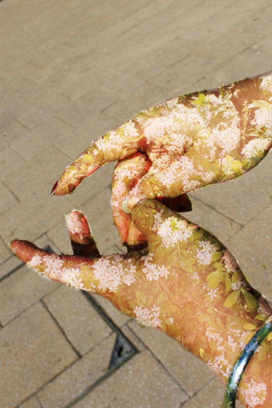
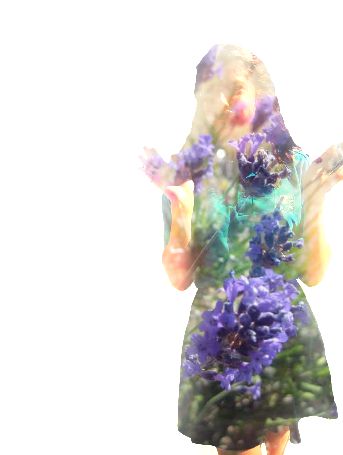
Here are the 3 images that I have chosen fro my final piece. These images were also made using picmonkey. However this time I made sure to take my images on a white background as I found out that by using the website clipping magic, to remove the background in images, it would make my overall end product pixelated, which I didn't want, so in the end I resulted to take the image with a white background so I didn't have to edit it. Which made it better as my end products were not pixelated. I kept both the subject of the image and the pattern in colour and used the normal blending mode as I found that by using this blending mode it game me the perfect balance of the overlay, so that the subject is not entirely covered but you can clearly see the pattern over the subject. I also used the eraser to remove the pattern from the background, this made the effect of the overlay only cover the subject and not on the background. I think that these images worked out well as they gave the double exposure effect I was looking for. For the overlays I varied the type of images for example two of the images that I have used is of nature and the other image is of a building. This then creates a immediate contrast inbetween the images, as two of them is nature and the other one is architecture. I have decided to keep the images in colour because I feel that with the overlay and the background images in colour it created high contrast because of the colours
Final Evaluation
During this project about contrast I have developed my research, experimental and development skills. As this project about contrast is very open, as there are many artists that I could of have chosen to do research and to develop my images on. Nevertheless, I have remained focused on this project and have produced final pieces that I am proud of.
To start off the project I researched many artists and evaluated at least one of their images. The artists that I have researched are Edward Weston, Trent Park, Victoria Siemer, Christoffer Relander, Pirjo Keene. All of these artists were found on Pinterest. For every artist that I researched I carefully analysed their images to find out how they were creating contrast in their images. For example Edward Weston used the light to control the contrast in the image. His image of the pepper inspired me to take a set of images, that was high in contrast. The artist that inspired me the most and what my final pieces are inspired by is Christoffer Relander. Christoffer Relander creates double exposure using human and nature. The contrast would then be between human and nature. This is what i based my project on. Researching different artists helped me explore the different ways contrast can be presented in an image. When i first started this project i thought that contrast can only be shown black/white and light/dark, i did not once think that contrast can be shown between buildings and plants or between the different ages of people or the difference in how family members look like. But when researching and evaluation their images, these artists have helped me develop my knowledge on how contrast can be presented in images.
My first experiment was inspired by Edward Weston, his image of the unique and bizarre pepper inspired me the most on my first experiment. For my first experiment I took images of an orange because I thought that oranges have many textures. Similar to how Edward Weston uses light to control the contrast in the image, I also tried to use the light to control the contrast in the image. For example most of the images were taken next to a window to get some natural light so the light on the orange wasn't as harsh or direct. I also did another experiment using the light to control the contrast in the image, however this time it was inspired by another artist called Trent Parke. Trent Parke was another artist that used light to control the contrast in the images. I think that these experiments were successful as it helped my understand how the basics of contrast worked.
After my first experiments I did some research on Victoria Siemer and Christoffer Relander. Researching these artists taught me that contrast can be between anything and not just black and white. After researching these artists, I chose one artist that I found the most inspiring, which was Christoffer Relander. I then took two sets of images, on set of images on people and the other set of images on nature, these images was taken with a digital camera. What I planned to do was to layer two images together, this then creates a contrast between humans and nature. My first attempt at layering was done on Photoshop, personally I think that these images didn't work the way that I wanted it to. What I wanted was an image thats layer is more opaque and the edges not as harsh. After being unsatisfied with the final images from Photoshop
