|
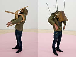
This photograph was taken by Erwin Wurm. This images is absurd as you can see the ordinary chair is not being used in the normal way. However the chair is being used in a rather unusual way, rather than sitting on the chair, the is on his head and through his arms. What makes this image more normal is that the man is dressed normally and is just standing there, not doing anything out of the ordinary. What makes this image more absurd is what the photographer was thinking when he told the man to put the chair over his head. And how long was he standing there with the chair on his head, in an uncomfortable position. In this image there is a lot of negative space, which means that there are a lot of empty spaces in the image. This then makes the man have more focus because there is nothing else in the image. Because this image is taken against a plain background, it also draws more attention to the person because he is wearing dark colours which contrasts against the plain background.
|
|
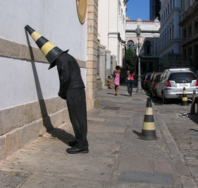
This absurd image is taken by Mark Jenkins. When you first look at this image the first thing you will see is a man leaning against the wall, wearing all black and has a black and yellow cone on his head. Because the man is wearing all black and standing against a white wall , this creates a contrast causing the man to stand out. Also because the yellow tones on the cone are bright, it draws more attention to the man and the cone. Another absurd thing about this image is the shadow of the man. If you were to just look at the shadow you wouldn't of have guessed that it was a shadow of a human being. The fact that in this image there is a lot of light in the foreground and background, it creates a larger depth of field. It also draws attention to the background, as you can see that most of the background is covered in shadows, which creates a contrast between the white walls and buildings.
|
|
Corey Bartle-Sanderson
|
|
|
At the heart of my work is a fascination with the mundaneness of the everyday. Objects are overlooked, they become invisible in this blur of overfamiliarity with the daily inattention. I am interested in interrupting the everyday, playing around with the overlooked aspects of the ready made. Altering the overly familiar through means of manipulation
Nancy Fouts
|
|
These images were taken by Nancy Fouts. These images are absurd because she is taking everyday objects and merging them together to make them weird and unique. In all the images the object is placed in the foreground making it the centre of attention and to make sure that the object is always the centre of attention, the background to all the images are a plain white background. The elements in the images are always in the centre of the images, which makes it the first thing you see when you look at the images. |
|
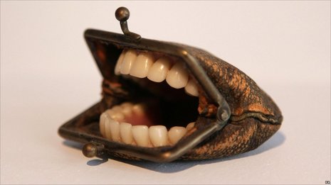
This absurd image is taken by Nancy Fouts. This is a great example of an absurd image because you can clearly see that there are two normal everyday objects, put together to make an absurd image. This image is taken in front of a white background, which makes the object stand out even more because the purse is dark coloured, making it stand out against the white background. In this image there are not many of the formal elements present. The formal elements present are focus, light and space. The main focus of this image is the purse with the teeth, there is also light on the purse making it to have a slight shadow under it. There is also a lot of negative space in this image, making the object in the image is have more focus because it is the only thing in the image. |
|
1st Set of Images: Hide
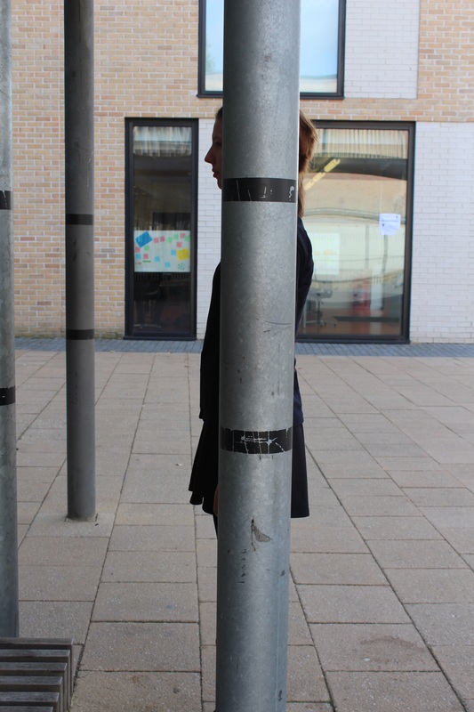
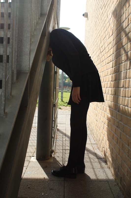
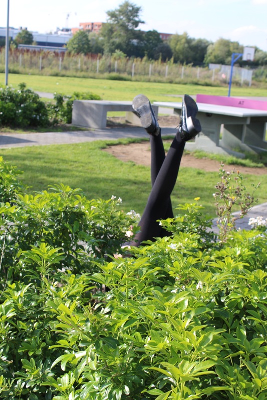
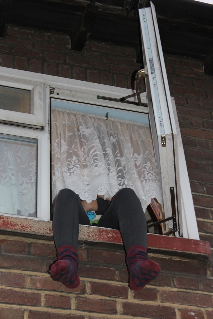
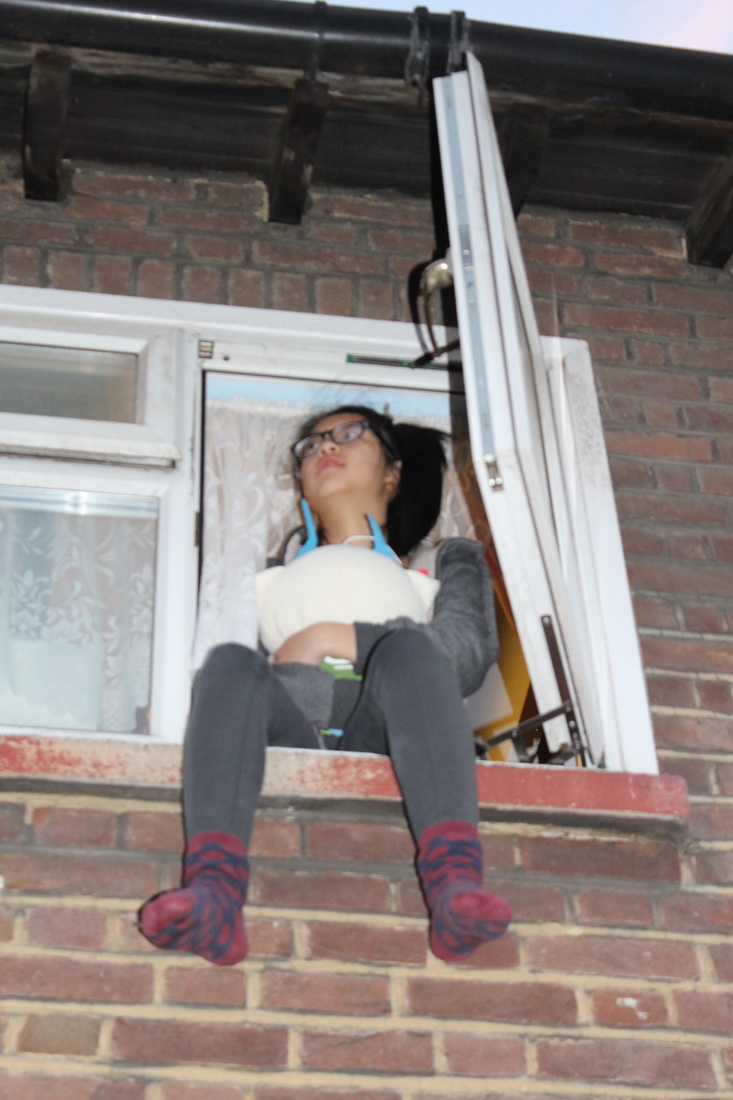
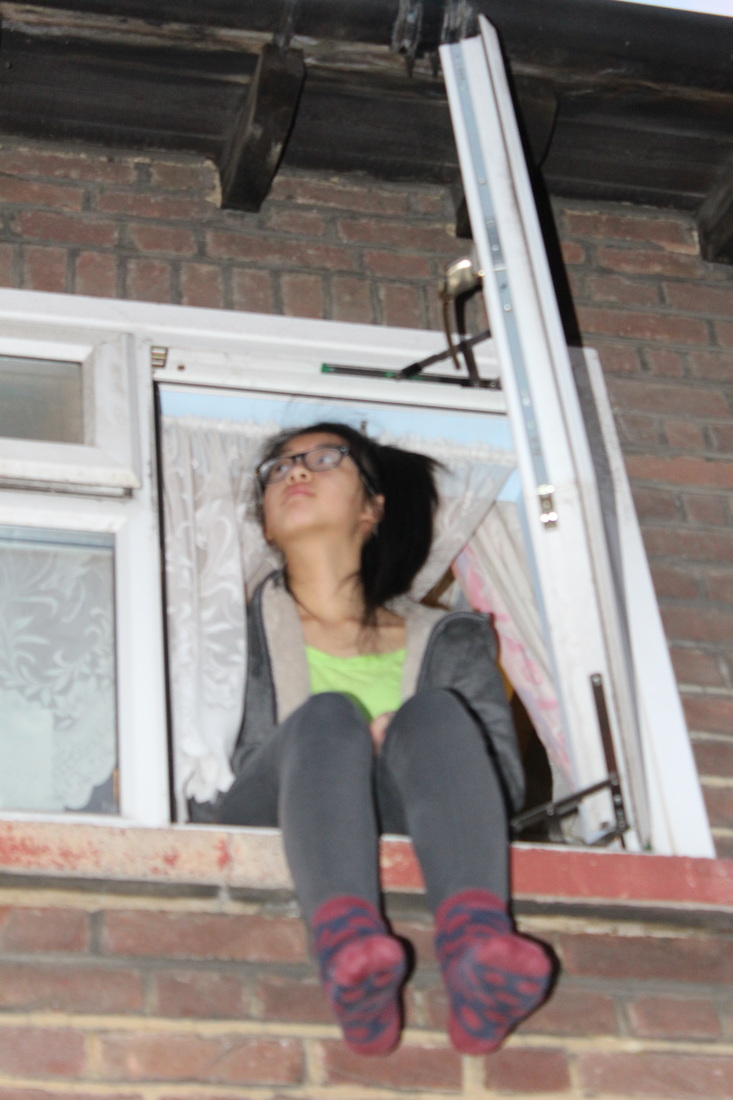
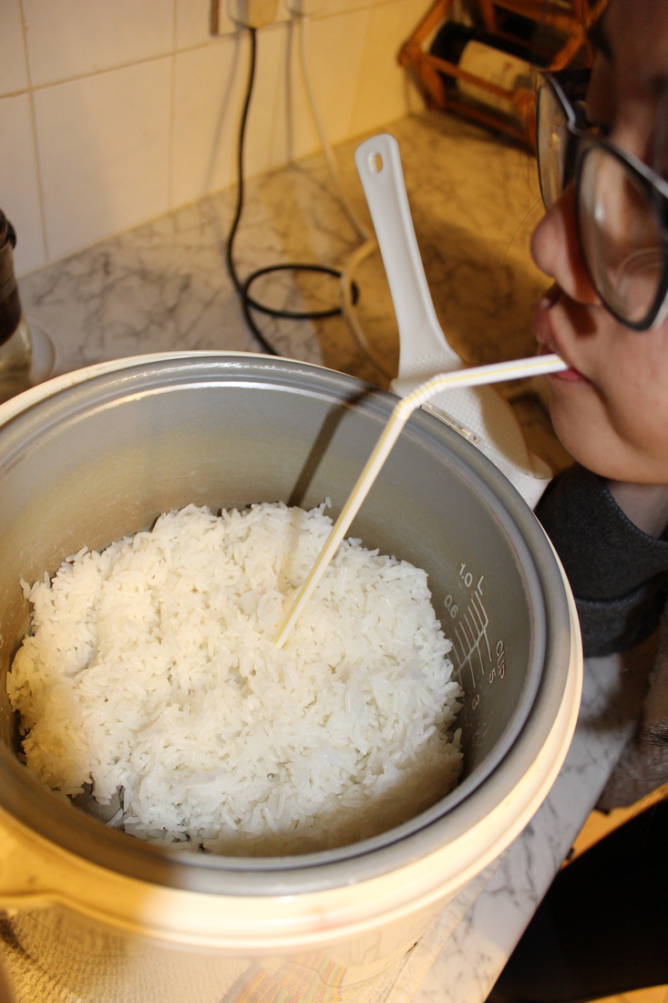
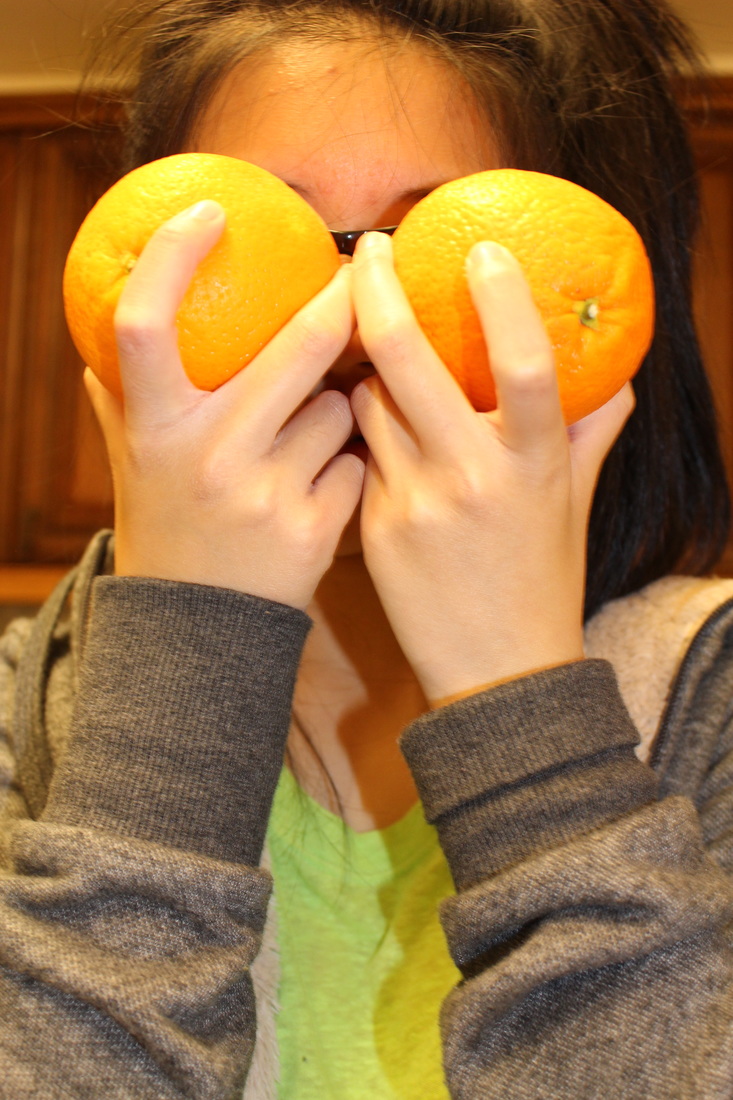
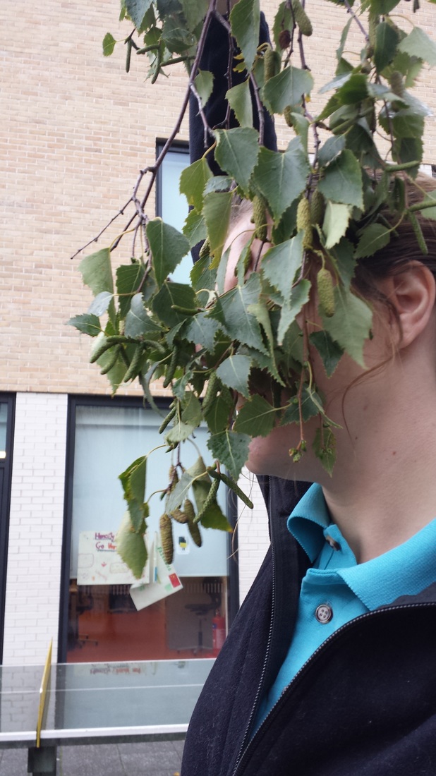
Here is my first set of images that I have taken around the topic 'Absurd'. All of the images above was taken with the word 'hide' on mind. I think that these images worked well as I feel that I have captured the concept of 'hide' well. In most of these images I have taken the concept of hiding only the head of the person, so that while hiding it can still look absurd. Personally I think that the best image from this set is the 9th image. I think that this image worked well because the person in the image is well hidden and you can only see the legs of the person popping out of the bush. This image is absurd because it makes you think why was the person laying on the ground with their legs up in the air. What I could improve in these images is to think about the background of the image. The background should be plain and simple so that the foreground can be in more focus and if the background was busy it may draw the attention away from the foreground. Another thing that I can improve on is the composition of the whole image, for example while taking the image think about where I want the object/subject in the image to be.
2nd Set of Images: Home images
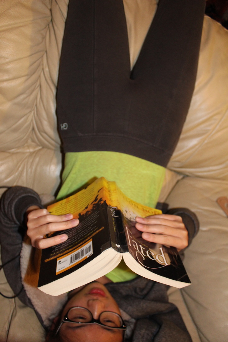
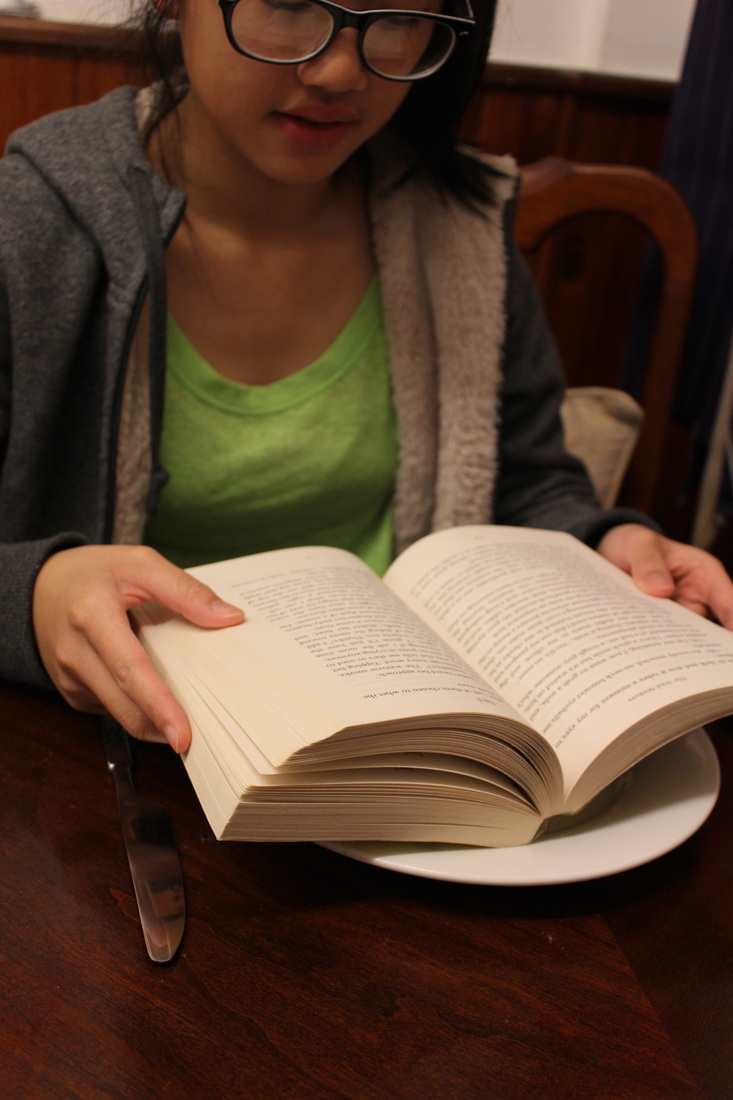
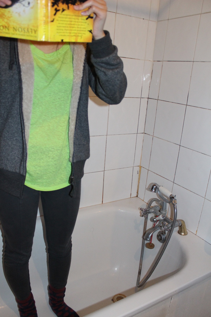
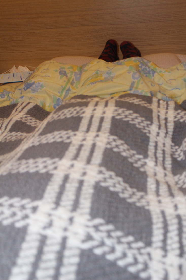
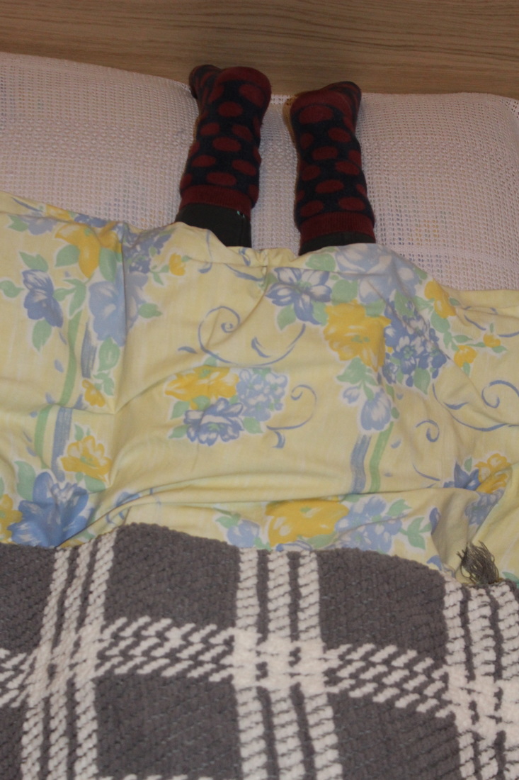
Here is the second experiment that I did around the topic 'absurd'. Personally I found it slightly hard to take these images as I have not yet fully understood the concept of absurd or how to take images based on absurd, however in this series of images I have tried my best to take some images that would scream unusual. What I found difficult in this task was thinking of what to place in the images that would make it unusual. What I had to keep in mind was the composition of the image, I had to be sure of where the objects/subjects in the images were placed and at what angle I took the images. What went well in these images is that I think I have slightly captured the aspect of absurd, as in some images is very unusual. For example the images where the girl is the shower fully clothed and reading a book, this is very unusual as you normally don't see this everyday. What I could improve on is to do more research on absurd and research more artists so I can get a better understanding of absurd.
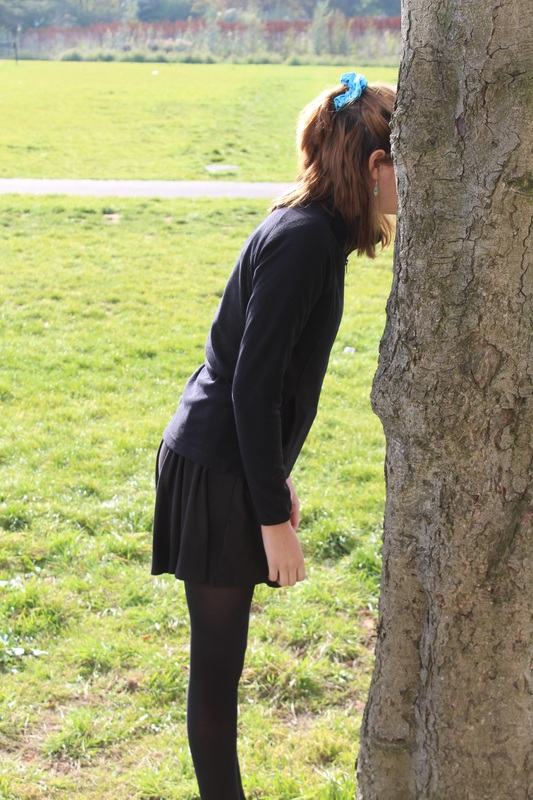
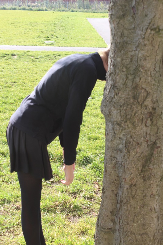
3rd Set of Images: Hide2
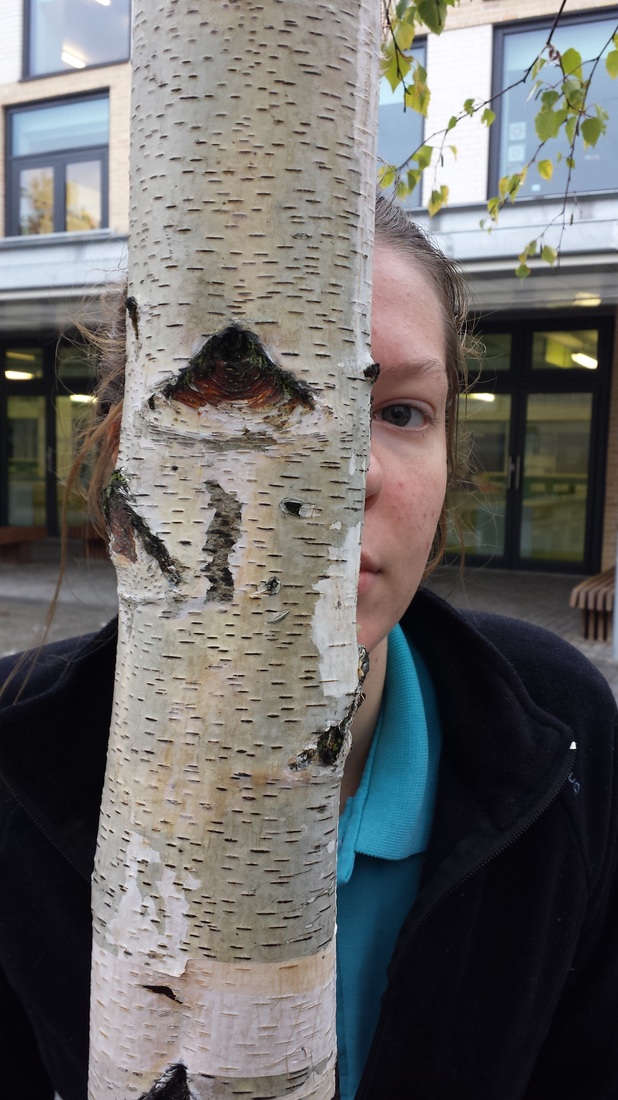
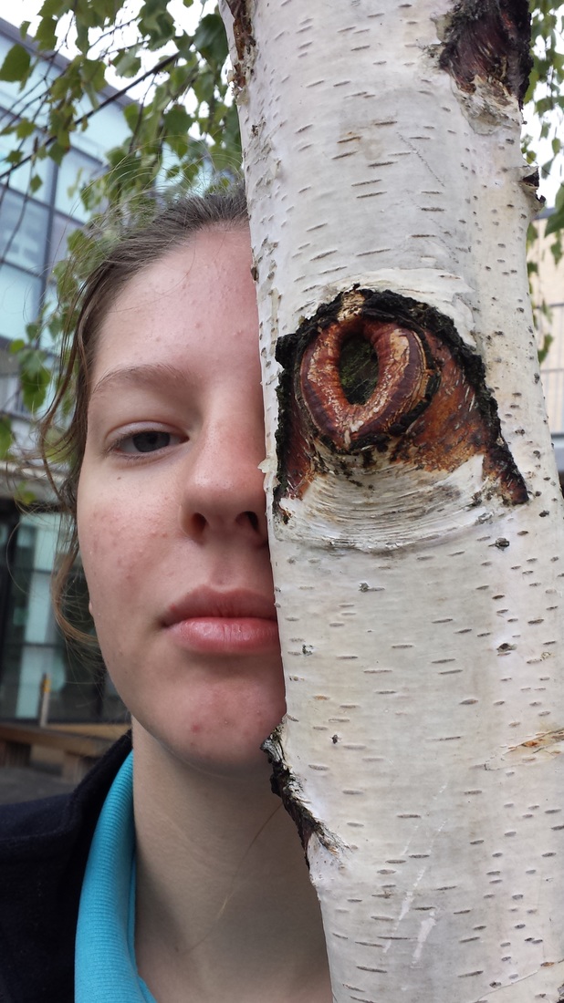
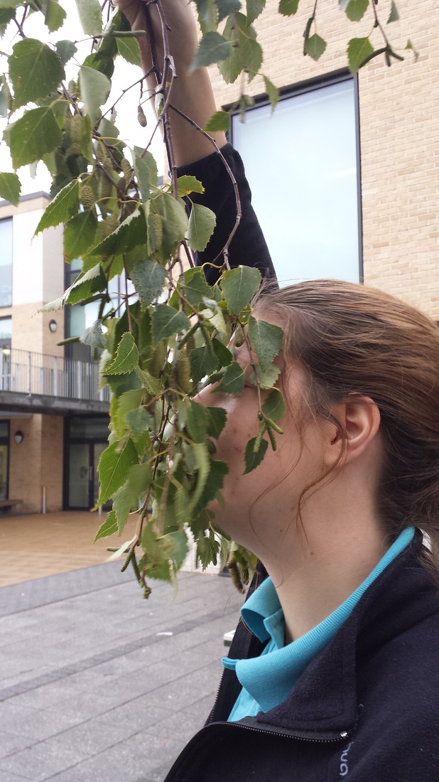
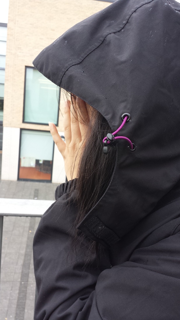
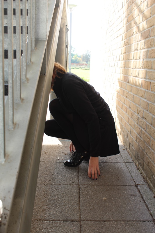
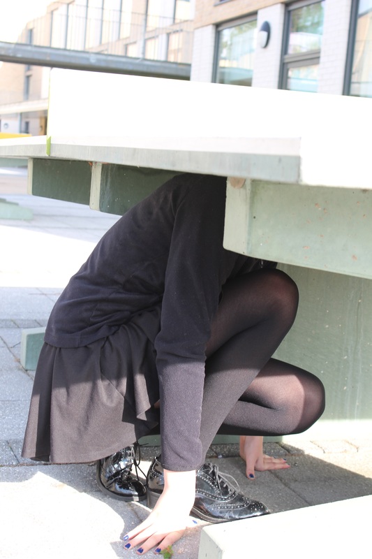
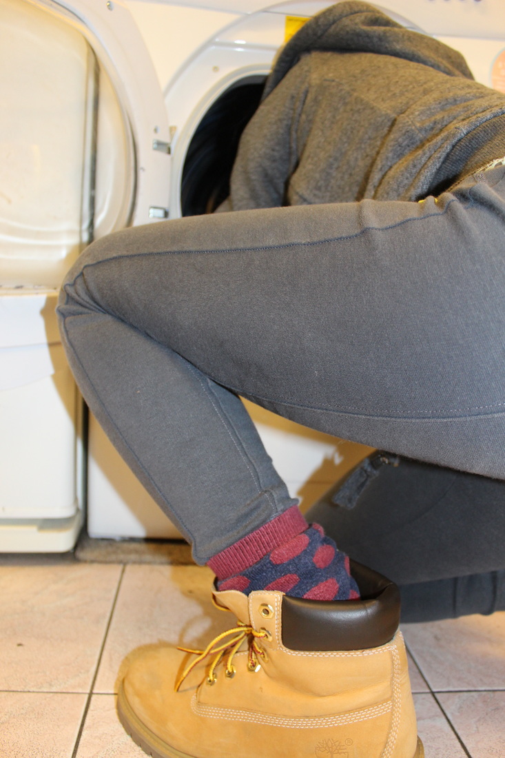
Here is the 3rd set of images that I have taken around the topic of Absurd. These images were also taken with the word 'hide; on mind again. I think that these images have turned out well because I feel that i have captured the concept of 'hide' well. I also feel that this set of images have improved from the first set of images on hide that I have taken because in these images I have taken I have found more unique and weird ways in which people can be hiding. For example in the first two images of this I have used the tree bark to hide the subject behind it. What made the images more unique is that on the tree there is knot in the tree bark, which makes it look like an human eye. So with the subject hiding behind the tree I positioned her so that the tree knot would look like her other eye. Another image that I found that worked out well would be the 3rd and 4th images. These image worked out well because I feel that it has captured the idea of hide and absurd well. Absurd because you would not normally see a person with their head in leaves. However what I could improve on these images is to think more about the composition and background of the images.
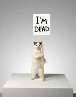
David Shrigley
|
Here is an image by David Shrigley. This image is absurd as the stuffed cat, which was alive before, is holding up a sign that says 'Im dead'. The fact that the cat was alive before it was stuffed and now is dead and is now holding up a sign that states that it is dead, is really funny. Another weird thing about this image is that the cat is standing up and holding the sign just like a human would be doing if it was holding a sign, which makes the images even weird as you would not normally see a cat standing up right like a human. |
|
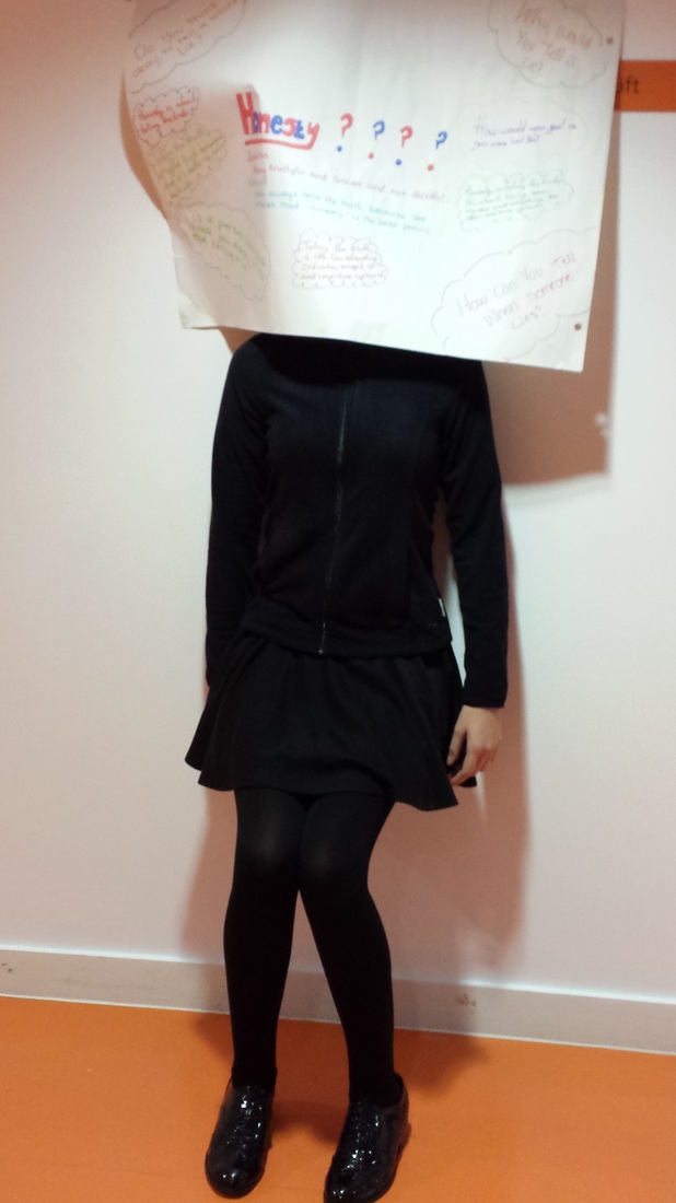
4th Set of Images: Signs
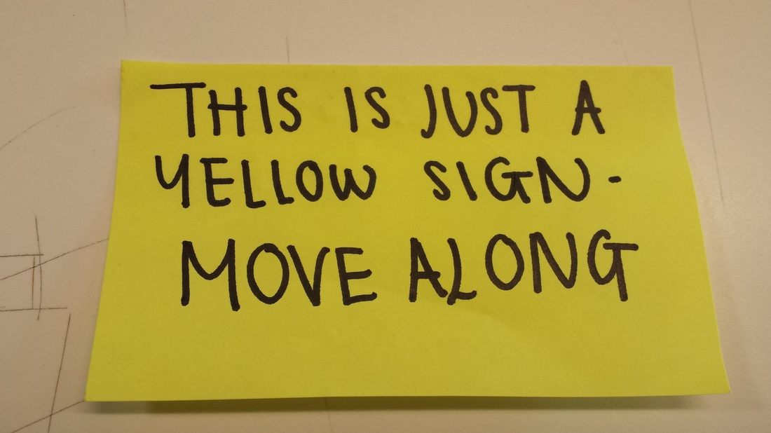
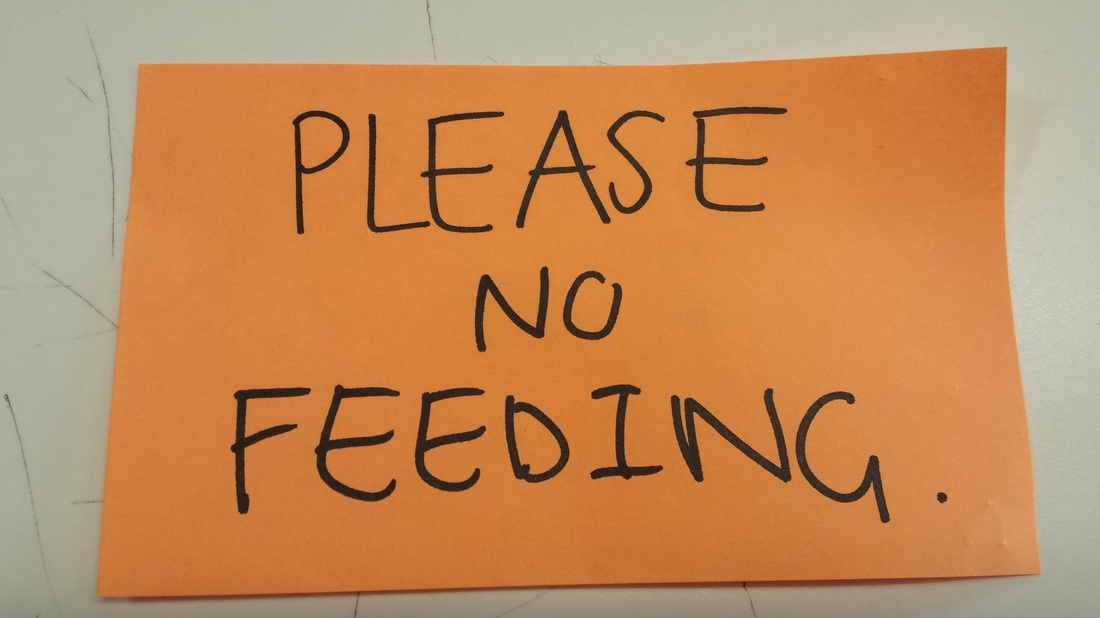
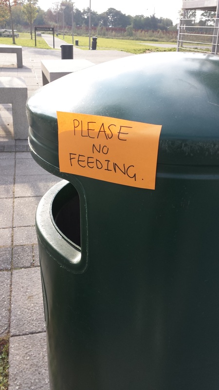
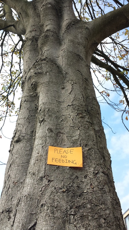
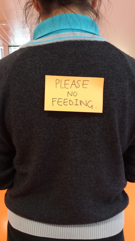
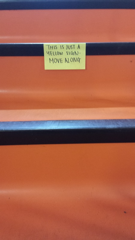
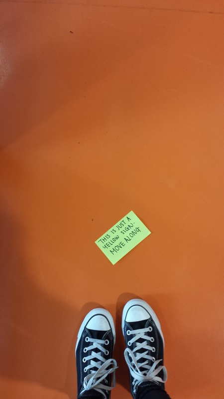
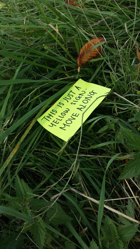
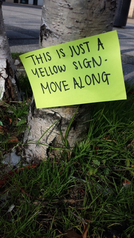
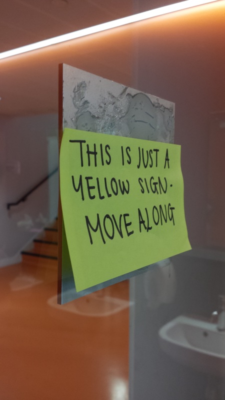
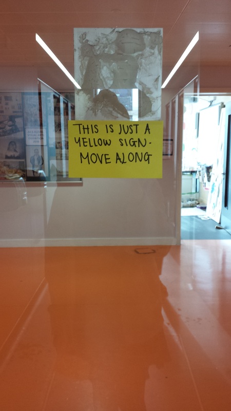
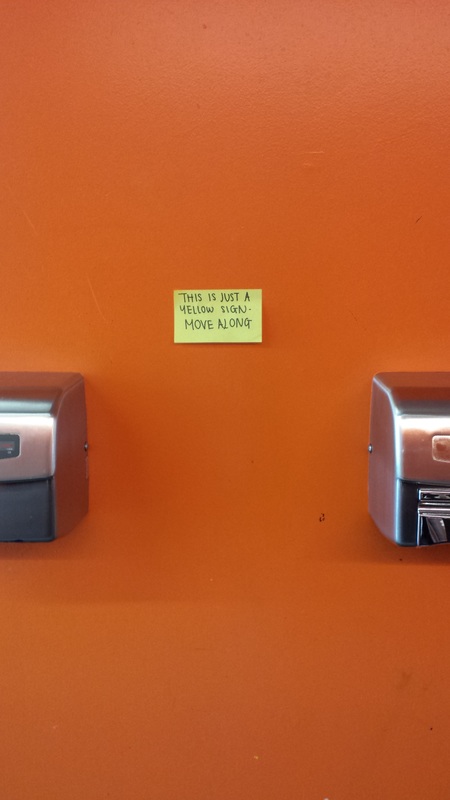
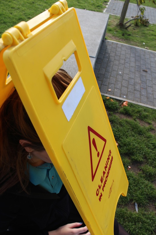
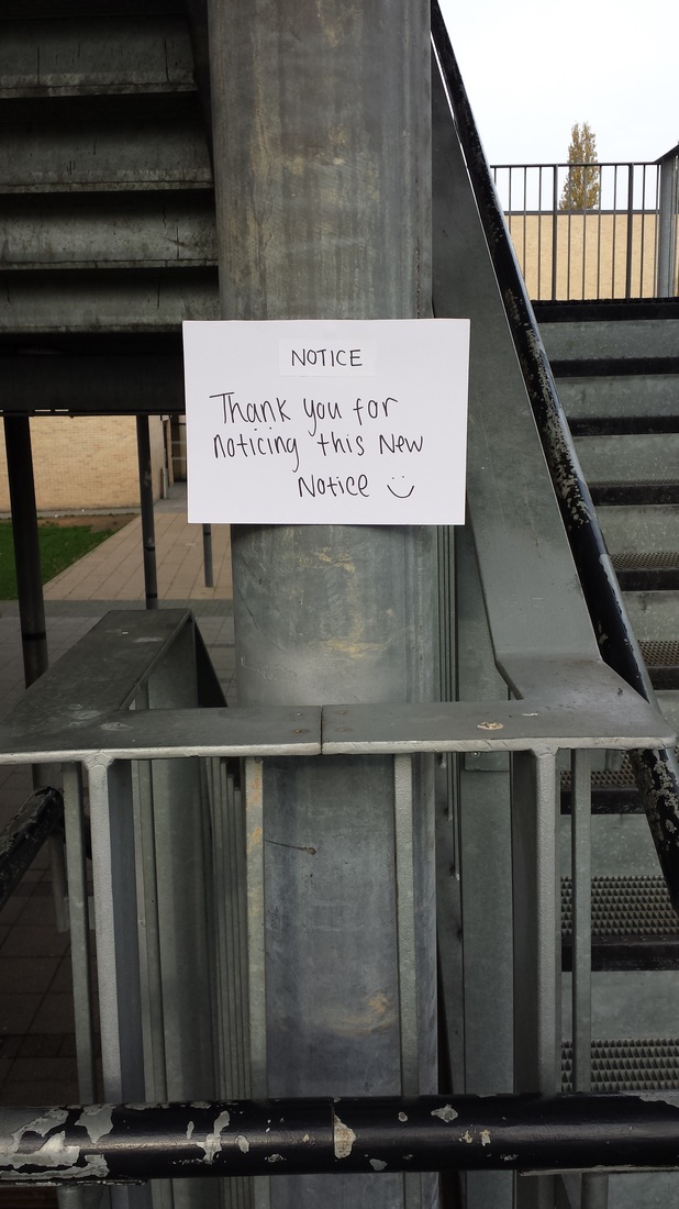
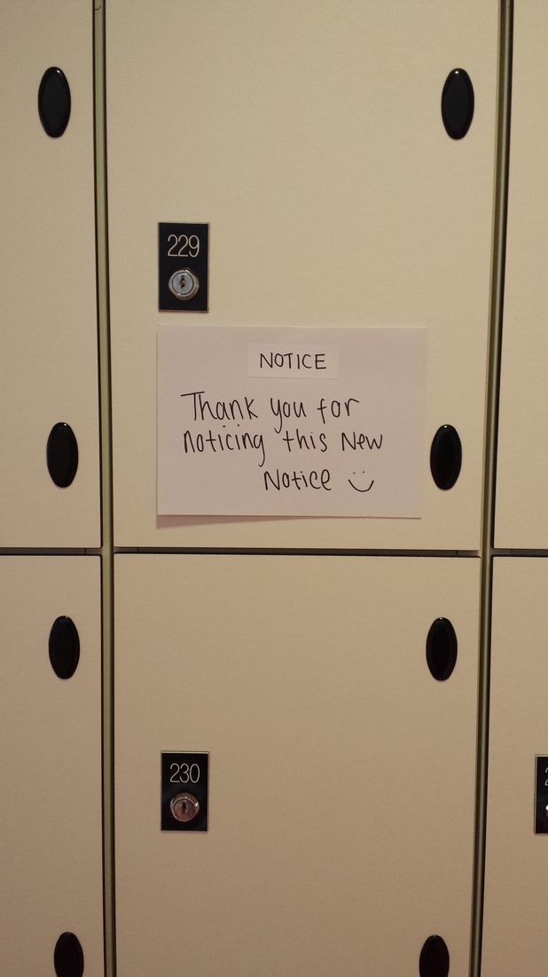
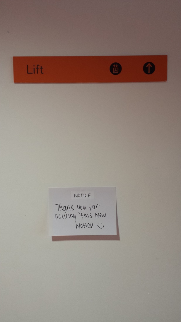
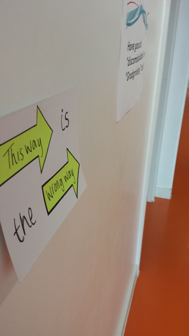
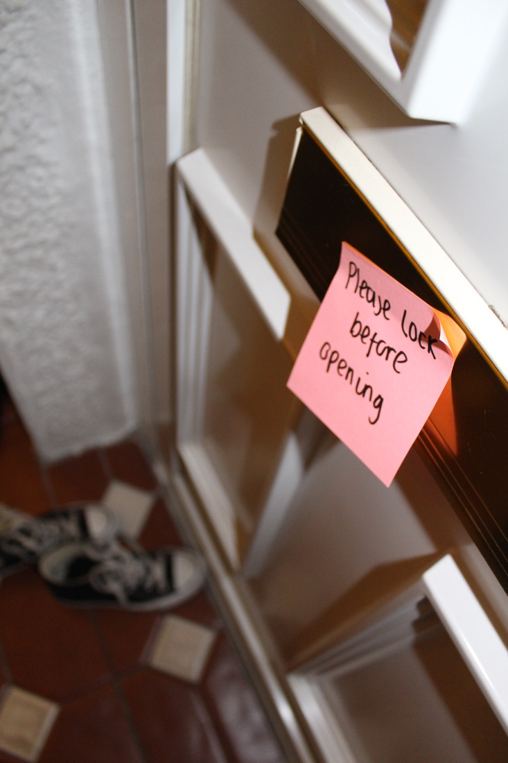
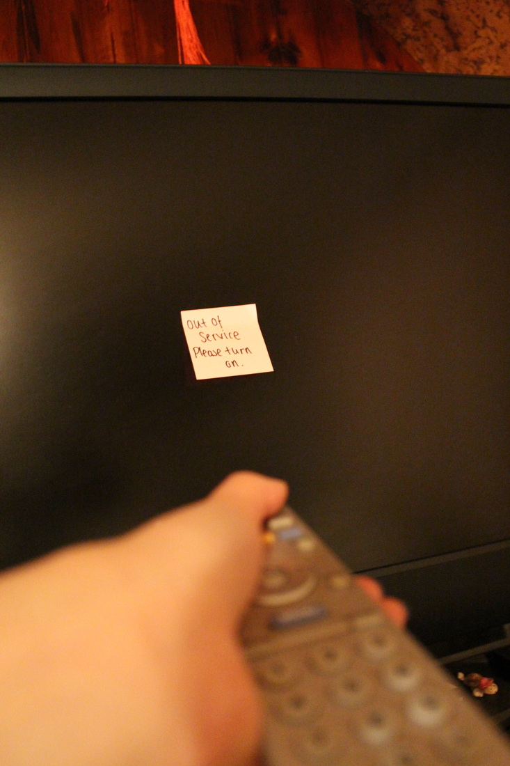
Here is the first set of images that I have taken with signs. I made these signs by using a post it note, as I felt that the simpler the sing the more absurd it would be. For the 'This is just a yellow sign. Please move along.' I have just stated the obvious, by saying that it is a yellow sing, which it is. The orange sign was inspired by the signs that you would normally see at zoos, stating that you shouldn't feed the animals. When creating these signs, I decided to use bright coloured post it notes as I feel that it would make the images stand out more against the normal everyday background. I think that this set of images worked well because I feel that these images were framed really well as in most of the images the background was not busy and there wasn't much in the background making the sign stand out more.
5th set of images : Home taken images
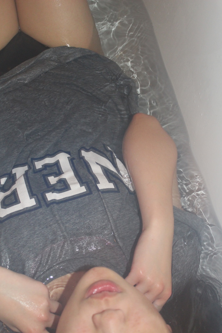
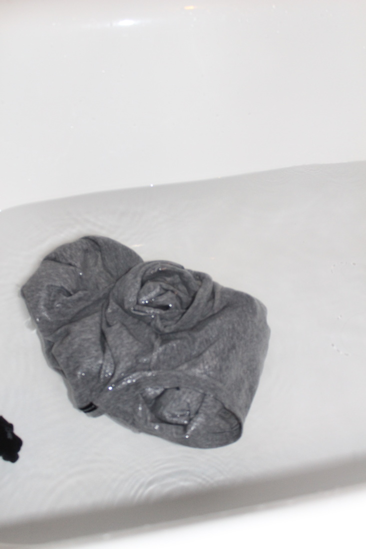
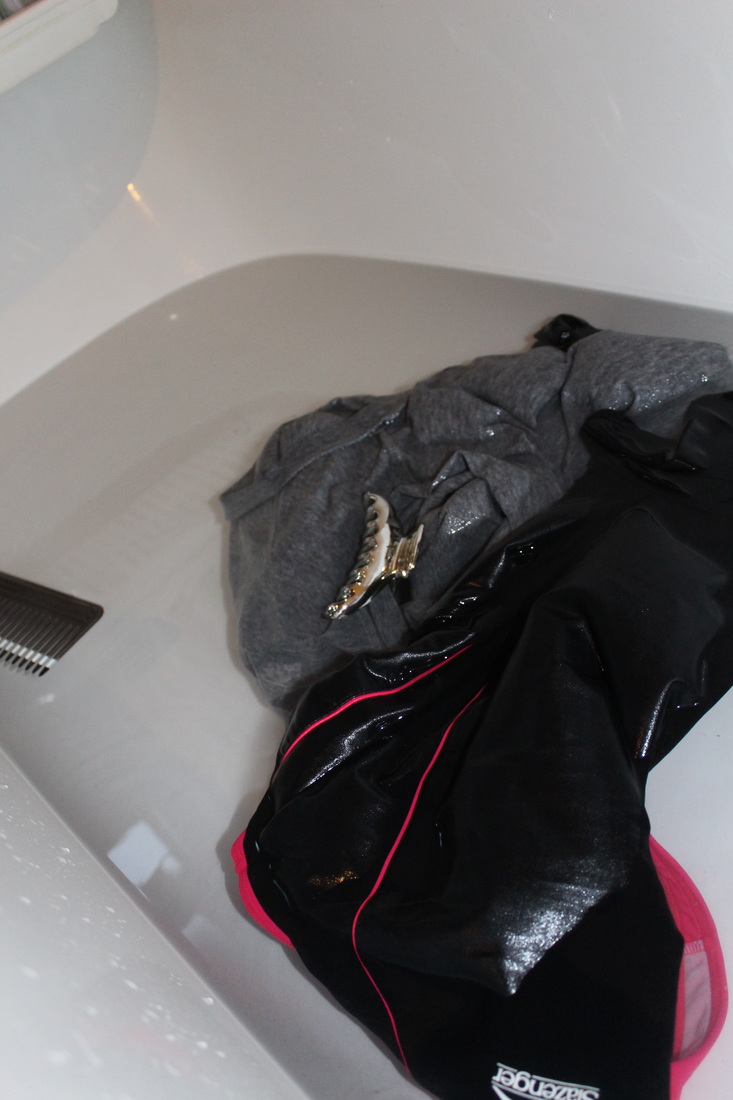
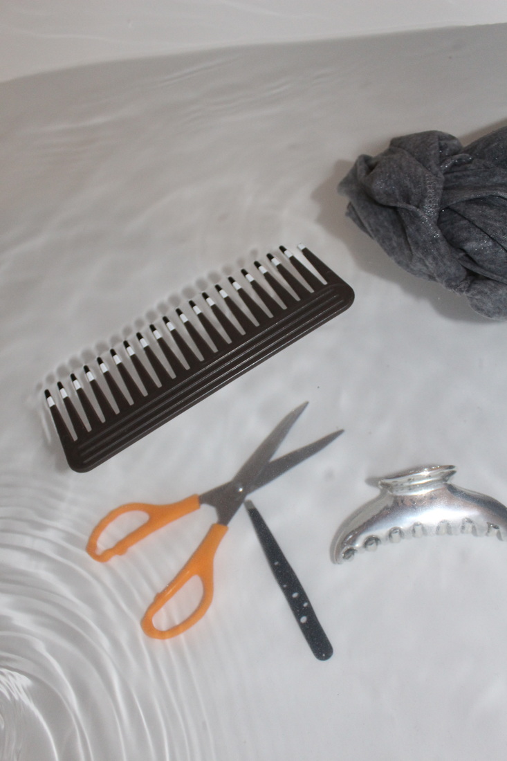
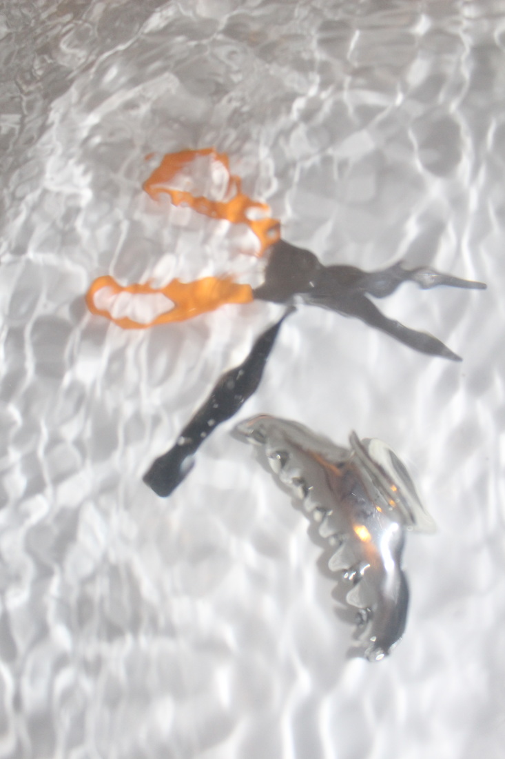
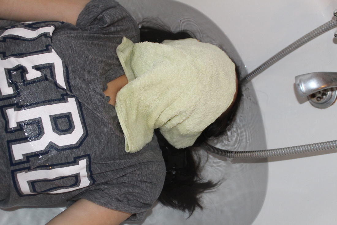
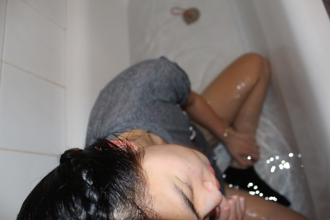
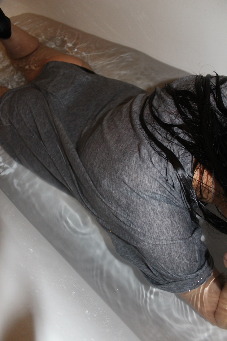
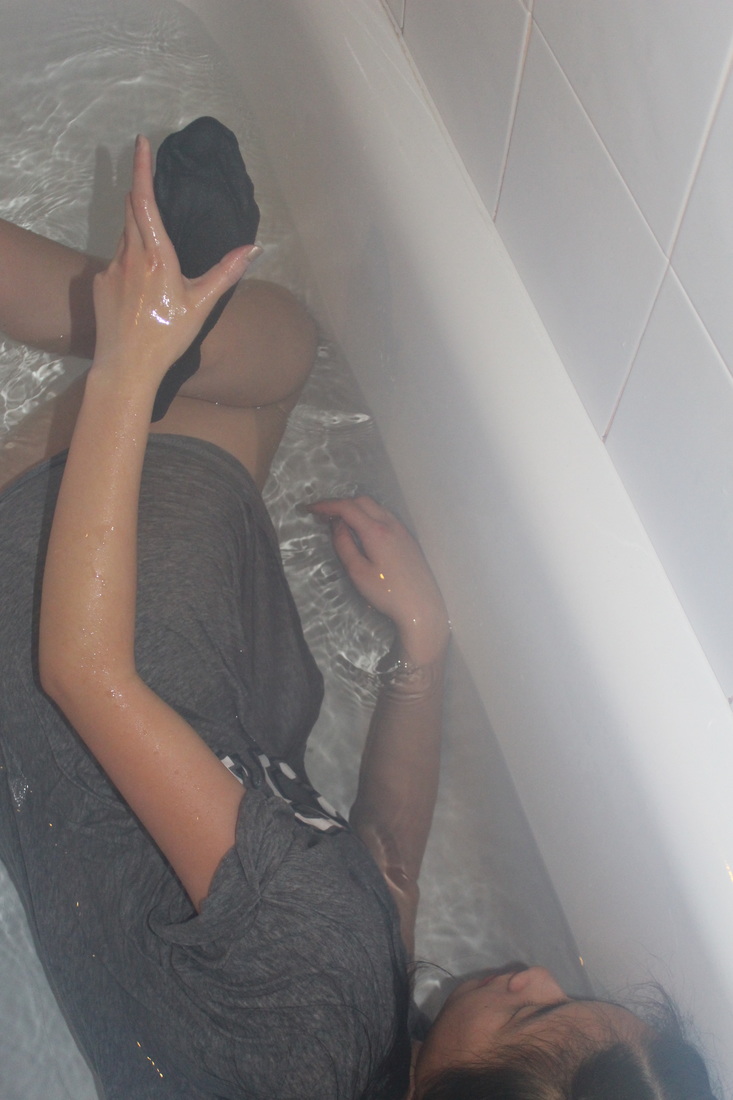
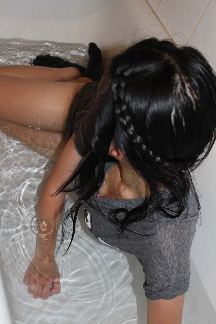
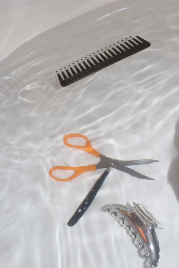
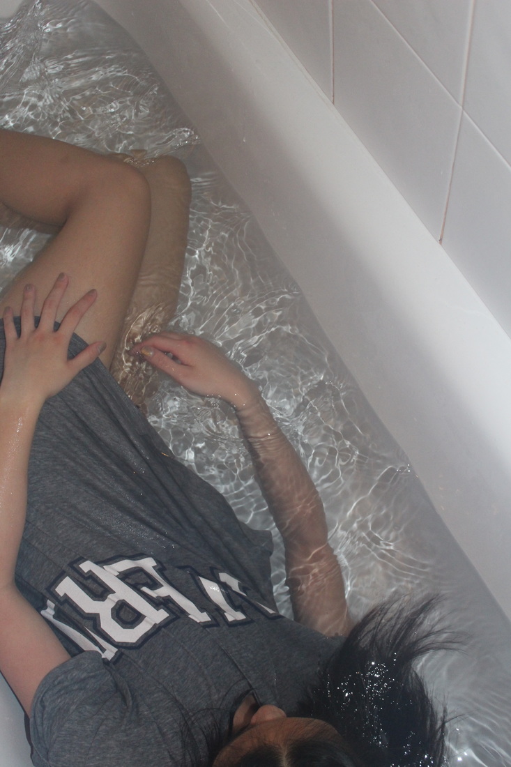
Here is the second set of images that I have taken at home. I have grouped the images in groups of similar images. In the first group of images, the image that I think worked out the best would be the 5th image. I think that this image worked out the best because, I feel that the ripples in the water creates a great effect on the image and makes the image more unique and absurd. Another reason why I think that this image worked out the best is because, I feel that this image this image represents absurd well. For example when you first look at the image, the first thing that comes to your mind would be " why are these ordinary every day life objects in water?" This is what I think that makes the image absurd. However overall I think that the 1st group images all relate to absurd as the girl in the image is in water fully clothed. Also I think that these images went well because I have thought well about the composition in these images, in most of the images I have zoomed in to just focus on the subject/object of the image to make it
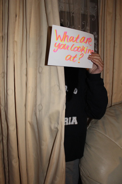
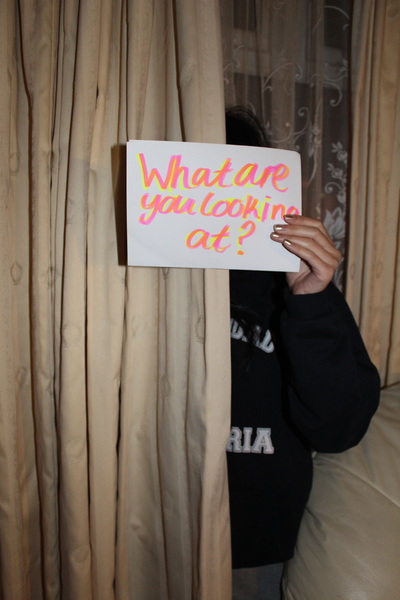
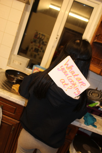
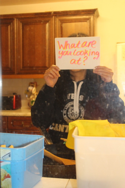
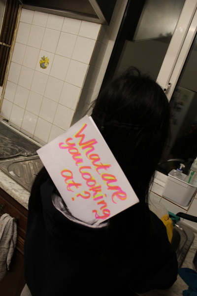
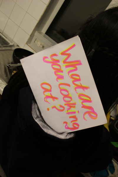
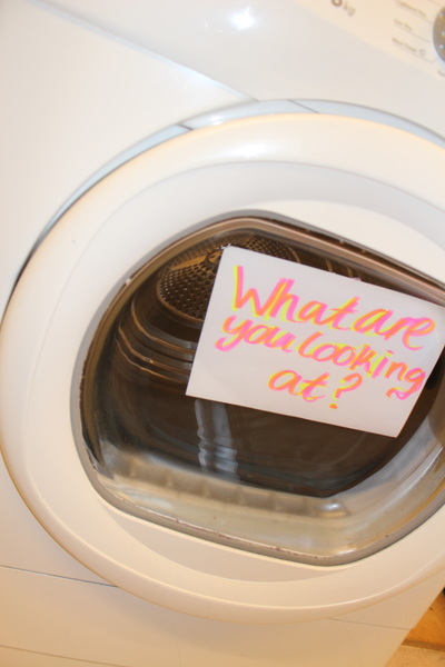
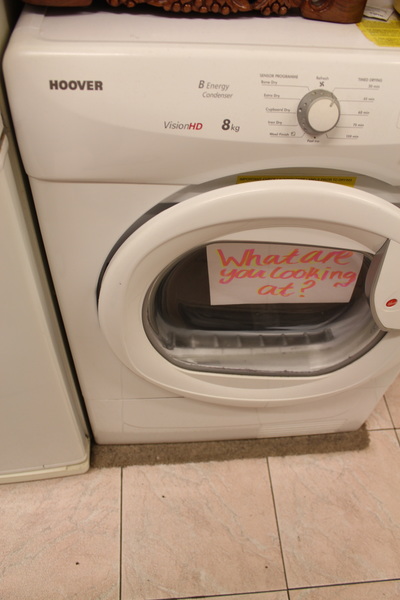
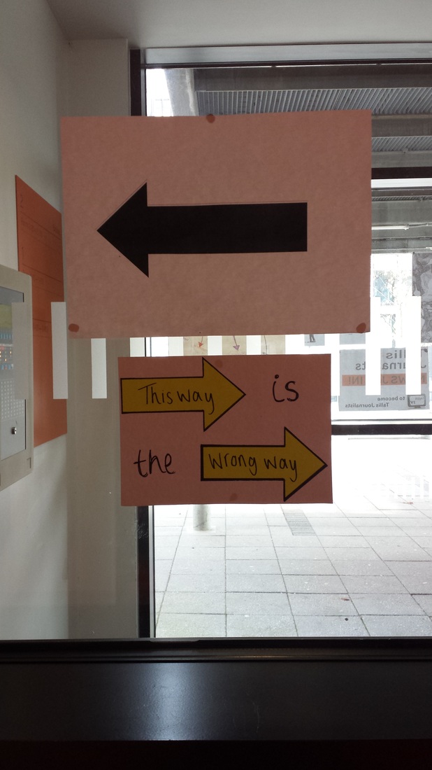
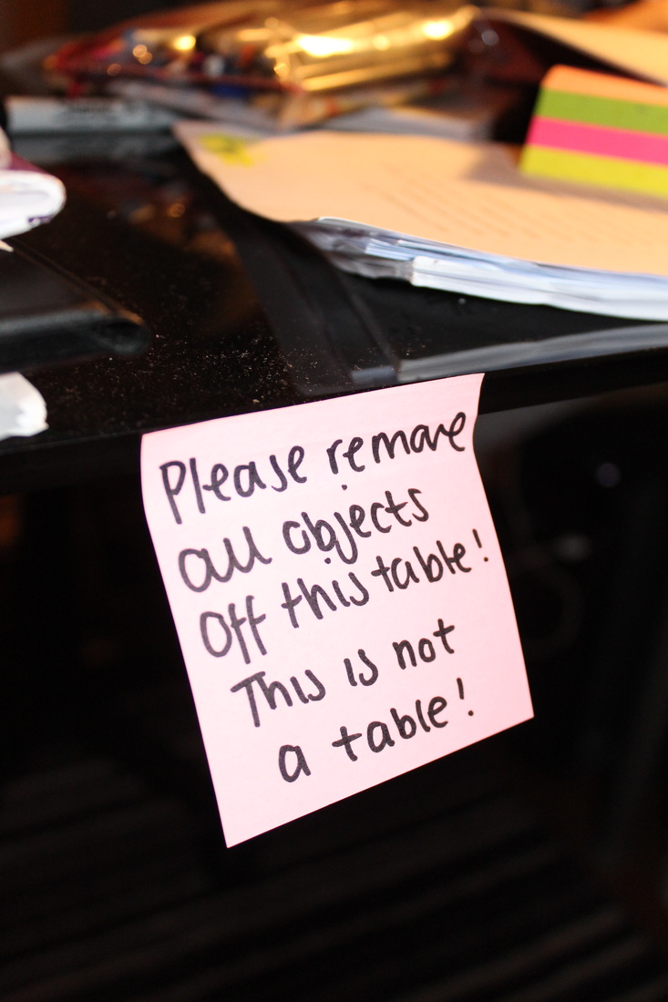
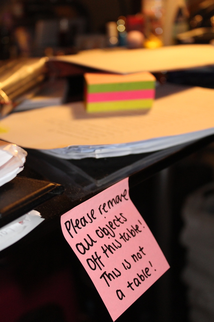
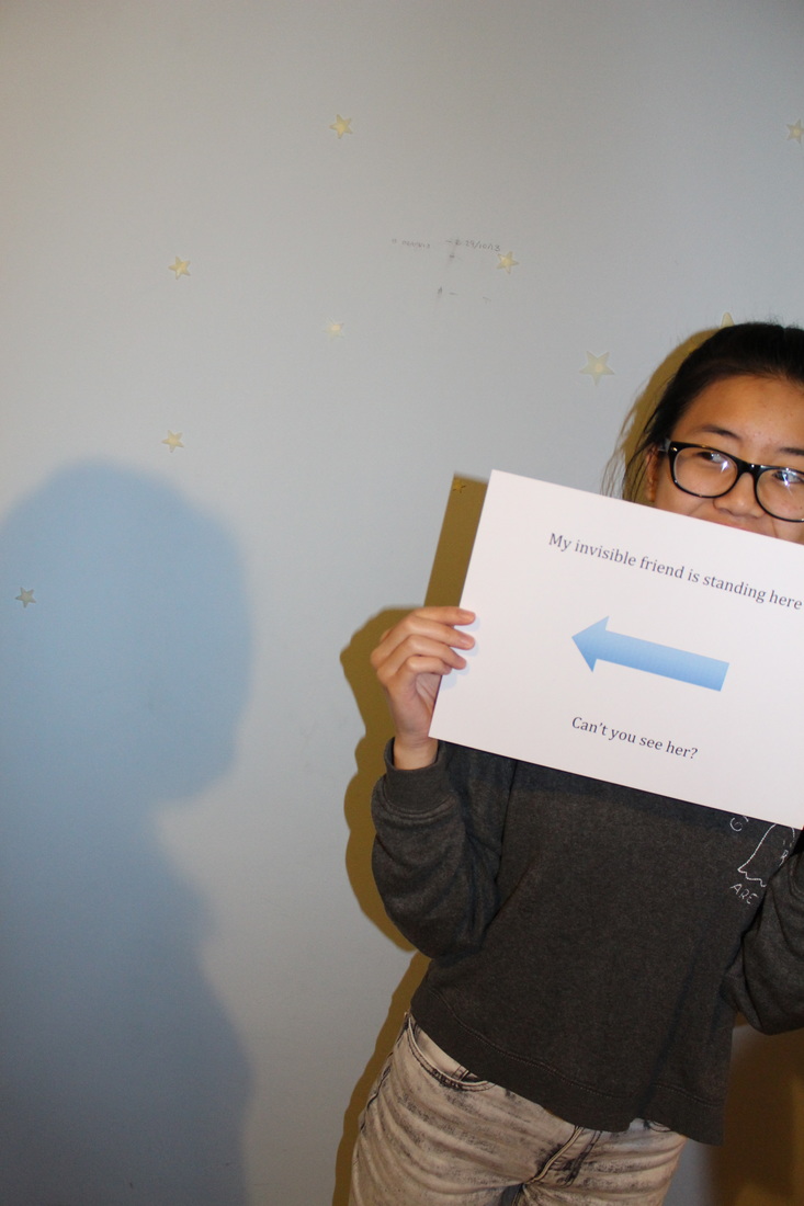
In the 2nd set of image I have created a simple sign that says "What are you looking at?" Personally I feel that this set of image didn't work out as well as the first set because I feel that these images were rushed;I also feel that the sign was too simple. In these signs the signs are all the same, which is another reason why I think that these images didn't turn out well. What I could improve in these image would be to think carefully about the composition of the image, for example thinking carefully about whats in the background and foreground. Another way to improve these images would be to have different signs, so its not repetitive.
In the 2nd set of image I have created a simple sign that says "What are you looking at?" Personally I feel that this set of image didn't work out as well as the first set because I feel that these images were rushed;I also feel that the sign was too simple. In these signs the signs are all the same, which is another reason why I think that these images didn't turn out well. What I could improve in these image would be to think carefully about the composition of the image, for example thinking carefully about whats in the background and foreground. Another way to improve these images would be to have different signs, so its not repetitive.
6th set of images: School Signs
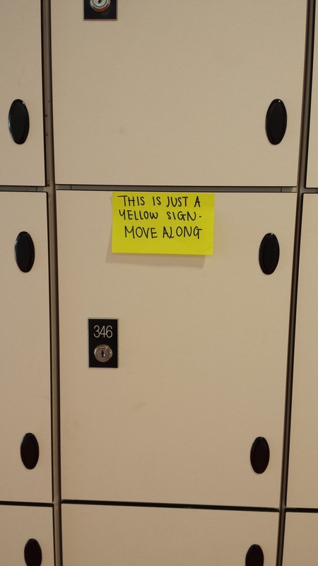
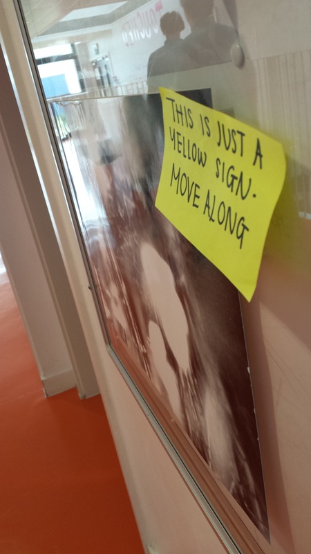
Here is the 3rd set of images that I have take with signs in school. I have created two different signs, which are really simple and plain. Personally I think that signs that are simple and plain are the best signs to use in absurd situations because when placed in a normal situation it would look quite weird. I think that these images are a little too simple and to improve these images I think that I should focus more on framing the image.
Next Steps: Take more images using a range of different signs and focus more on framing the image
Next Steps: Take more images using a range of different signs and focus more on framing the image
6th set of images: Home signs
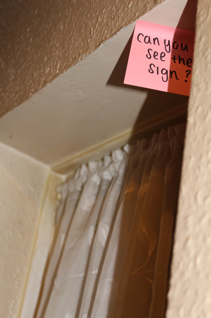
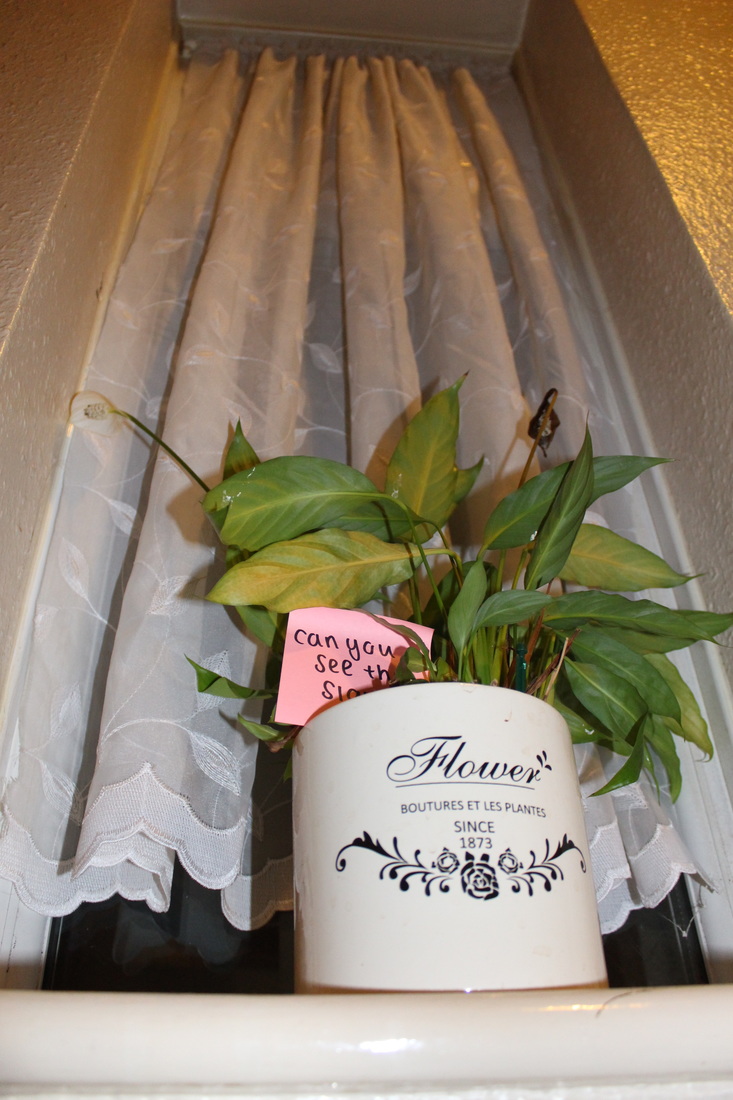
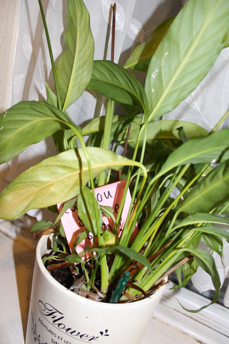
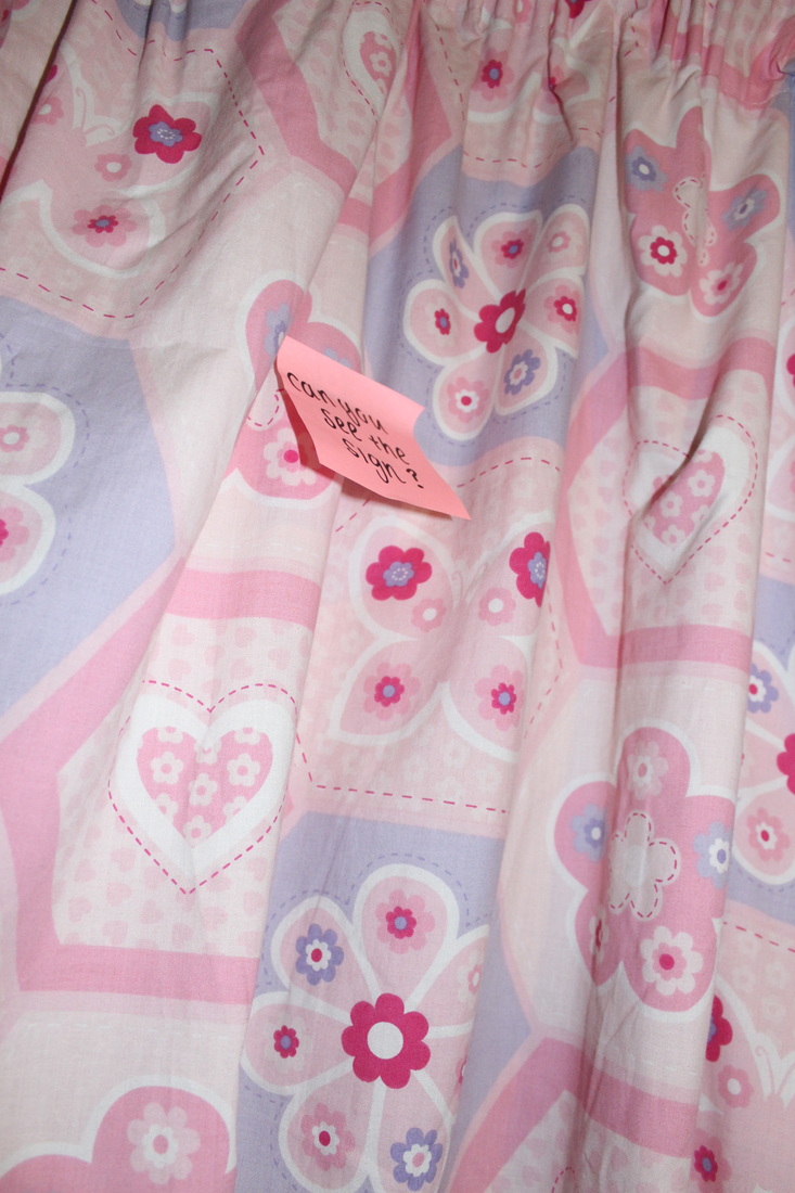
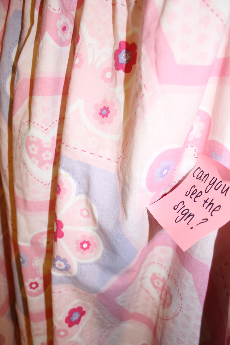
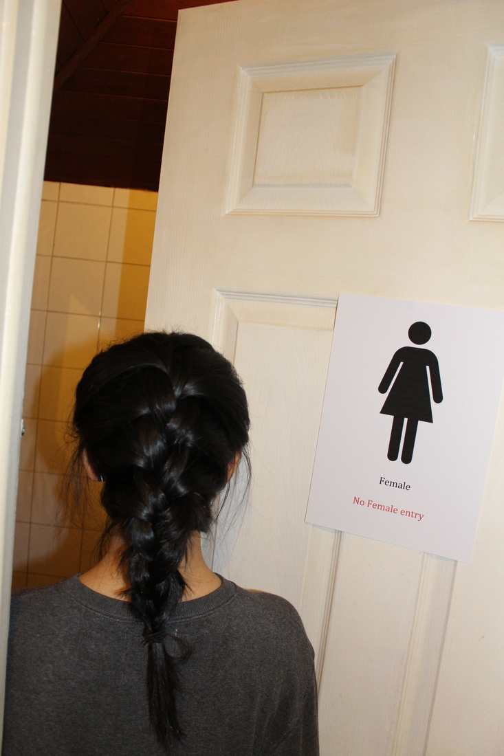
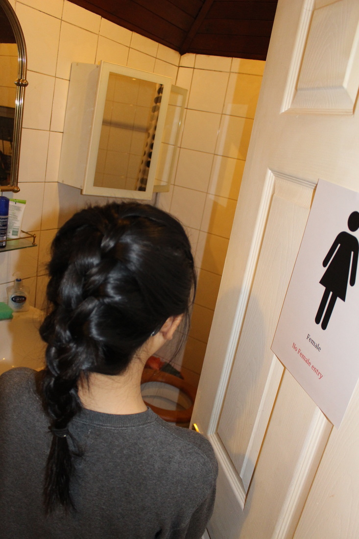
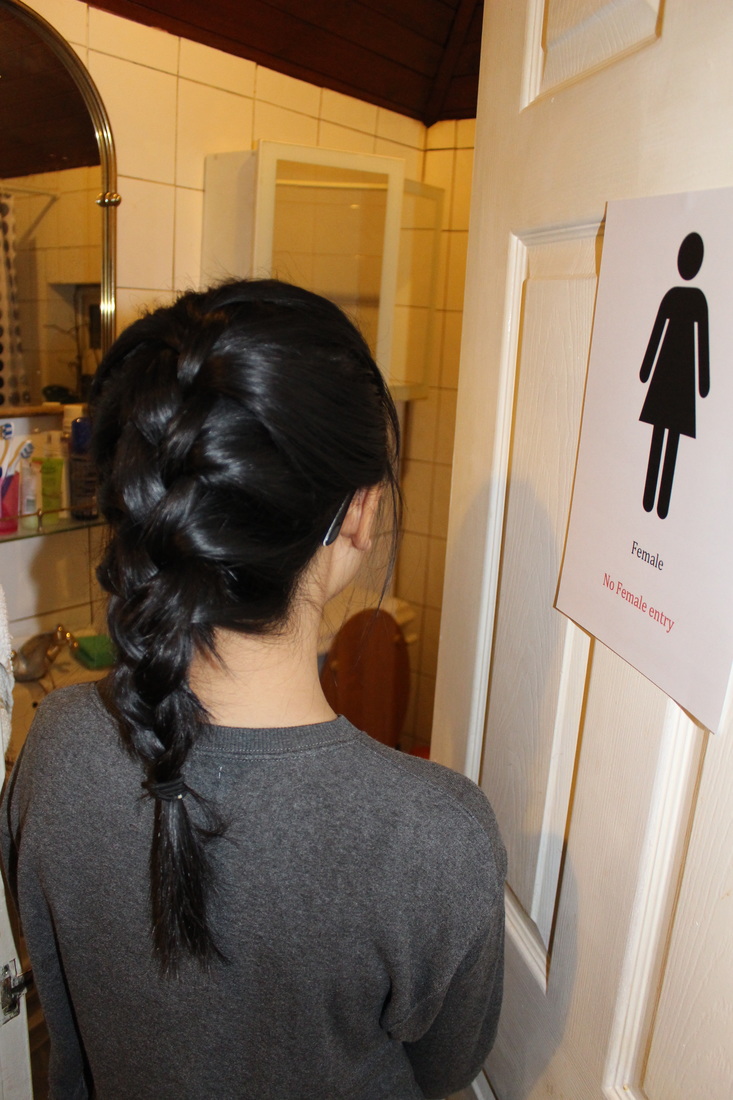
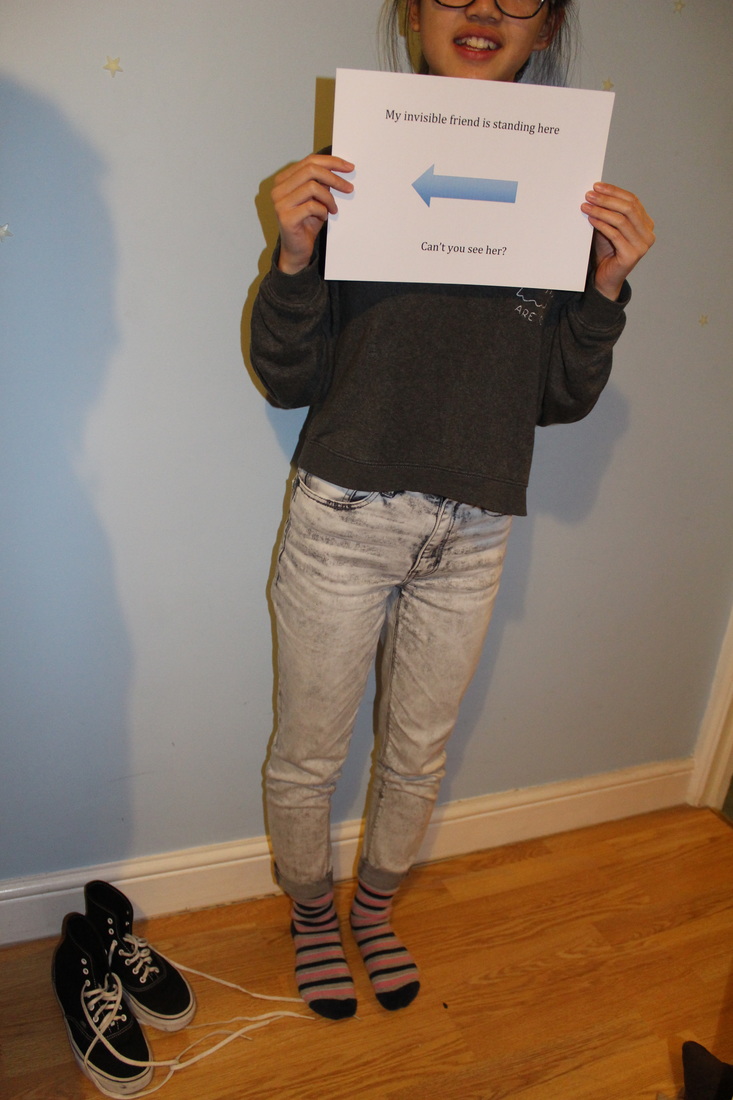
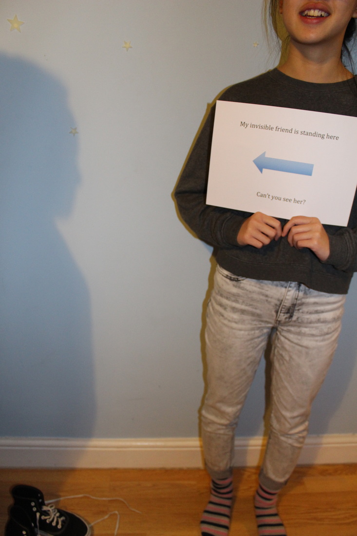
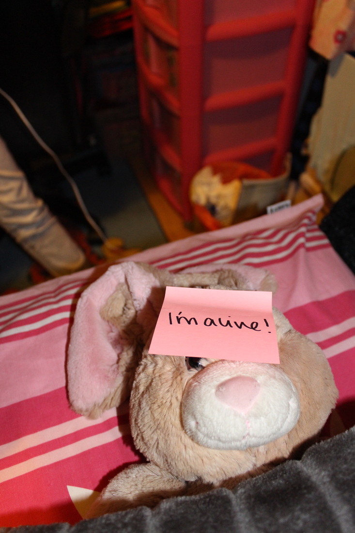
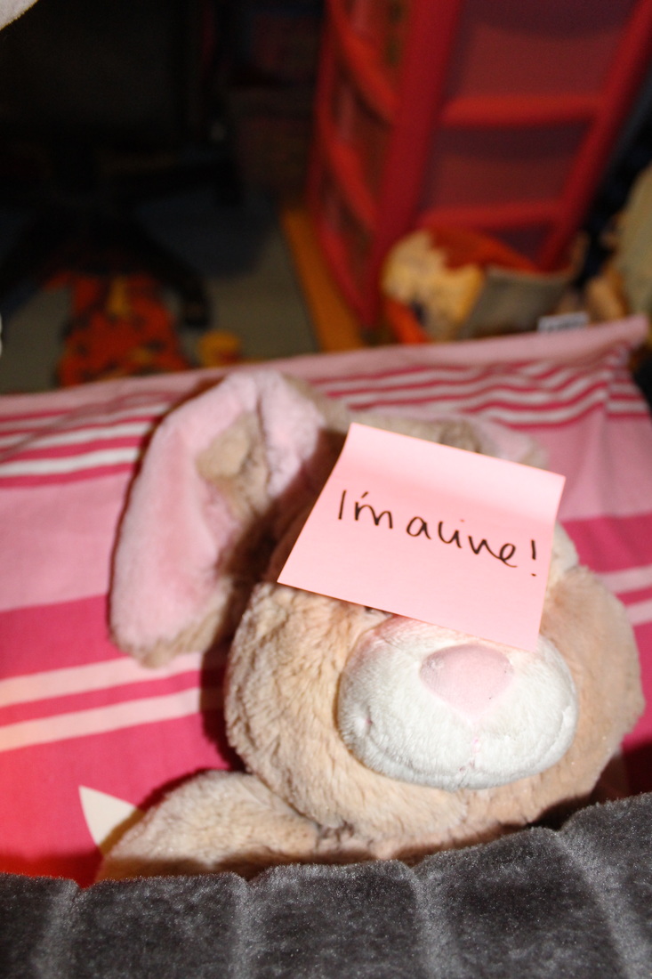
Improving from the last set of images, in this set of images I have used a larger range of signs and I have tried to focus more on faming the images. For the signs I have made them using post it notes, I felt that by using post it notes it made the sings more unique because I was using an everyday object and writing normal phrases on them and placing them in everyday situations. I think that these worked out well because I feel that I have I have framed the images well, placing the object in the image in the centre so that they are the main focus of the image. I think that the best image in this set would be the 7th image because I feel that I have framed this image really well as I have made sure that there isn't much in the background. Also the sign in this image is well hidden within the plant, which goes against the sign which says 'can you see the sign'. I think that this then makes the image more absurd.
Forced Perspectives
|
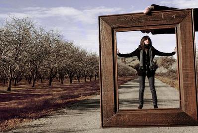
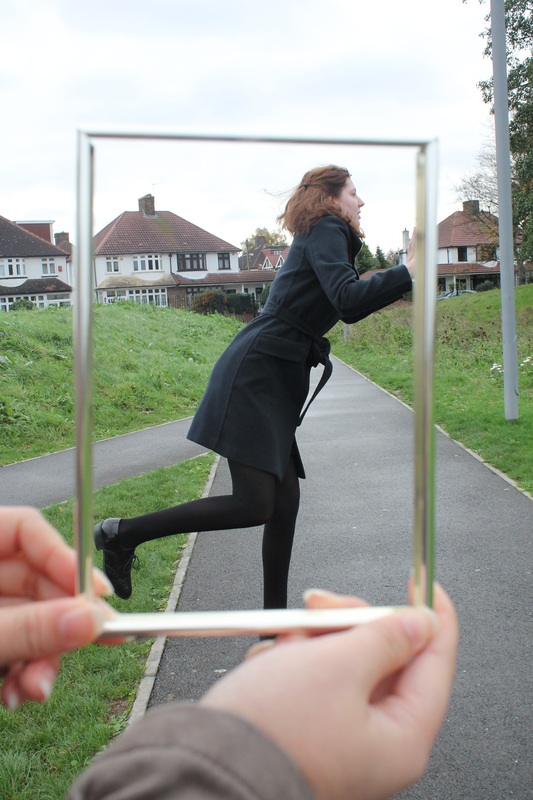
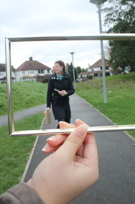
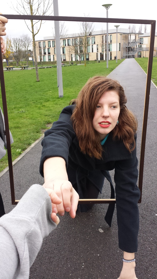
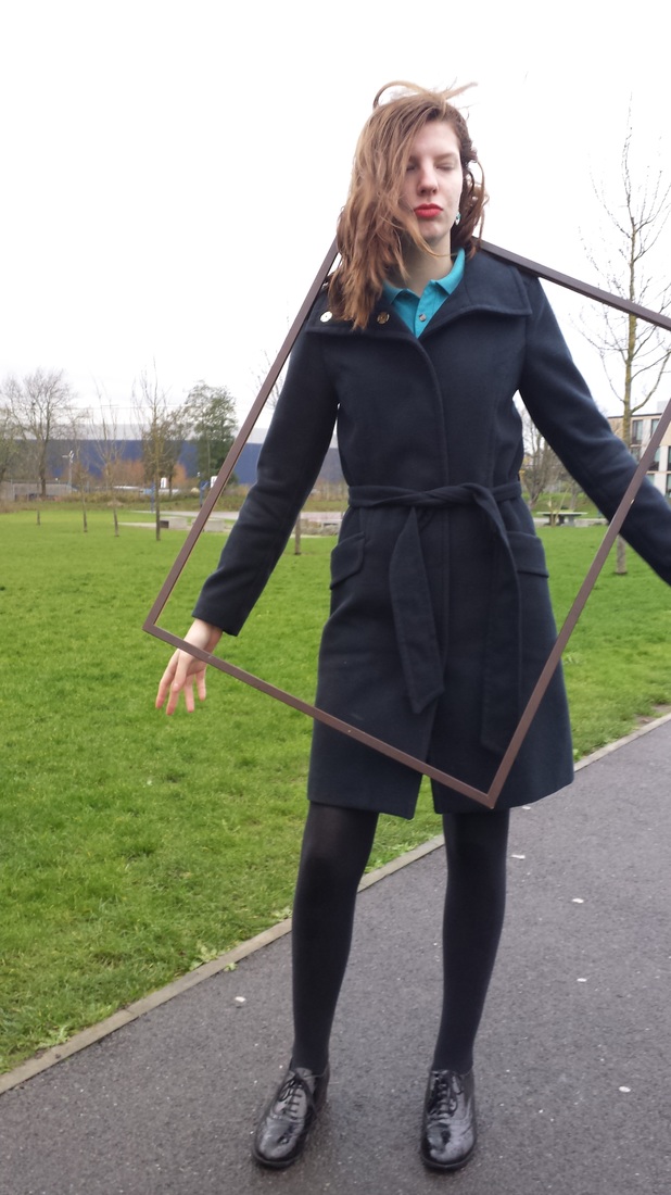
I think that this image represents the word 'Forced Perspectives' well because it looks like the person in the images is actually in the picture frame, which also makes the image look more absurd. The way the person is in the photo frame makes it seem real and that she was placed into the frame. The frame is in the foreground of the image making it the centre of the image, which makes it the first thing that you can see when looking at the image. The background of the image is plain and calm, as there is nothing in the back ground expect for the trees and the pathway. The frame and the background has similar tones and colours which makes the frame look very natural in the image.
|
|
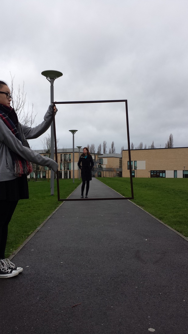
Here is the first set of images that I have taken on based on the words 'Forced Perspectives'
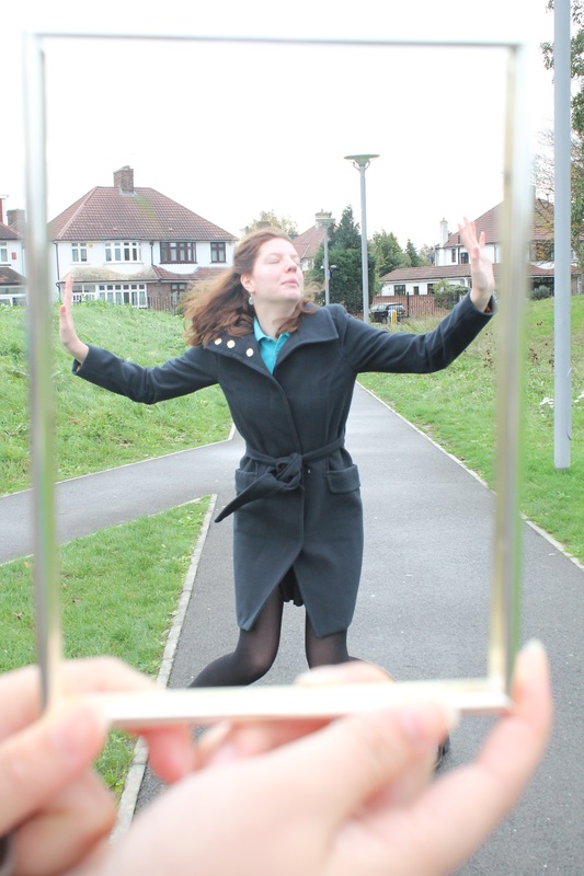
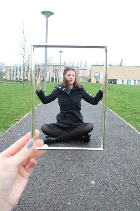
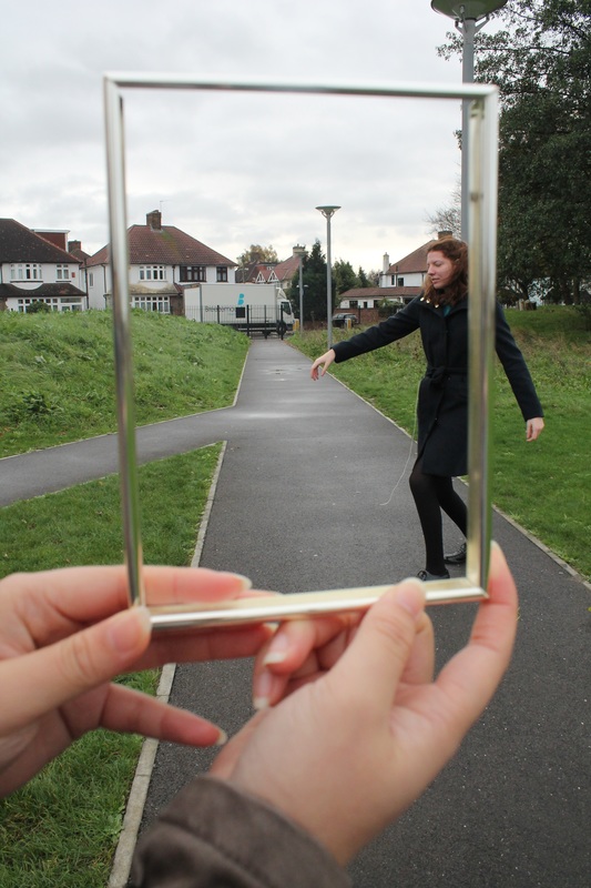
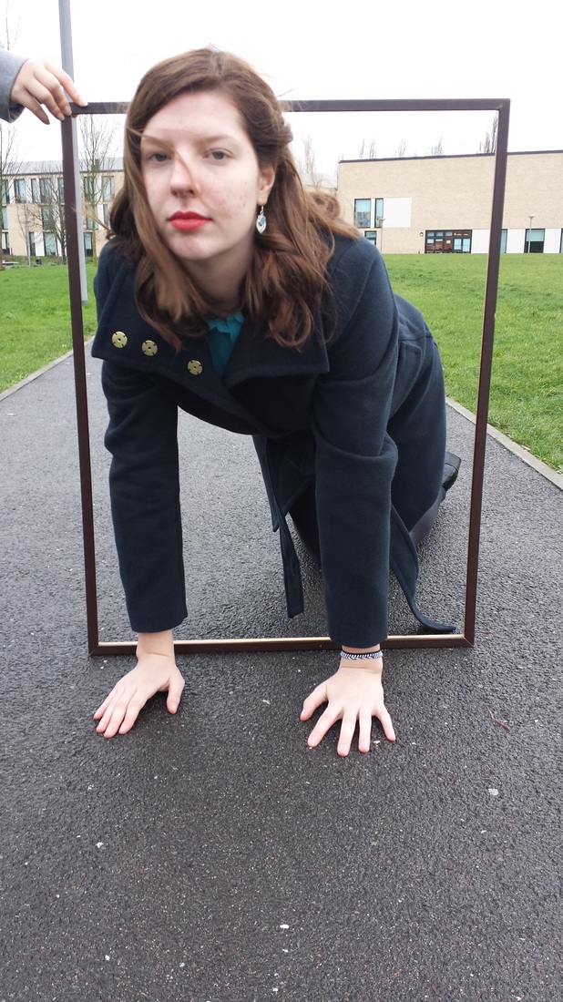
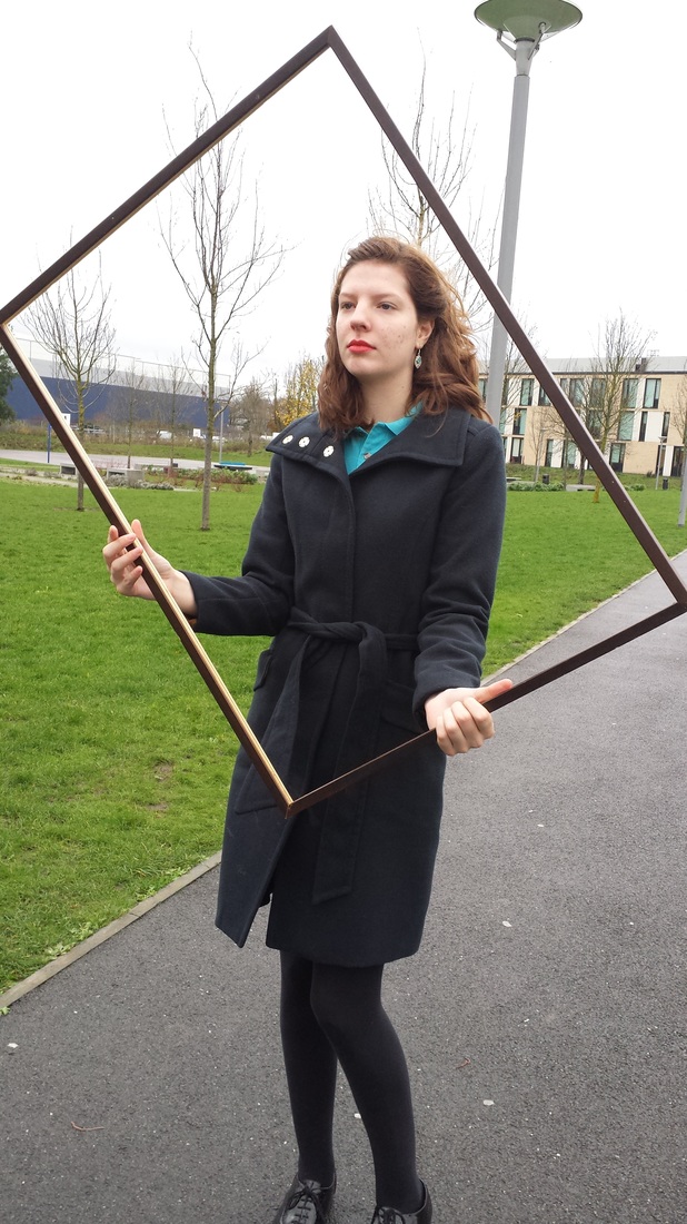
WWW: What I think that went well in this set of images is that I feel that I have managed to make the person seem like she is actually in the photo frame. In this set of images I have decided to use a small photo frame because I felt that it was easily controlled, which made it easier for me to direct the person into the photo frame. The image that I thought that worked well would be the 4th image. I think that this image works the best because it actually looks like the person is sitting in the photo frame. Another thing that I feel that worked well in the 4th image is that I have managed to make sure that the photo frame and the person is in the centre of the images making it the focus of the image.
EBI: One thing that I could improve on would be to think more about the framing of the image. For example just make sure that the photo frame is in the image. Another way to improve on this set of images would be would be to focus more on the framing of the image.
Here are the images that I have improved from the last set of images, however I feel that these images didn't go as well as the first set of images, as I feel that I haven't been able to frame the image properly.
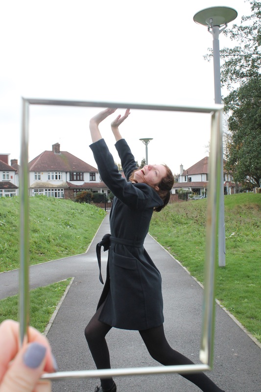
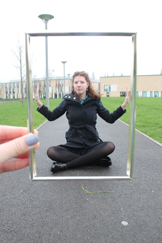
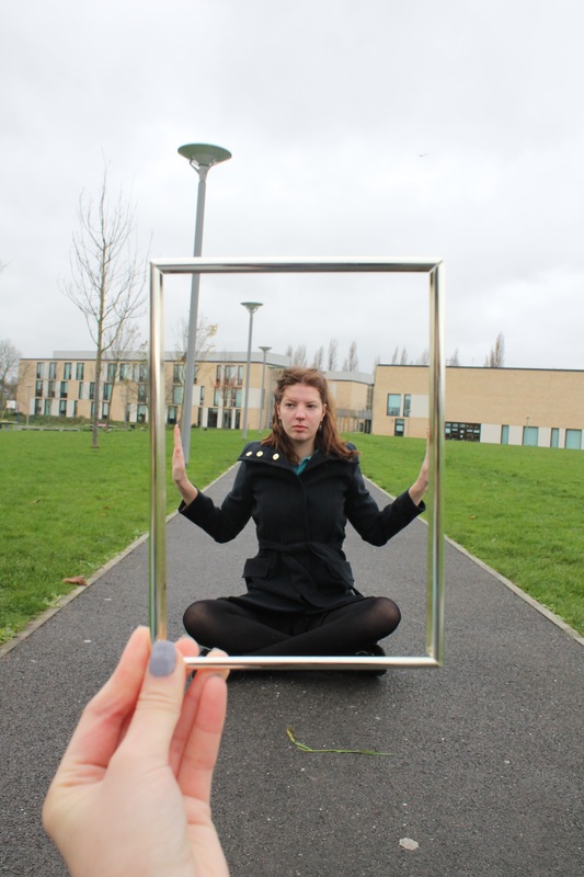
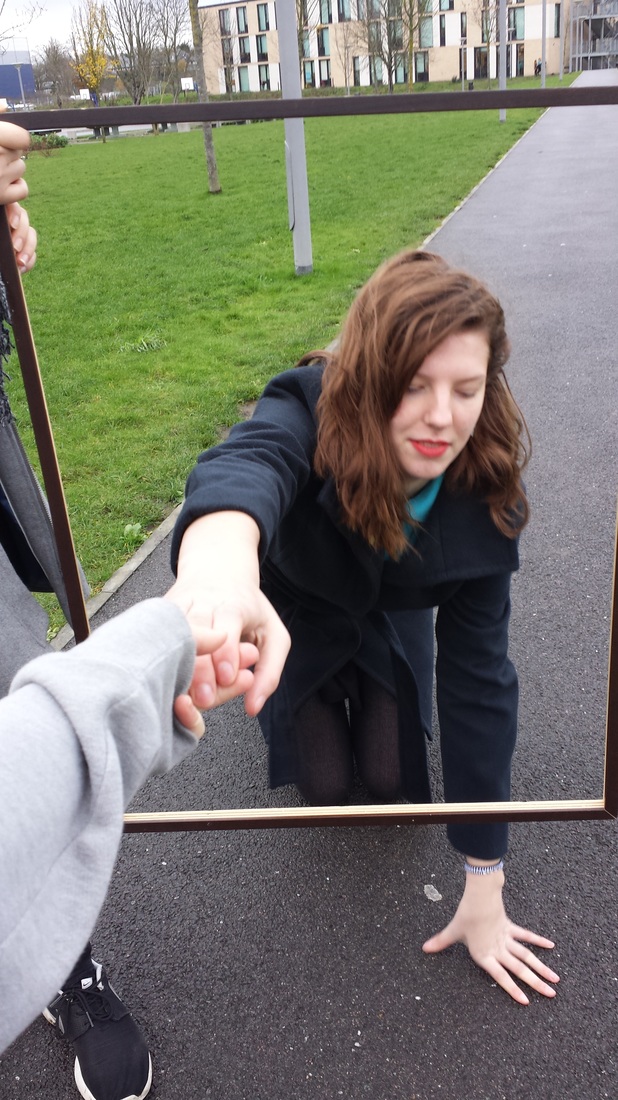
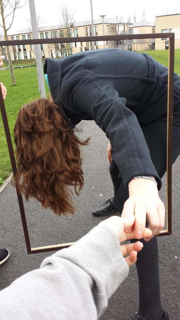
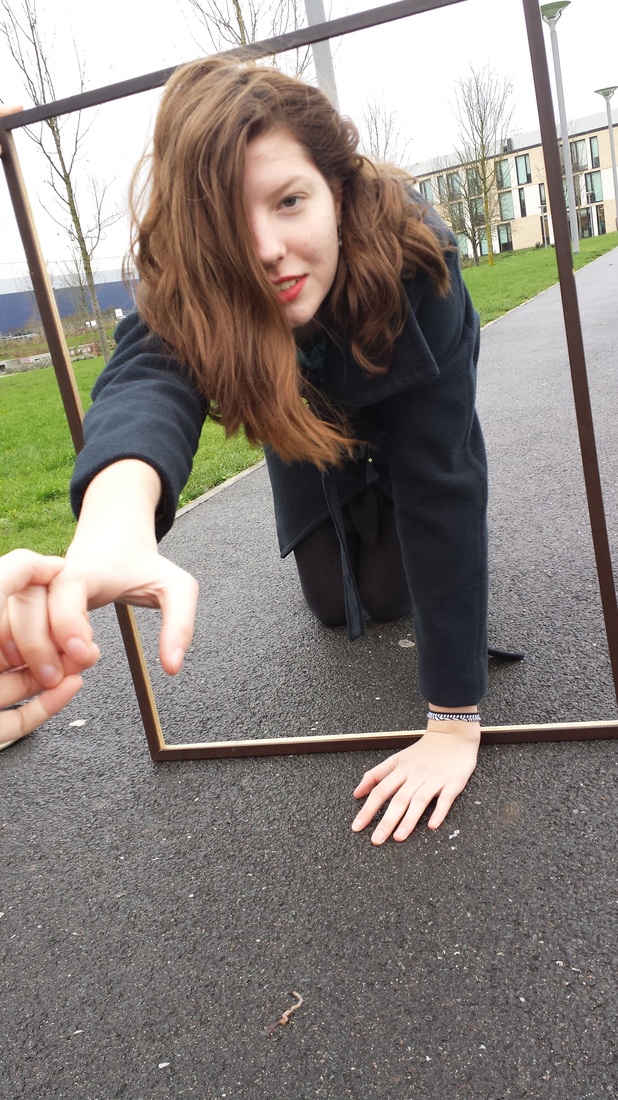
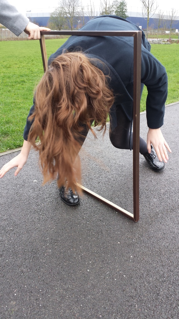
WWW: I think that the best image from this set of image would be the 4th image. I think that this image is the best image out of this set because I think that because the image was taken at a lower angle the image looks more absurd as normally images are not taken at this angle. Another good thing about this image would be that because the person is halfway through the photo frame, it makes it seem that she is coming out of the photo frame.
EBI: If I were to take more of these forced perspective images the one thing that I could improve on would be to think more on the framing of the image. For example think more about the background and the foreground of the image. Another way to improve would be to make sure that only the photo frame is in the image making it the main focus of the image. Another way to make the image more absurd would be to take the image at a weird angle, for example taking the image at an lower angle which make the object in the image look bigger that normal.
Portraits
Marcel van der Vlugt
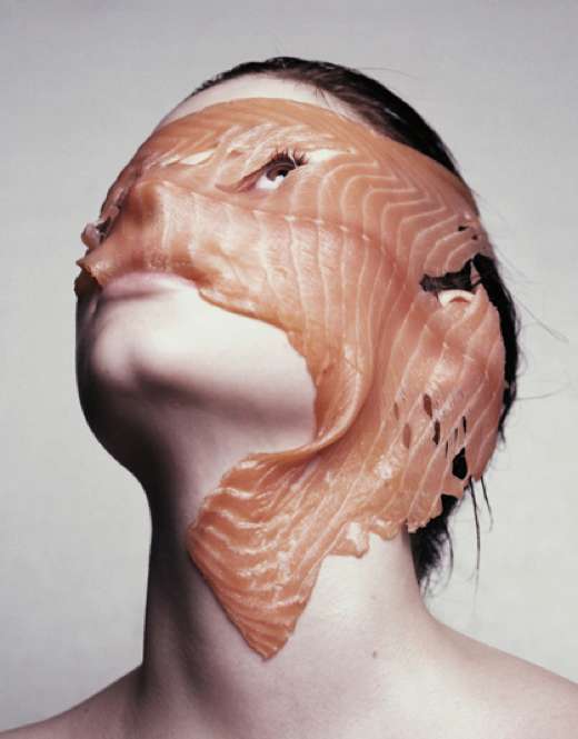
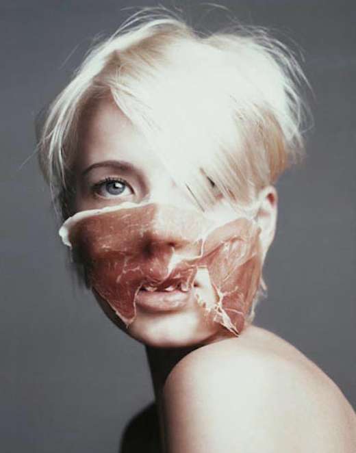
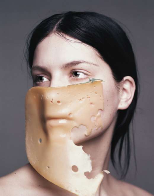
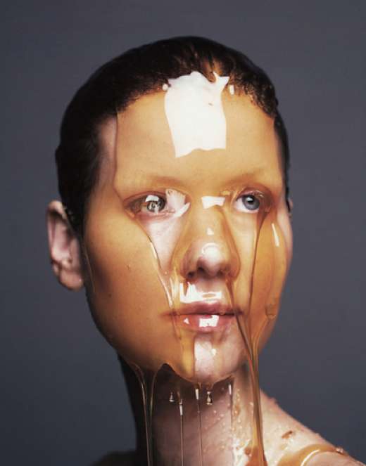
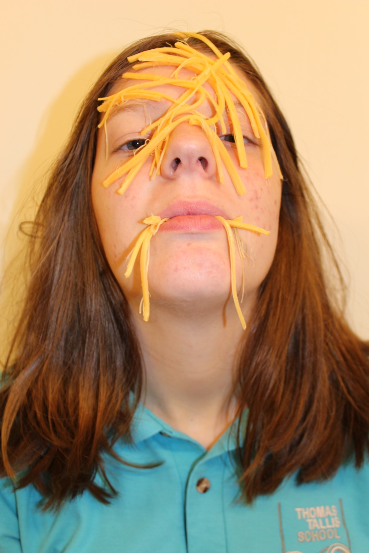
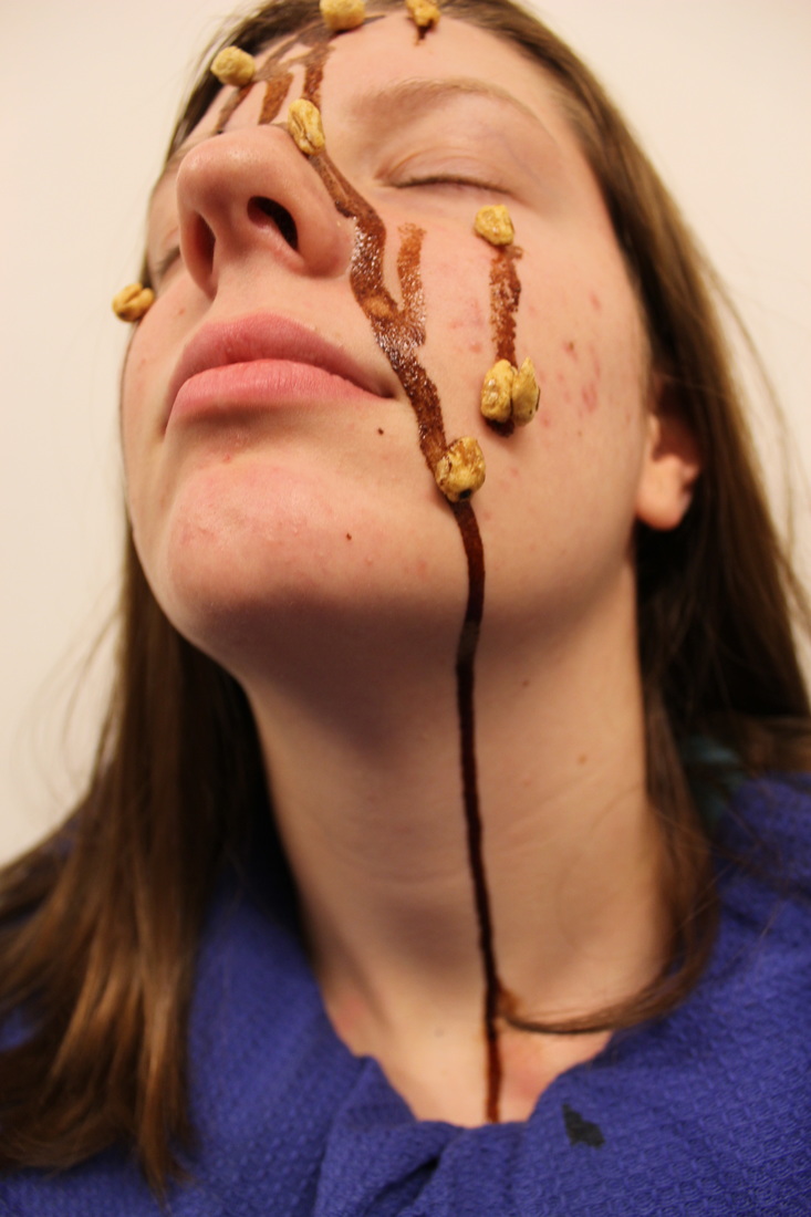
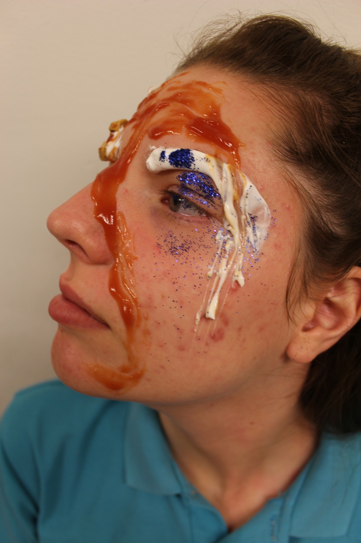
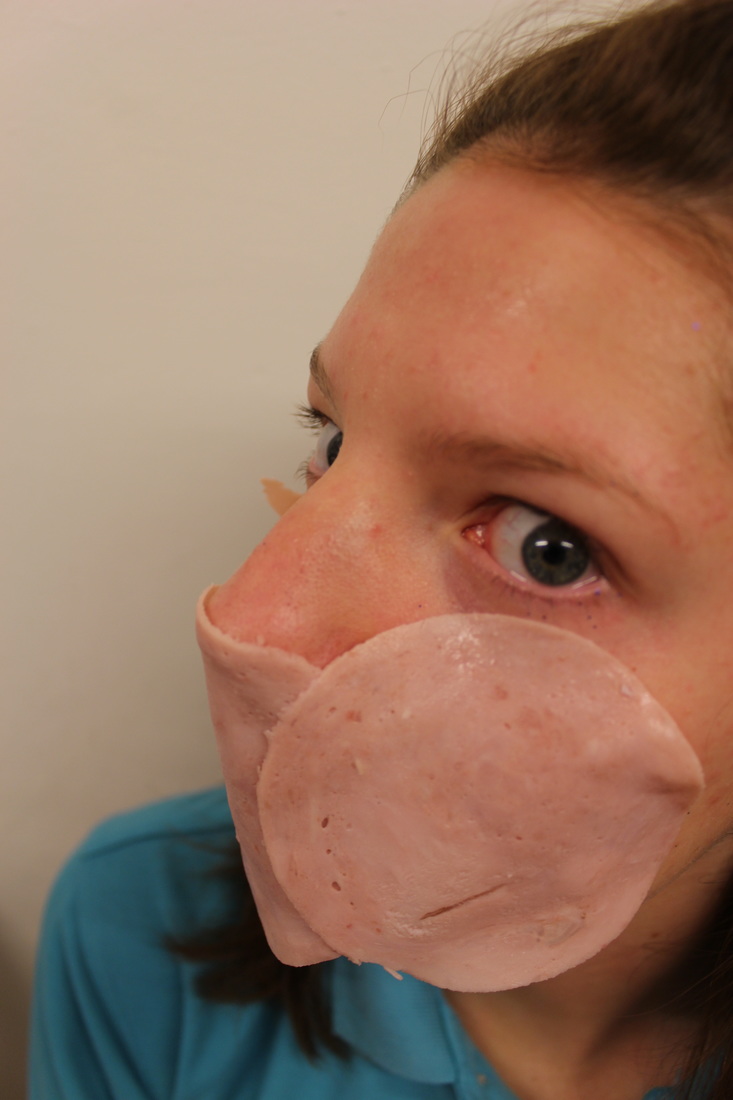
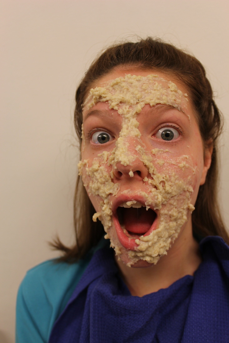
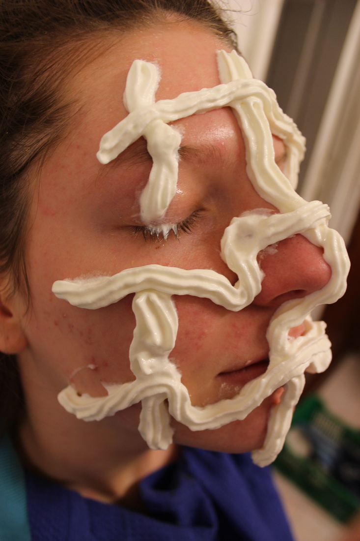
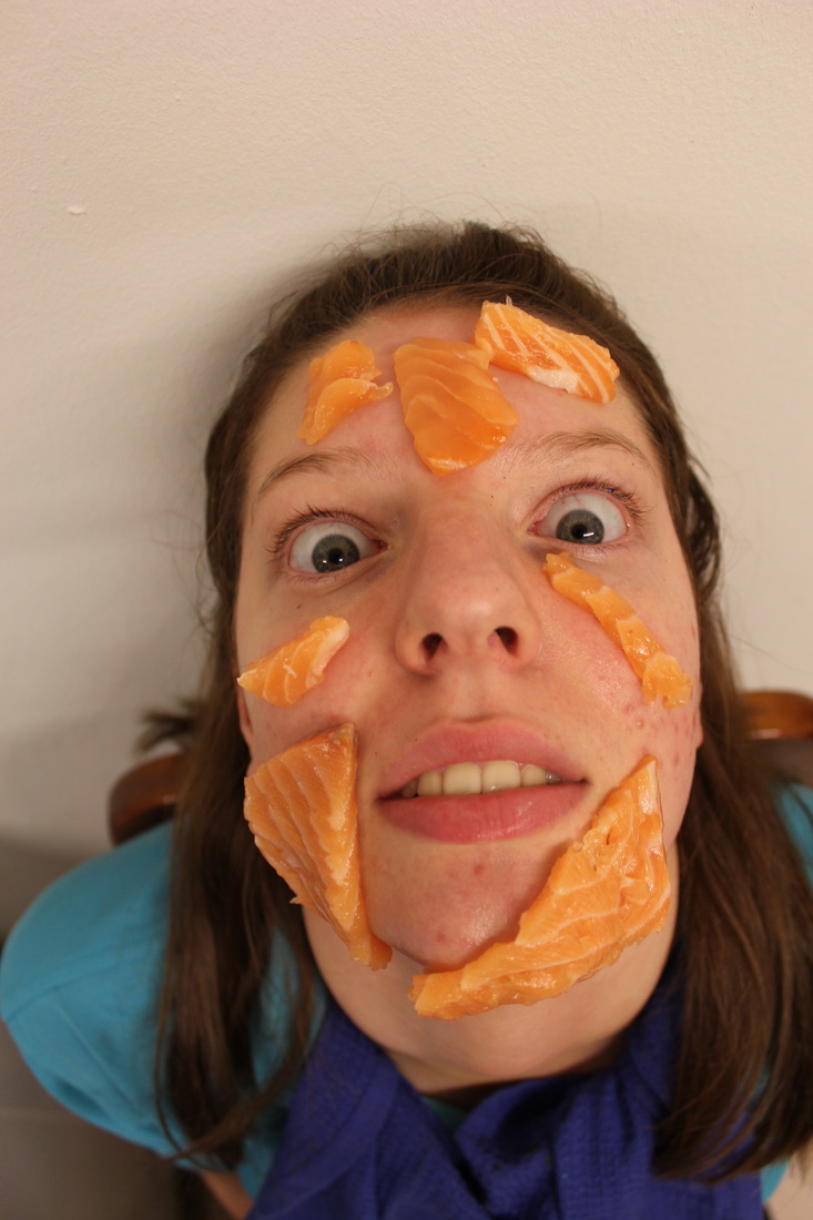
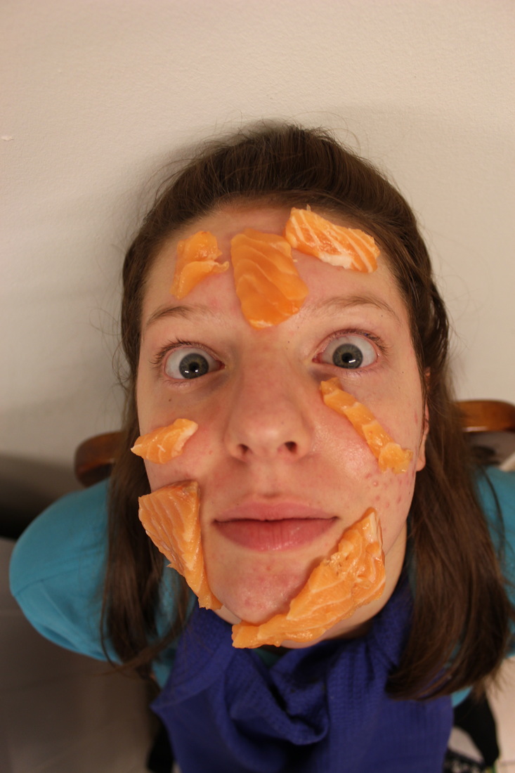
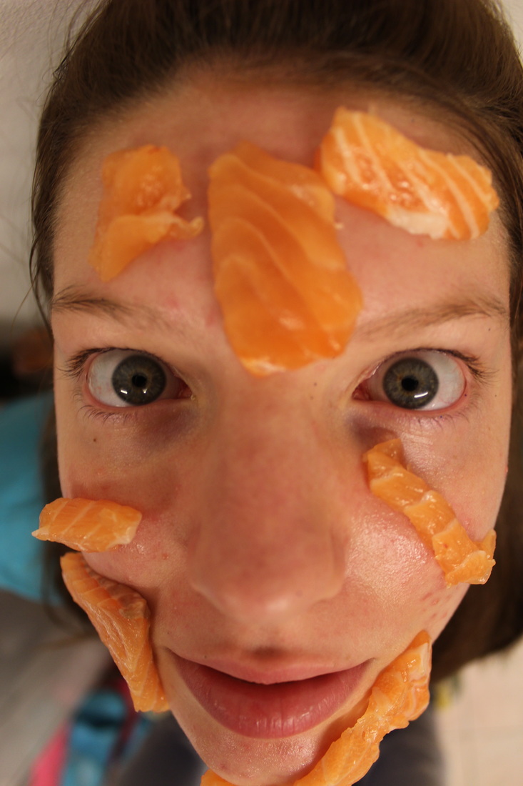
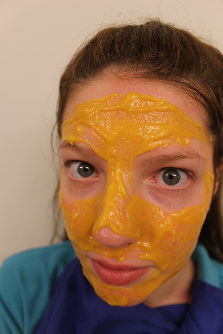
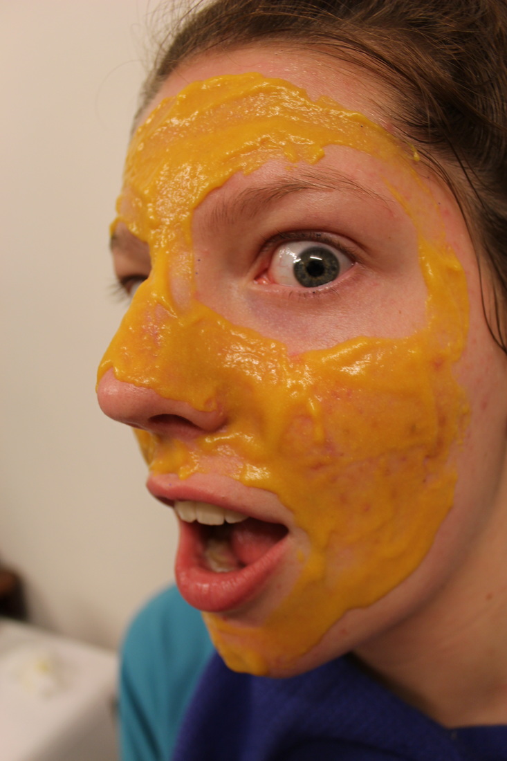
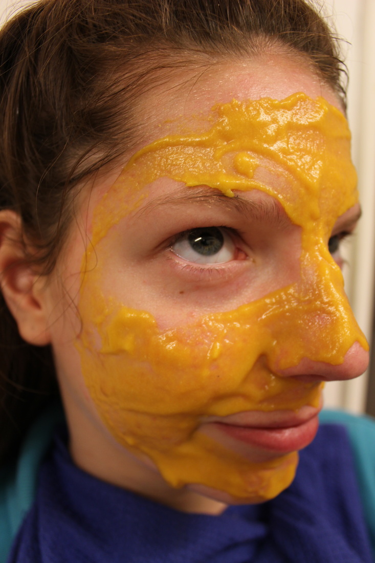
These images were taken by Marcel van der Vlugt. He puts food on people's faces to make an absurd image. These images were taken against a plain background, which makes the subject in the image stand out. There is a lot of positive space in these images which means that, a lot of the space in the image is filled up. The subject in the images are close in the foreground, which makes it the main focus within the image and the first ting you see when you look at the image. In these images there is a lot of texture due to the things that are placed onto the face, which make the image look more interesting as the texture makes the image look more realistic. This then makes the image more absurd as it would make the viewer wonder why they have food on their face and would make them wonder why the photographer chose to do this.
Marcel van der Vlugt inspired images
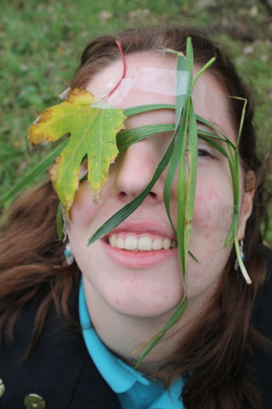
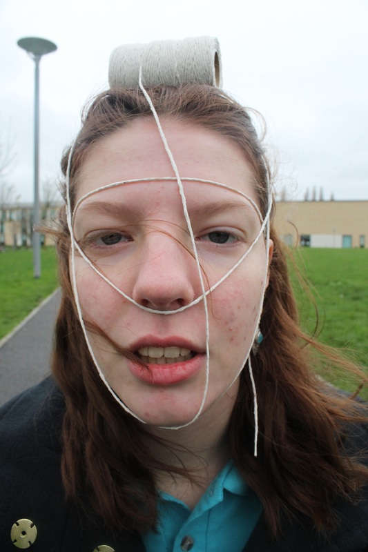
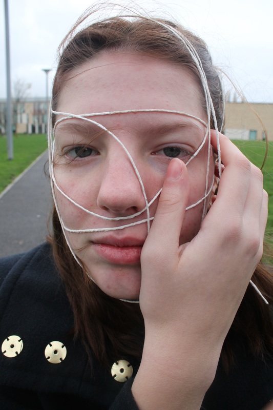
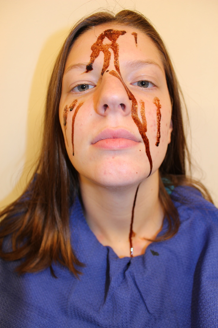
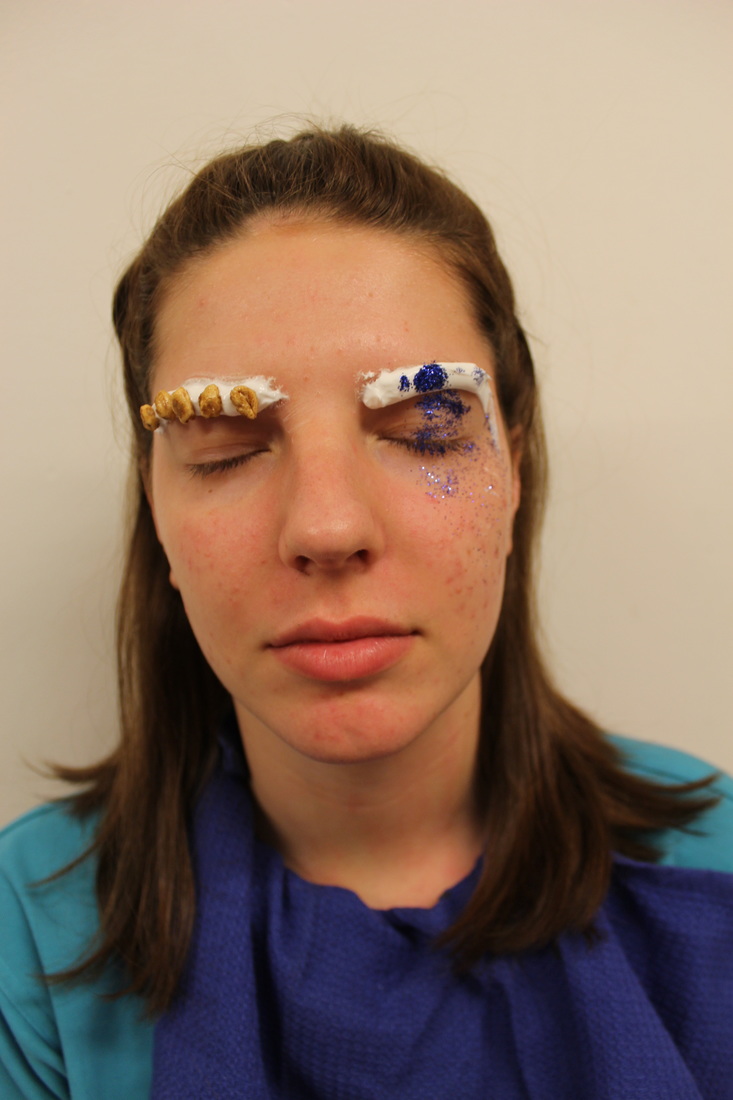
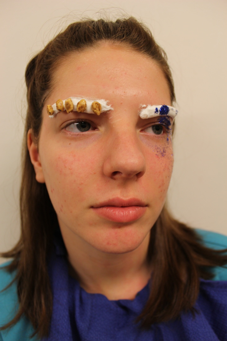
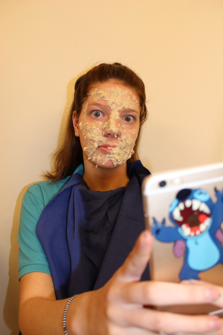
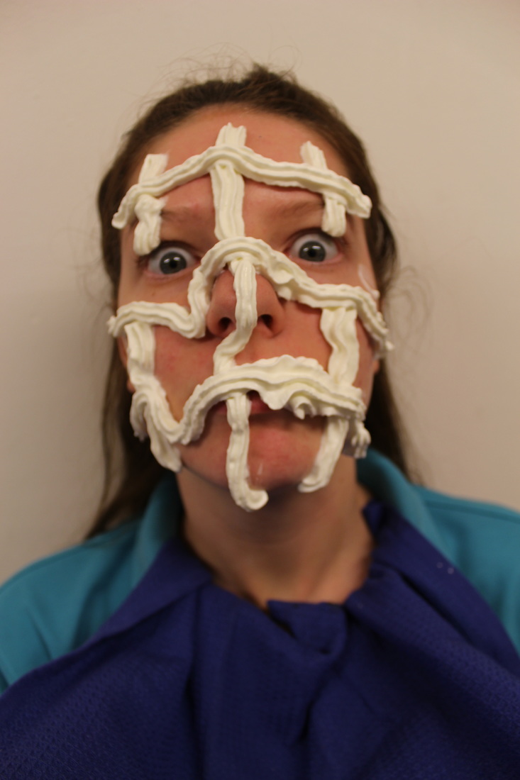
Here is the first set of images that I have taken in response to Marcel van der Vlugt. Instead of using food like Marcel van der Vlugt did, I decided to try using string and grass.
EBI: Because this was my first attempt at taking this type of images, it I think that this set of images didn't work really well as I was not confident. One way to improve these images would be to take the images against a white background so that the face in the image would be the main focus in the image. Another way to improve this set of images would be to change the material used to make sure that there is a variety so the images don't look similar.
EBI: Because this was my first attempt at taking this type of images, it I think that this set of images didn't work really well as I was not confident. One way to improve these images would be to take the images against a white background so that the face in the image would be the main focus in the image. Another way to improve this set of images would be to change the material used to make sure that there is a variety so the images don't look similar.
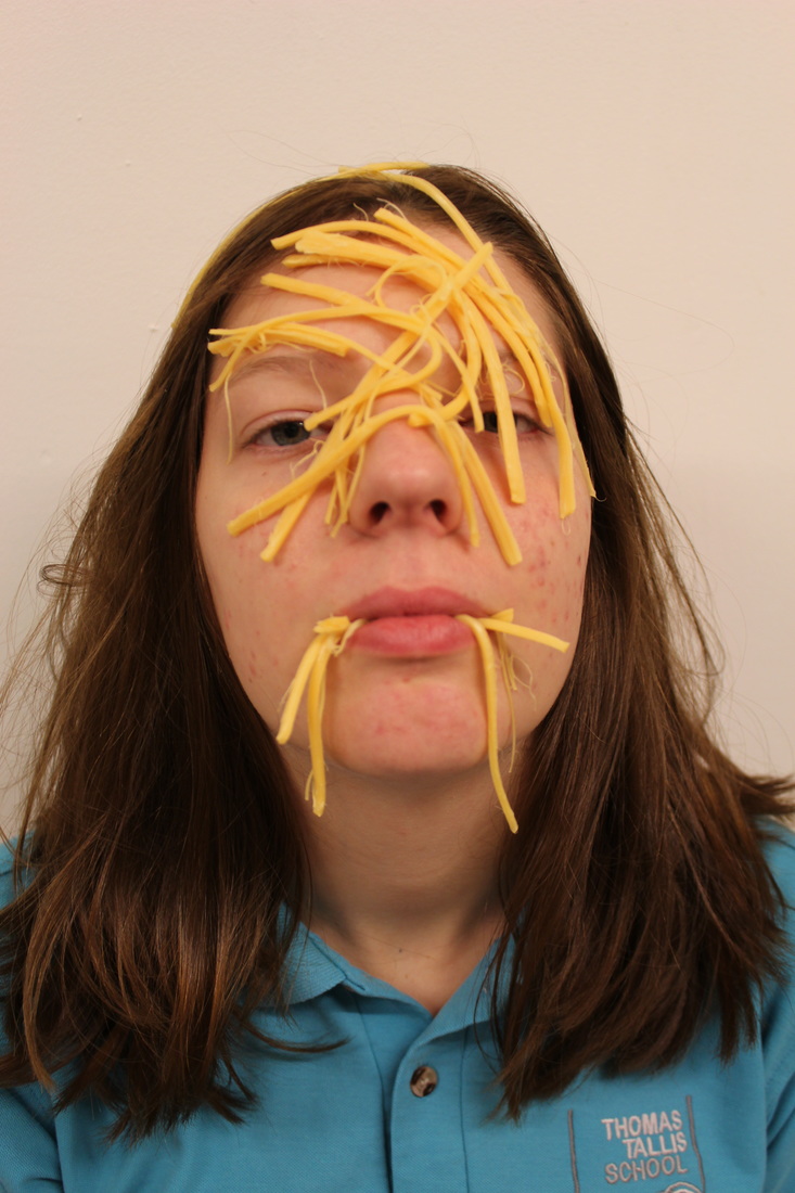
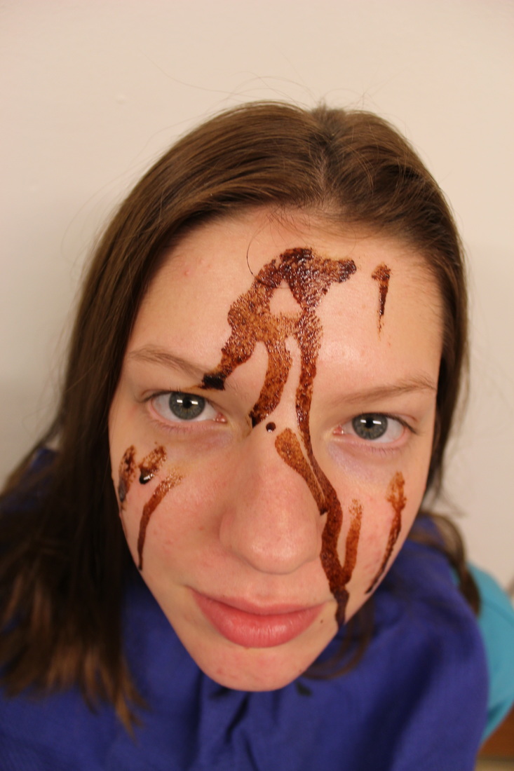
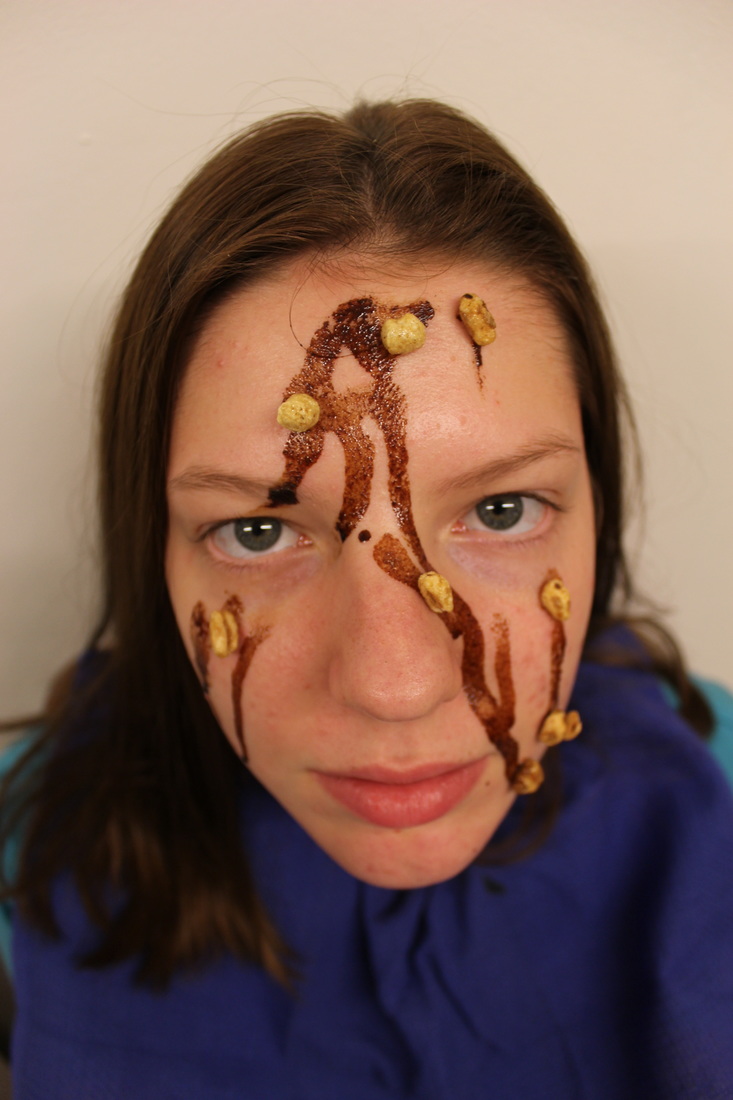
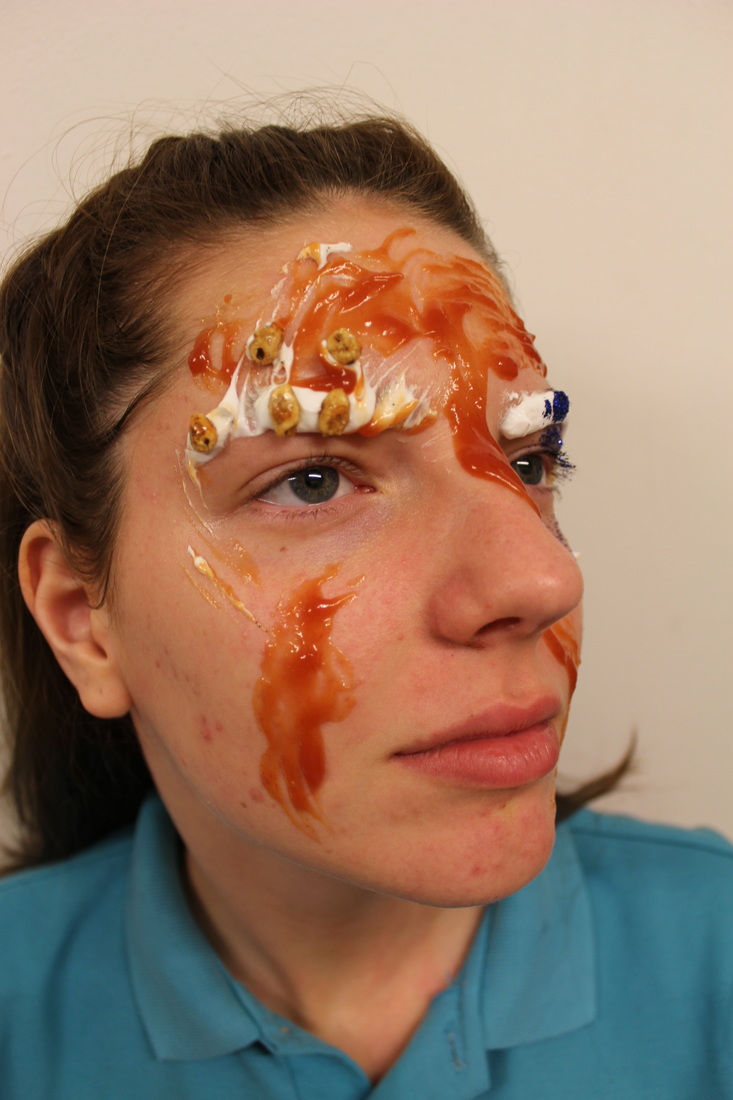
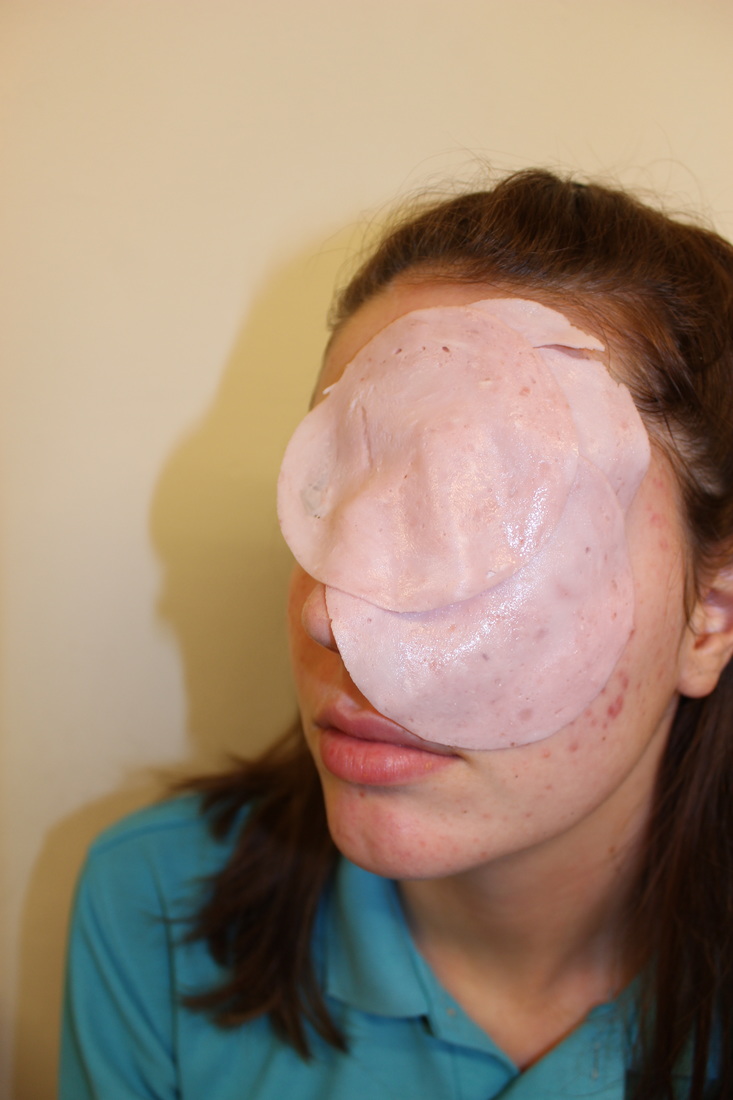
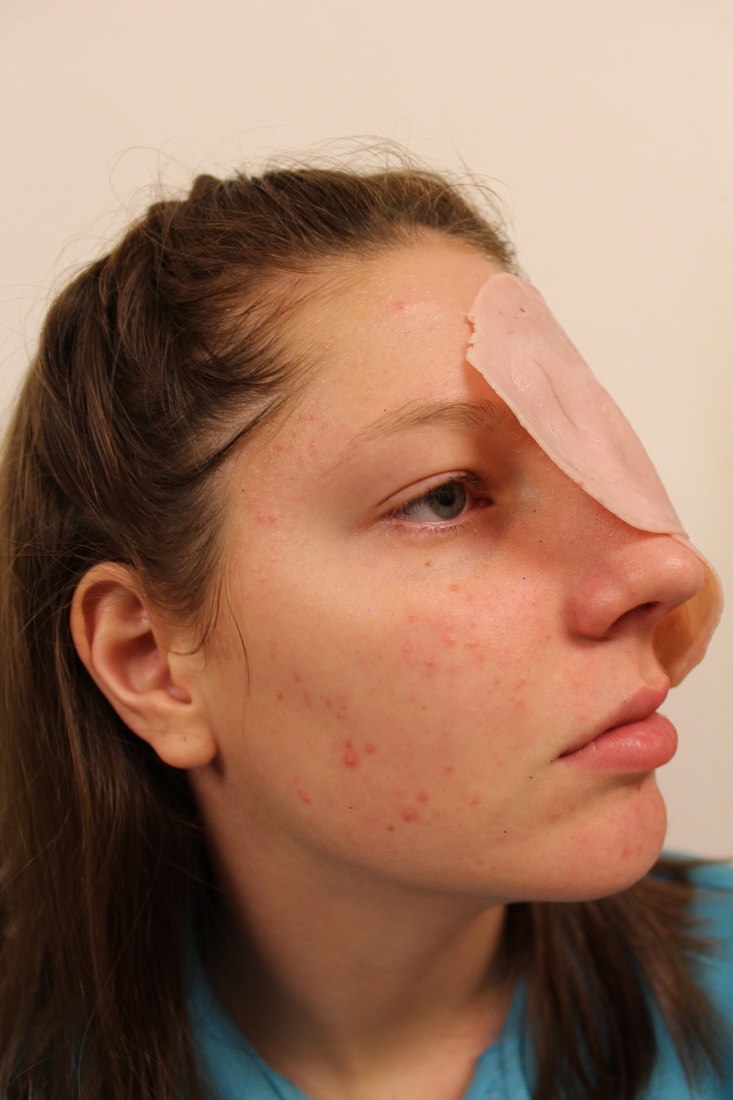
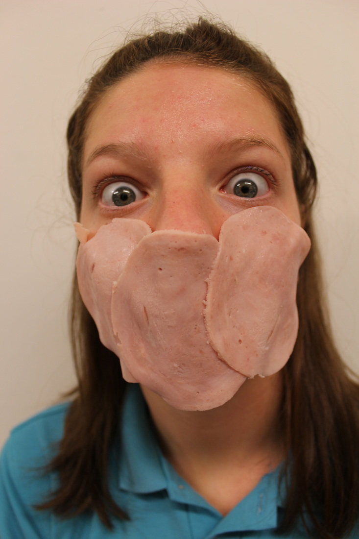
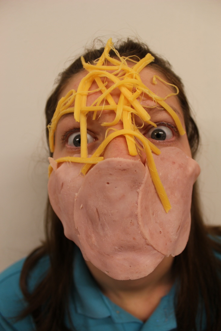
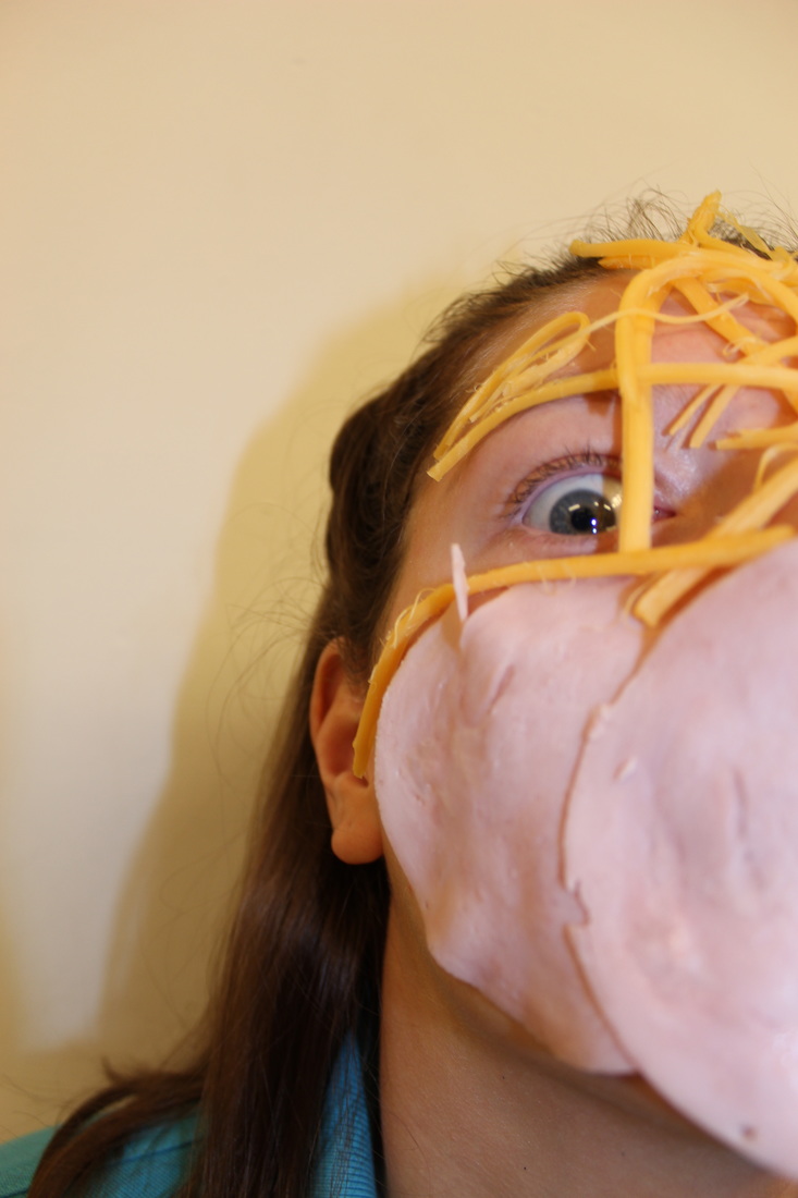
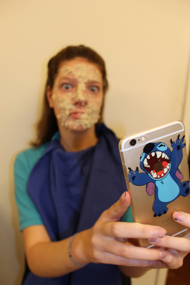
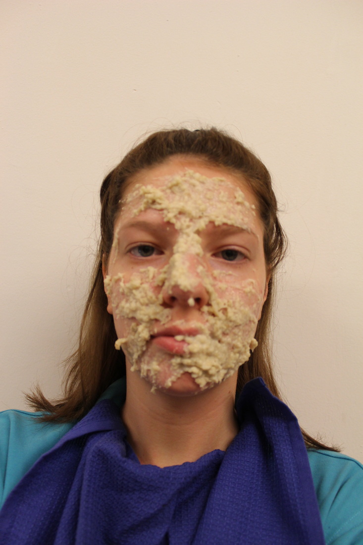
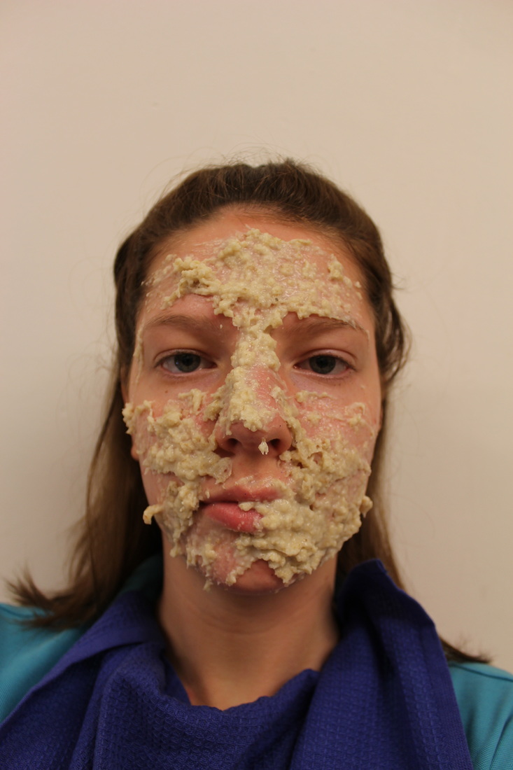
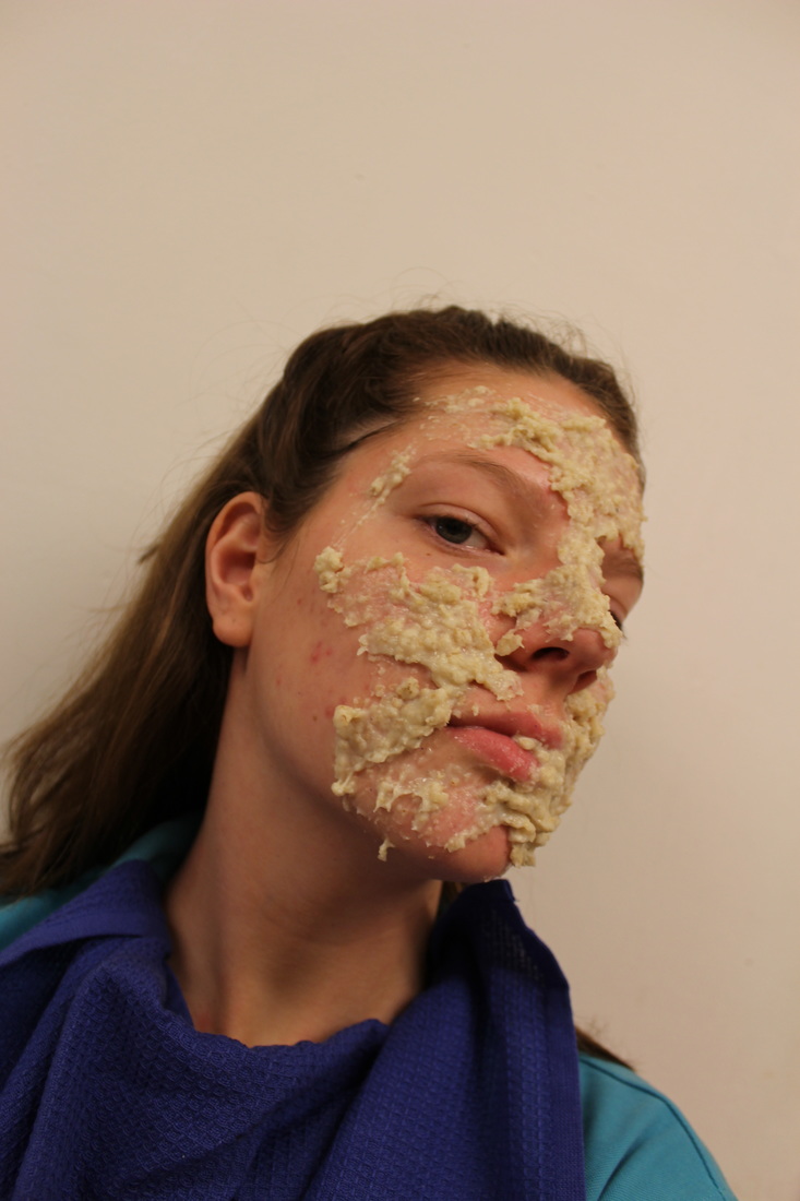
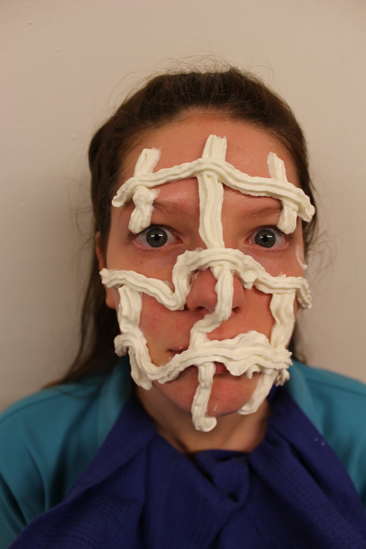
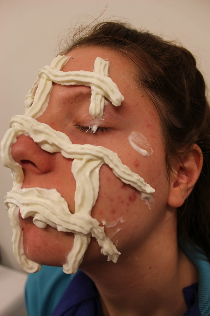
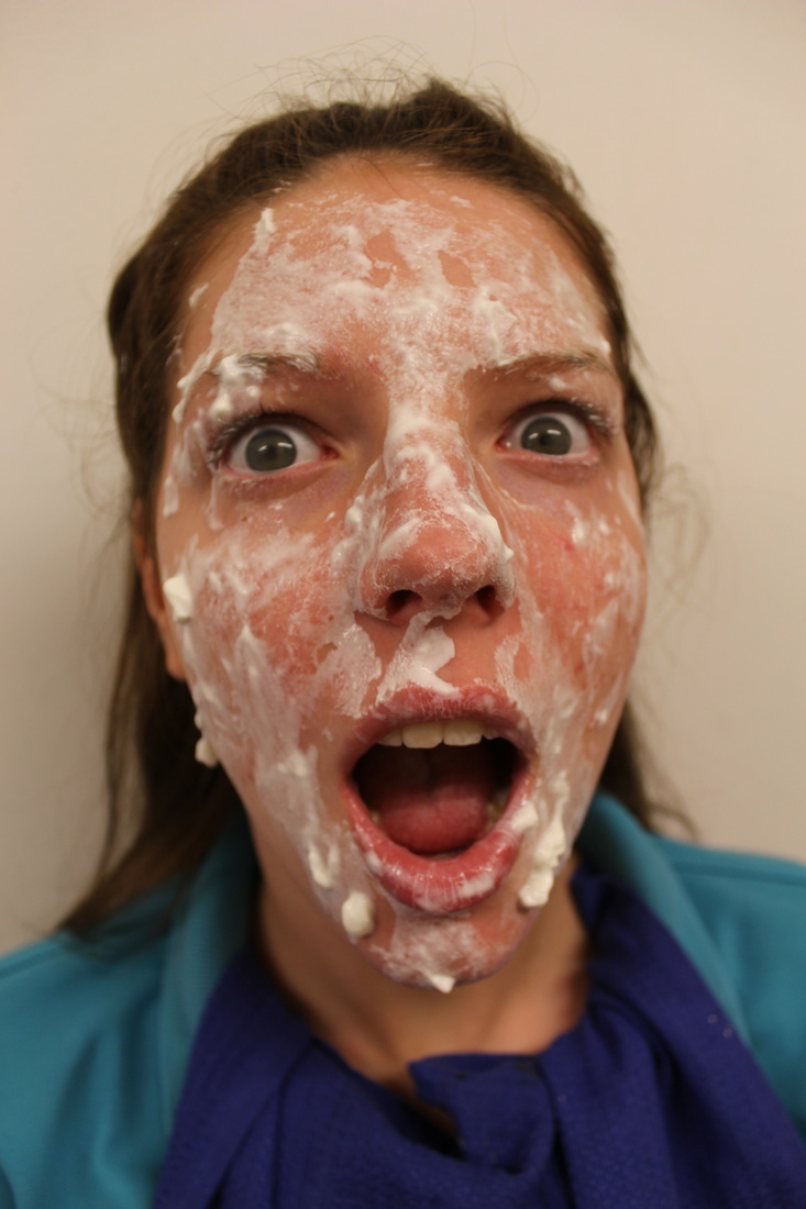
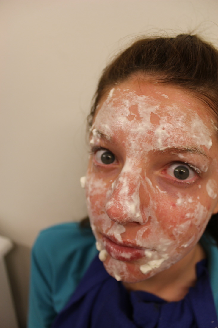
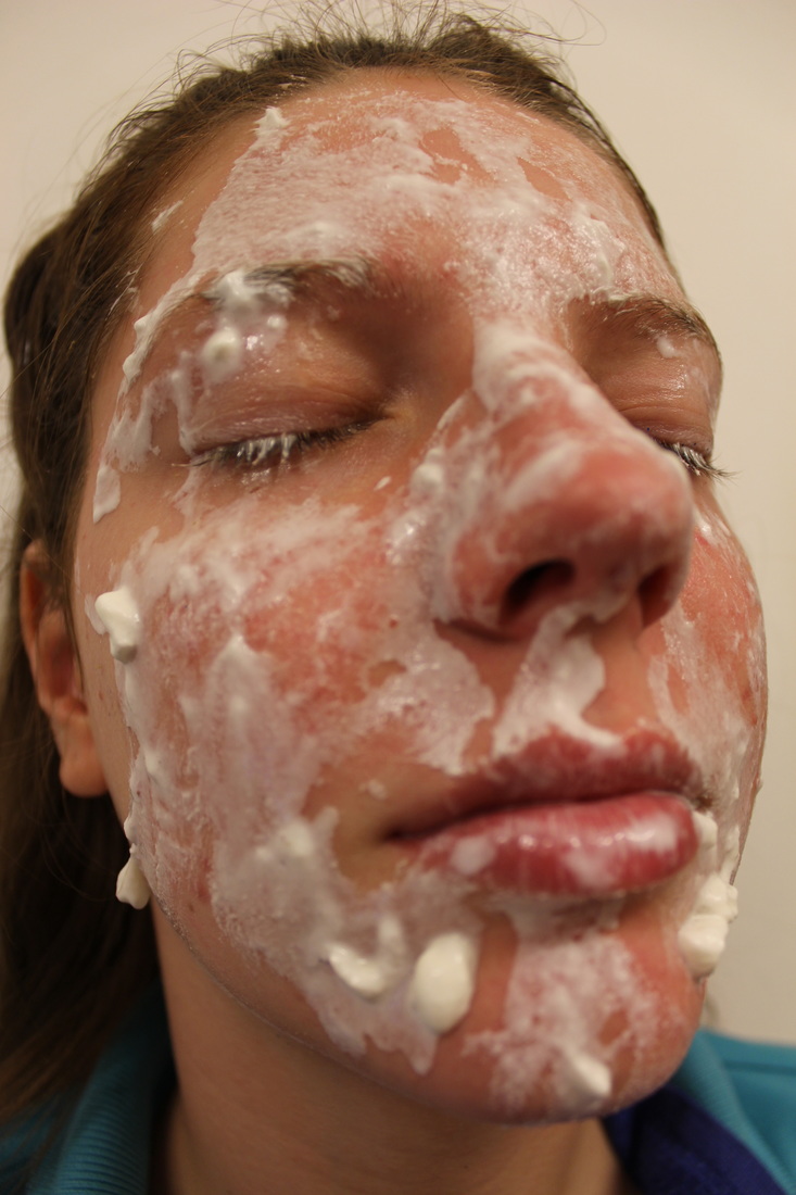
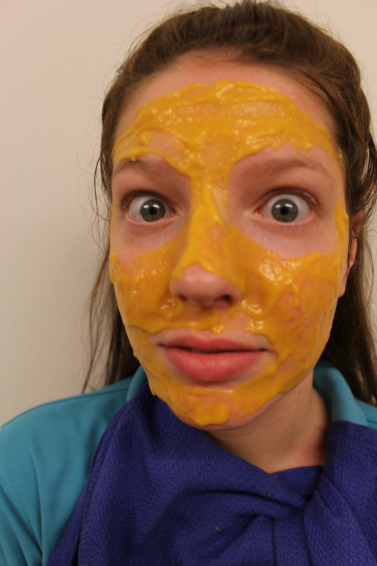
Here is the 2nd set of images that I have take in response to Marcel van der Vlugt. I think that these images turned out well because I think hat these images look really absurd, as it can make the view think 'Why is there food on her face?' or 'What was the photography thinking?'. By taking these images against the plain background. it made the subject of the images rally stand out, it also contrast against the colors in the images making them seem really vibrant. However to improve these images I would have made it seem lie it was planned , as I think that my images seems really planned out.
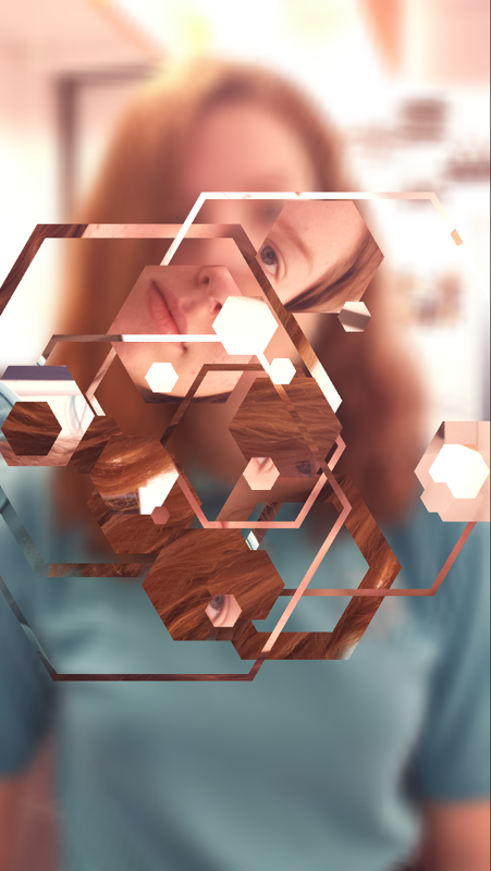
Mihaela Ivanova: Conceptual
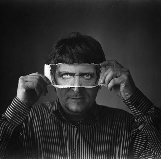
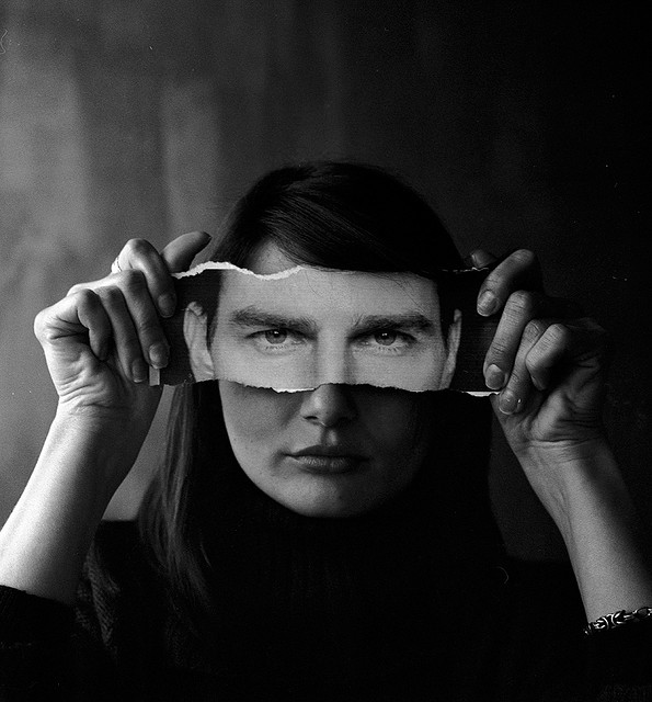
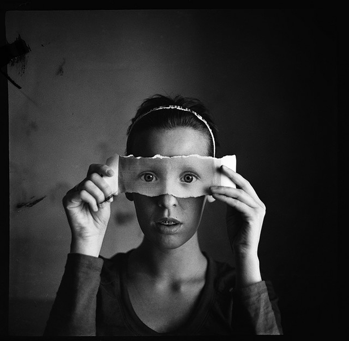
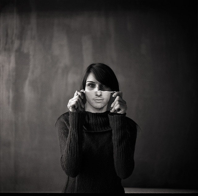
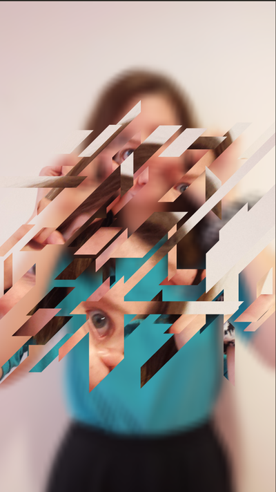
These images by Mihaela Ivanova imspired me to create my next set of images. These images are really absurd as it makes the view think 'Why are they holding bits of images up to their face?' By taking these images against the dark background it makes sure that the focus id on the subject of the images. The picture that the people are holding up to their face are slightly lighter that the people them selves, which draws the views attention to the images, rather to the people holding the images.
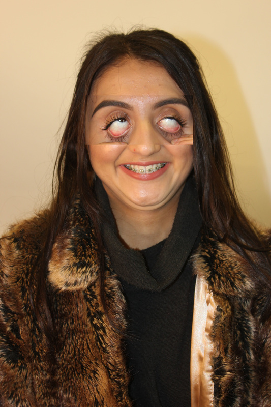
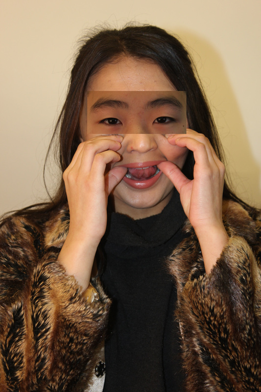
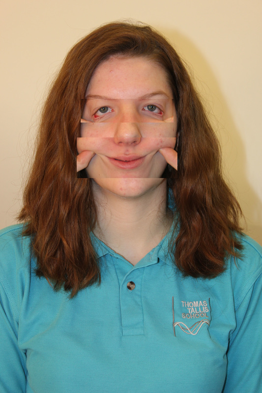
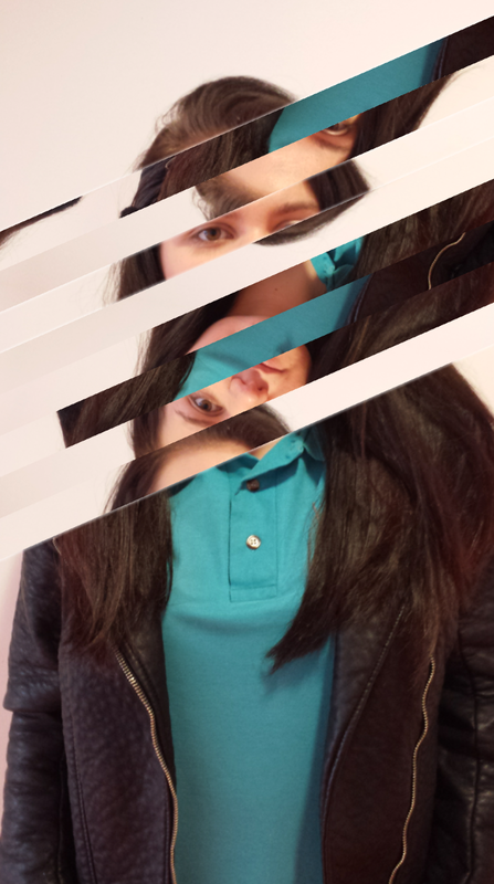
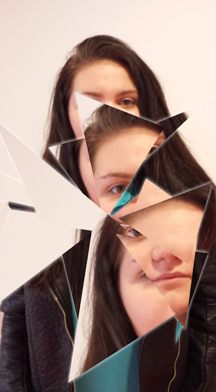
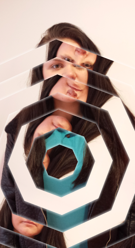
Being inspired by Mihaela Ivanova I tried to make my own set of images. But instead of having people holding images up to their face I decided to Photoshop them on instead as it can make the images seem more weird and abstract.
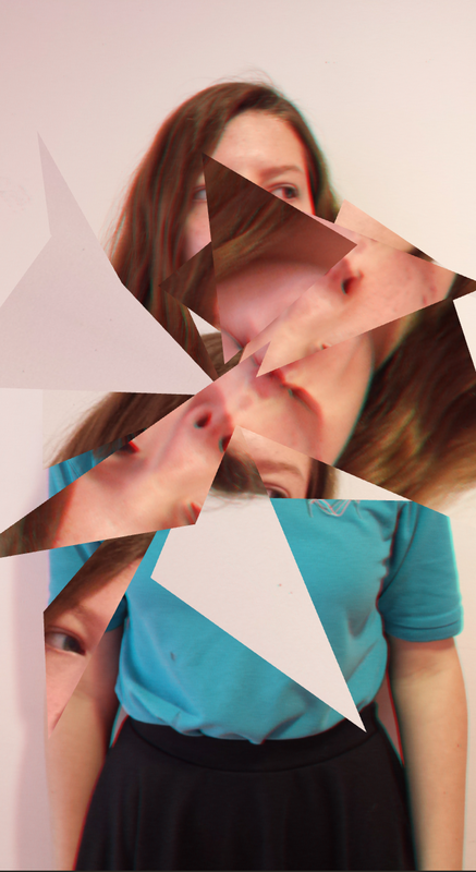
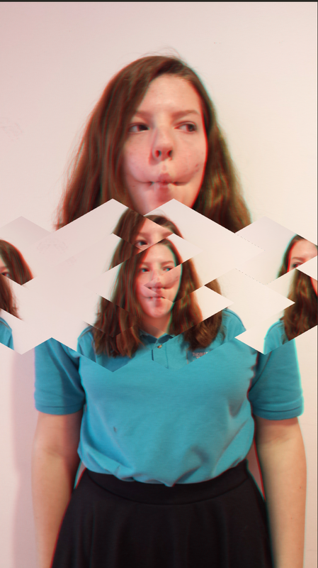
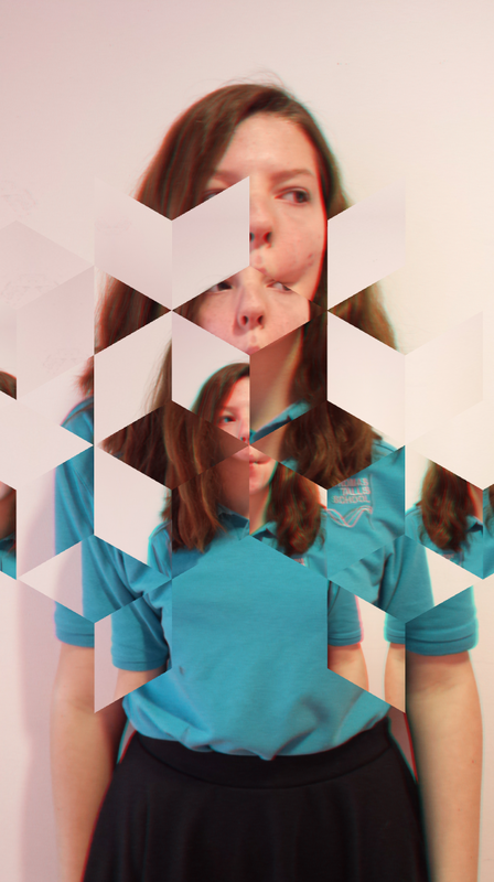
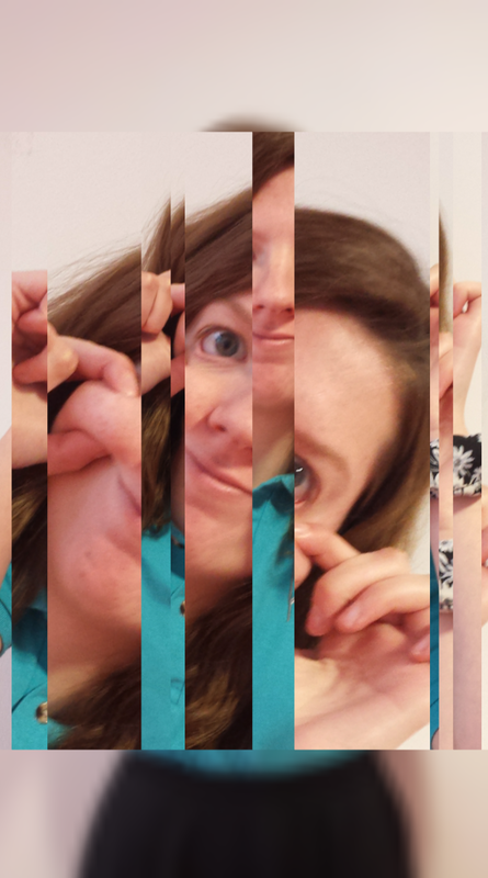
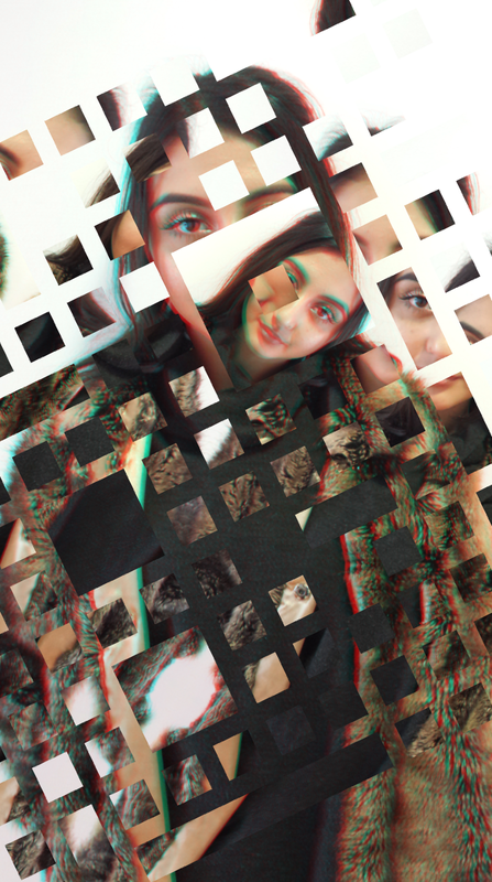
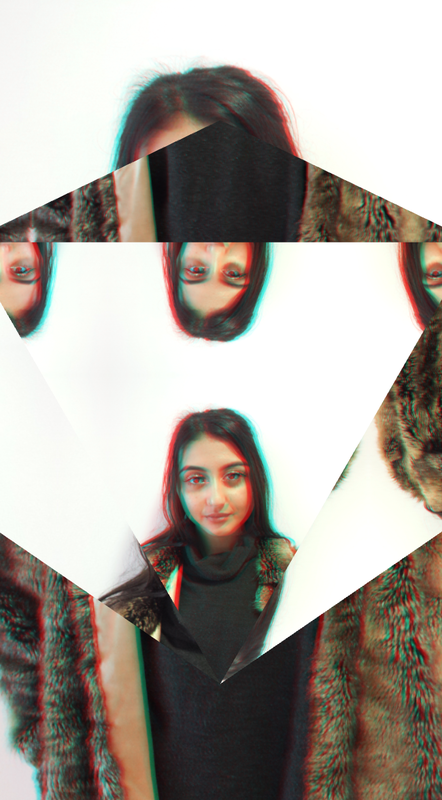
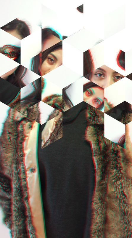
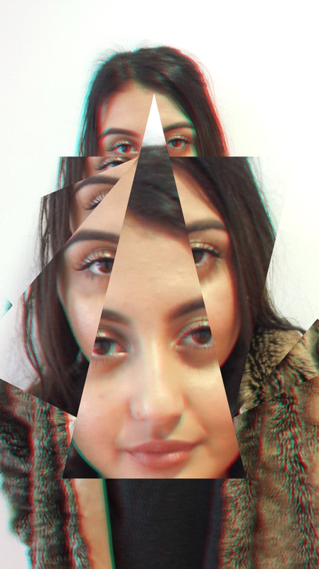
Final Piece


Final evaluation
During this project about Absurd I have developed my research, experimental and development skills. As this project about Absurd is very open, there are many artists that I could have chosen to research and develop my images on, which means that there are many possible paths to go down to make a successful final piece. Despite the many paths that could have been taken, I have remained focused and managed to create a final piece.
To start of this project I have evaluated 2 example images of absurd. Evaluating these images gave me the chance to see what things that need to be present in an 'Absurd' image. From this first initial evaluation of the images I had found out that the framing of the image is the most important thing to focus on. After evaluating the 2 images I used pinterest to find artists that create absurd images that interests me the most. The artist that stood out the most was Corey Bartle-Sanderson. Even though I did't create any work inspired by Corey Bartle-Sanderson, this artist research helped me to realise that there are many ways to create an absurd image. After researching Corey Bartle-Sanderson, I moved onto a subtopic of 'Hide'. Within he subtopic of hide I had manages to create 3 sets of experiments. After each experiment I evaluated them talking about what went well in the image and what could I improve on in the next set of images. To refine these images I wrote myself a little plan of what to do better next time, for example thinking more about the composition of the images.
The second artist research that I did was David Shrigley. This was when I decided to move onto a subtopic of absurd which was Signs. Researching David Shrigley gave me more ideas on what to do on the signs subtopic. When researching him, I chose my favourite of his and evaluated it, so that I could gain more ideas and inspiration. After researching and evaluating I went out in the school to take some initial images that related back to signs. For this first set of images I had simply made the signs out of post it notes, I made them out of post it notes because I felt that the simpler the sings the more absurd they would be. After taking the first initial set of images, I evaluated them Making sure to include what when well and what I could improve on. With what I sad to improve on, I made another set of images, making sure to make to make all the improvements on the new set of images. However after making all the improvements for the new set of images, I felt that the second set of images did't work out well, as fro the signs I had just made one sign, which made the images repetitive and similar. Same with the first set of images after taking the images I evaluated the images making sure to include what went well and what I could improve on, in this case it was to make more signs so that the images don't turn out repetitive and similar. Once again I took in all the improvements from the last set of images and once again I took more images making all the right improvements.
